


I see the Club HQ has photo-shopped (poorly) SGIO off the jumpers, in a similar fashion to how they removed Puma from everything the year before.

The strange bit is that they used the Burger logo instead of the word mark they are running with this season.
Also here is a pic of the clash complete with sublimated golf AFL logo.


The strange bit is that they used the Burger logo instead of the word mark they are running with this season.
Also here is a pic of the clash complete with sublimated golf AFL logo.


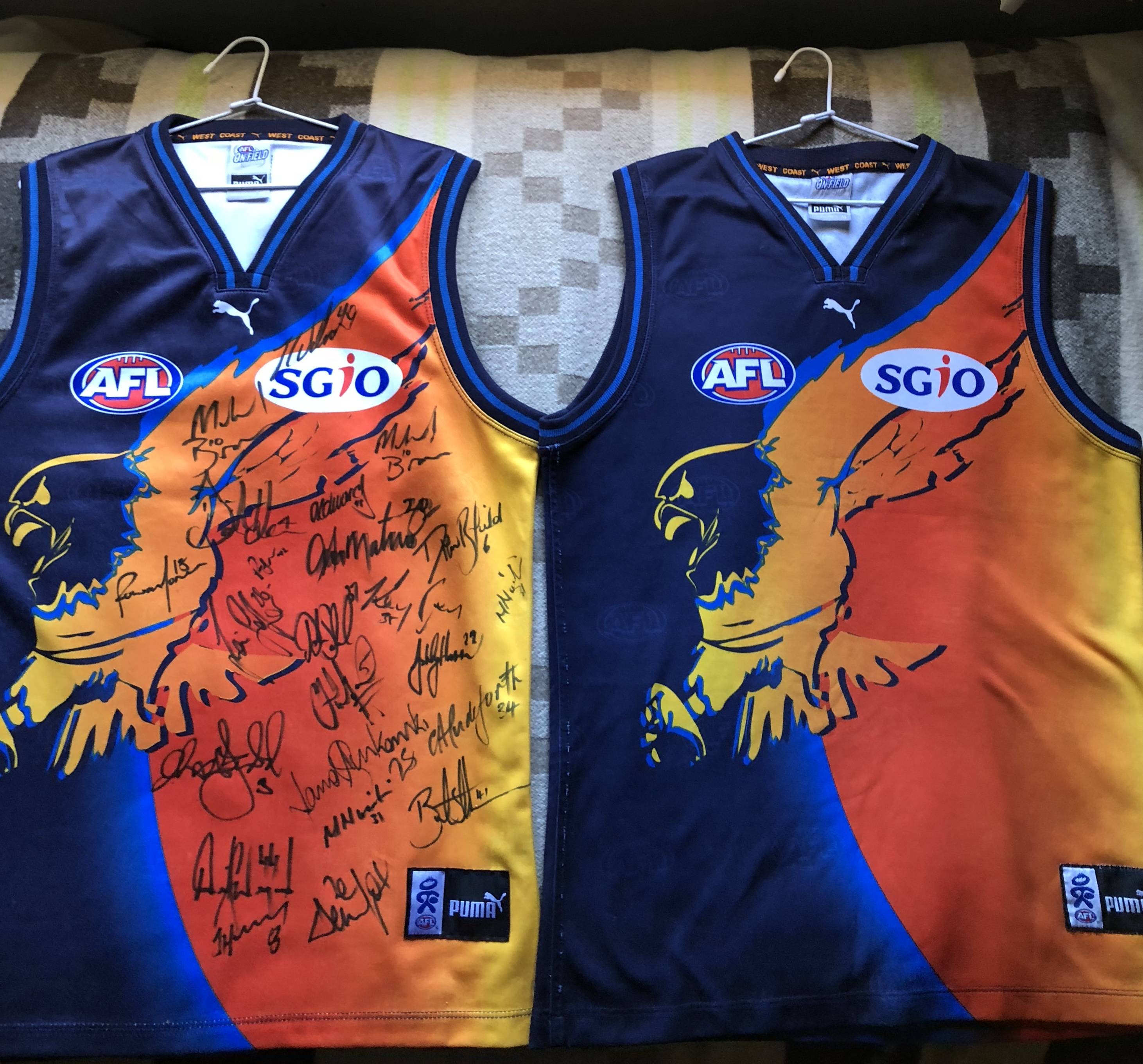
") I've tried my best to name all of the signatures and it had Peter Matera, Andrew Williams and Brent Tuckey who left at the end of 2002. Nicoski and Staker who joined in 2003 and Humm who signed as number 8 which he became in 2003.
I've tried my best to name all of the signatures and it had Peter Matera, Andrew Williams and Brent Tuckey who left at the end of 2002. Nicoski and Staker who joined in 2003 and Humm who signed as number 8 which he became in 2003. 