


Great for watching on a mobile, terrible for a big screen. Also can't stand the way the clock and the quarter are aligned and sized to each other. So much wasted space.Fox netball graphics. I’d expect something similar for Fox Footy/League
View attachment 1334068
Navigation
Install the app
How to install the app on iOS
Follow along with the video below to see how to install our site as a web app on your home screen.
Note: This feature may not be available in some browsers.
More options
You are using an out of date browser. It may not display this or other websites correctly.
You should upgrade or use an alternative browser.
You should upgrade or use an alternative browser.
Discussion TV Broadcast Graphics - Designs & Discussion
- Thread starter Red Crow
- Start date
- Tagged users None
Maybe Fox has done it on purpose for netball as there is no FTA partner so most viewers will be digitally? I would expect a smaller version for the AFL thoughGreat for watching on a mobile, terrible for a big screen. Also can't stand the way the clock and the quarter are aligned and sized to each other. So much wasted space.
Rubber Arm
AFL Sucks
- Oct 10, 2018
- 1,643
- 3,574
- AFL Club
- North Melbourne
- Other Teams
- ^ I don't actually go for North.
P6?

Edit: Nvm didn't realise there were two extra periods for youngsters this year

Edit: Nvm didn't realise there were two extra periods for youngsters this year
Last edited:
Some clubs are, some clubs aren'tP6? View attachment 1334593
Edit: Nvm didn't realise there were two extra periods for youngsters this year
akkaps
Community Leader
- Mar 20, 2012
- 47,444
- 32,665
- AFL Club
- Carlton
- Moderator
- #2,455
You should ask how Magpies supporters feel about this. Yesterday they had a 66 point lead to end up drawing the gameP6? View attachment 1334593
Edit: Nvm didn't realise there were two extra periods for youngsters this year
Fox netball graphics. I’d expect something similar for Fox Footy/League
View attachment 1334068
Alignments all over the place. Needs to be cleaned up.
pattymalone00
All Australian
Knowing aswell they aren’t run by the same company but do share the same logos it’s kinda crazy channel 7 graphics are probably closer to fox sports America then fox sports Australia is…Interesting that Fox are using the full names. Fox and 7 almost working in opposite directions when it comes to team identification; Fox from simpler to complex, Seven from complex to none.
pattymalone00
All Australian
 Looks like fox footy are debuting its new graphics tonight (I thought they may wait till round 1)
- Apr 9, 2015
- 1,196
- 3,420
- AFL Club
- Carlton
- Other Teams
- Melbourne City FC, Southampton FC
Yep the new graphics are in action, and as predicted their similar to the cricket ones with the logos in circles - although they don’t seem to be using the actual AFL logos just a representation of the club’s home jumper
- Mar 14, 2014
- 39,390
- 72,491
- AFL Club
- Gold Coast
- Other Teams
- Las Vegas Bears
Hmmm not sure if I like the new graphics.
Smoooothy
SACK THE LOT OF THEM!
- Jan 12, 2005
- 24,312
- 22,283
- AFL Club
- Adelaide
- Other Teams
- North Adelaide; ConeyIslandWarriors

Smoooothy
SACK THE LOT OF THEM!
- Jan 12, 2005
- 24,312
- 22,283
- AFL Club
- Adelaide
- Other Teams
- North Adelaide; ConeyIslandWarriors
Way way too big IMO
Pakenhamsaint
Premium Platinum
- Jan 5, 2011
- 46,228
- 37,647
- AFL Club
- St Kilda
The old one was better
- Jun 3, 2015
- 743
- 760
- AFL Club
- Port Adelaide
The cricket ones worked better because of a bigger size. I like it when the graphics match the kit the team is wearing

I don’t mind it but for me the goals and behinds section is too cramped and the total score section becomes disproportionate. If they had similar spacings it would look better
acm21
Club Legend
- May 7, 2019
- 2,695
- 1,395
- AFL Club
- Essendon
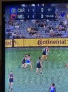
Looks like a video gameWhat’s going on with fox’s new scoreboard?
View attachment 1337610
Pakenhamsaint
Premium Platinum
- Jan 5, 2011
- 46,228
- 37,647
- AFL Club
- St Kilda
They're still using the old one during the ad breaks.
dekani19
Debutant
- Feb 23, 2021
- 117
- 315
- AFL Club
- Collingwood

Agreed, and I don’t see the point of showing the goals and behinds, should just show the total scoreLooks like a video game
Should have club logos like SSN/Cricket
Similar threads
- Replies
- 8
- Views
- 564
