
Was about to say...My memory must be failing me as I remember the Grand Final being a tad closer than that

Follow along with the video below to see how to install our site as a web app on your home screen.
Note: This feature may not be available in some browsers.
Was about to say...My memory must be failing me as I remember the Grand Final being a tad closer than that
View attachment 607179
Without Photoshop at the moment, this is a demo of what the Channel 7 cricket graphics should look like.

View attachment 607179
Without Photoshop at the moment, this is a demo of what the Channel 7 cricket graphics should look like.
")
I have an issue with that and that 35+35=70 balls not 46 there.
Would require 24 no ballsCould've bowled a boatload of no balls.

View attachment 609310
I know they've only had the current set for a year, but could fox move to something like this next year given the cricket has this? They do like to change it up a lot (excuse BF for squishing it)
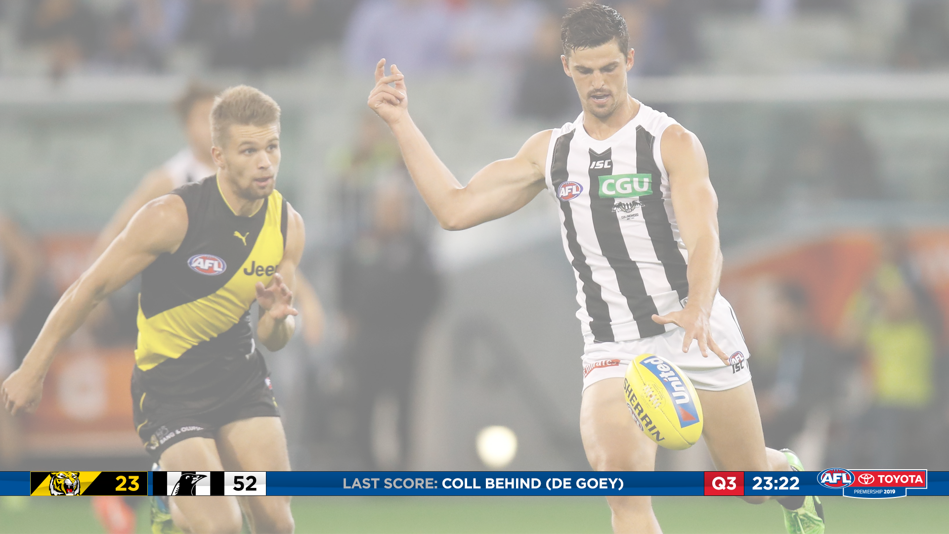
Not sure if you meant 7 or Fox, but I had a go at 7's:I'd love the see the cricket graphics almost exactly the same for the footy, down the bottom, two teams scores on the left, and stats + match information on the right. I'm a big fan of graphics stretching across the bottom, doesn't intrude as much as it can on top of the screen
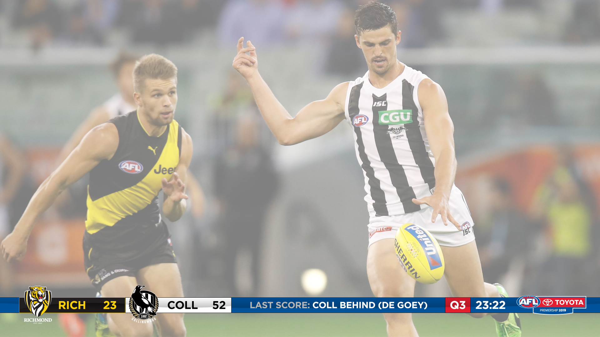
Not sure if you meant 7 or Fox, but I had a go at 7's:
Yeah, this would be a much better idea, The white collingwood and richmond text is getting lost at the moment and would be even worse with a moving image, this is a far cleaner execution (for the cricket ones as well).I was thinking they could both do it, these came up fantastic. Only change I'd make is to use icons for the teams rather than their full logo:
View attachment 611344 View attachment 611343
Other than that, these graphics came up great. Fingers crossed they look at doing something like this in 2019, it looks heaps better than the 2012-17/2018 style
this is true, the bar across the bottom does have a news vibe or something like NFL redzone or a Soccer Saturday rather than a proper sports broadcast.A scorebar in AFL is so unnecessary though. All you need are the scores and the time. Extra info like last score or stats don't need to permanently be on the screen, its just clutter IMO.
Yeah, this would be a much better idea, The white collingwood and richmond text is getting lost at the moment and would be even worse with a moving image, this is a far cleaner execution (for the cricket ones as well).
Hmmm, not sure it works as well.I was thinking they could both do it, these came up fantastic. Only change I'd make is to use icons for the teams rather than their full logo:
View attachment 611344 View attachment 611343
Other than that, these graphics came up great. Fingers crossed they look at doing something like this in 2019, it looks heaps better than the 2012-17/2018 style
Hmmm, not sure it works as well.
But the stats are already popping up in real time with more detail than what this system proposes, and we don't have to run a bright blue bar across the bottom of the screen. The commentators in an ideal world should be able to call stats and play at the same time. I'd argue that at the moment, 7's commentators are better at reading stats than calling the play, although, that's not saying much. 7's graphics at the moment are far less intrusive than any scorebar could be, that's not a dig at TimothyJ23's design, more so the idea of a bar in general.Given that they end up blocking the scores at every stoppage to give stats anyway, a space left in the scorebar (like what TimothyJ23 did) means they can pop up in real time and be in more detail (like the 'Match Alerts' at the MCG and Eti... Marvel). And it means the commentators can focus on calling the match rather than making a meal of telling stats when something is happening on the field
My chief complaint about 7's graphics is that the logos are almost indecipherably small - I guess that's fine though given the clubs' full name appears beside it. I rate Fox's tbh.But the stats are already popping up in real time with more detail than what this system proposes, and we don't have to run a bright blue bar across the bottom of the screen. The commentators in an ideal world should be able to call stats and play at the same time. I'd argue that at the moment, 7's commentators are better at reading stats than calling the play, although, that's not saying much. 7's graphics at the moment are far less intrusive than any scorebar could be, that's not a dig at TimothyJ23's design, more so the idea of a bar in general.
But the stats are already popping up in real time with more detail than what this system proposes, and we don't have to run a bright blue bar across the bottom of the screen. The commentators in an ideal world should be able to call stats and play at the same time. I'd argue that at the moment, 7's commentators are better at reading stats than calling the play, although, that's not saying much. 7's graphics at the moment are far less intrusive than any scorebar could be, that's not a dig at TimothyJ23's design, more so the idea of a bar in general.

