

- Dec 18, 2014
- 3,989
- 10,955
- AFL Club
- North Melbourne
- Other Teams
- Pierce & Pierce, Stratton Oakmont
i'd have to see it overlayed on a game screenshot to see, but it might be too big

Follow along with the video below to see how to install our site as a web app on your home screen.
Note: This feature may not be available in some browsers.
i'd have to see it overlayed on a game screenshot to see, but it might be too big
Nah.
Agree that teal text on black and black text on silver makes sense for PortHave teal behind the logo, but black behind the name with teal text for home, silver with black text for clash.
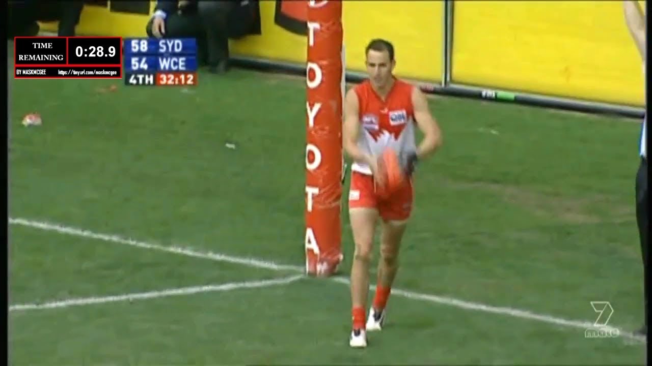
Not to mention the 5 minute warning
This will always remain as the best scorebug. It's short, simple and to the point.

If the background was black you wouldn't be able to see their logo clearlyWestern Suburbs Magpies (Wests Tigers reserves) have a white base with black text despite wearing their home jersey in The Knock On Effect Cup game on Fox League View attachment 1094368
Carlton 
| Fitzroy 
|
Hawthorn 
| North Melbourne 
|
Black version would be nice
Port's scorebug should be black with white numbers. Teal should just be the box surrounding the PA shield logo.
Teal (Aqua) text would work finePort's scorebug should be black with white numbers. Teal should just be the box surrounding the PA shield logo.
This ^I'd much prefer we had a black base especially when we wear a black jumper, numbers could be teal or white I honestly don't mind, I just don't like the implication that teal is our main colours, it's no more Port than silver.
This ^
I like the 7 scorebug but Ports needs to be black this was especially noticeable against The West Coast's royal blue last week.
Sent from my SM-A505YN using Tapatalk
He posts it... FROM THE PAINT, OH THAT'S CRAZY GOOD!Thanks for your thoughts Dwayne Russell, from wherever you may be logging in from around the planet.
HE BLASTS IT. OHHHH BABY!Thanks for your thoughts Dwayne Russell, from wherever you may be logging in from around the planet.
THIS POST COULD BE A FIRESTARTER!!He posts it... FROM THE PAINT, OH THAT'S CRAZY GOOD!
7 not matching Carlton colours tonight. Don’t know why they thought it would be white given the 2 colour don’t even clash !View attachment 1099046

7 not matching Carlton colours tonight. Don’t know why they thought it would be white given the 2 colour don’t even clash !View attachment 1099046
7 not matching Carlton colours tonight. Don’t know why they thought it would be white given the 2 colour don’t even clash !View attachment 1099046

very strange for a collingwood saturday night game to be a fox footy game i thoughtI saw this, made a sarcastic comment about it, then by the time I looked up it was back to Navy. They're semi on the ball at Ch7 I guess
View attachment 1099048

