Navigation
Install the app
How to install the app on iOS
Follow along with the video below to see how to install our site as a web app on your home screen.
Note: This feature may not be available in some browsers.
More options


You are using an out of date browser. It may not display this or other websites correctly.
You should upgrade or use an alternative browser.
You should upgrade or use an alternative browser.
Discussion TV Broadcast Graphics - Designs & Discussion
- Thread starter Red Crow
- Start date
- Tagged users None

Bwillow11
All Australian
- Sep 16, 2016
- 680
- 471
- AFL Club
- Collingwood

- Other Teams
- Melbourne Stars


Bwillow11
All Australian
- Sep 16, 2016
- 680
- 471
- AFL Club
- Collingwood
- Other Teams
- Melbourne Stars
The reason why I haven't used white is because I want the box with the overs in it to be a certain colour, as the white looks very bland.Nice, the only two I would change are england to blue and white and NZ to straight black and white, doesn't make sense to have only one team in three colours imo.
TheLoungeLizard
The world's most handsome man
It reminds me of Stick Cricket so much, but I love that game for reasons unknownNew Instalment!!!
BigAnton
Debutant
- Oct 22, 2015
- 141
- 187
- AFL Club
- Sydney
Do you still have this template lying around your PC?
Maybe because it's the best game EVER?It reminds me of Stick Cricket so much, but I love that game for reasons unknown
BigAnton
Debutant
- Oct 22, 2015
- 141
- 187
- AFL Club
- Sydney
Hi everyone!
I have an Instagram account (afl_city, 7.6k strong) and I've made all the following graphics on my account with Photoshop CS6. I'm looking for feedback on what I can improve in all my graphics, more in particular my Full Time graphic.
Thanks guys")
I have an Instagram account (afl_city, 7.6k strong) and I've made all the following graphics on my account with Photoshop CS6. I'm looking for feedback on what I can improve in all my graphics, more in particular my Full Time graphic.
Thanks guys
Attachments


Fizzler
BBTB
- Dec 26, 2013
- 12,765
- 16,359
- AFL Club
- Port Adelaide
- Other Teams
- OKC, Coburg, Werribee, Storm, QPR
Probably the only feedback I can give you is to use a light Bevel and Emboss on them and to change the picture for the Fixture to the inside of a ground (as focussed on the train tracks looks a bit odd.) Other than that, great work!Hi everyone!
I have an Instagram account (afl_city, 7.6k strong) and I've made all the following graphics on my account with Photoshop CS6. I'm looking for feedback on what I can improve in all my graphics, more in particular my Full Time graphic.
Thanks guys
fancyscum
Radical Crommunist
Has it won any awards?Hi everyone!
I have an Instagram account (afl_city, 7.6k strong) and I've made all the following graphics on my account with Photoshop CS6. I'm looking for feedback on what I can improve in all my graphics, more in particular my Full Time graphic.
Thanks guys
Seriously though, I like that you have put your own spin on the Channel 10 graphics (there are a few carbon copies out there) but there is still some refinement that I would make:
- The round number tab on the fixture and the ladder tab are different blues, is this done on purpose? would look better in the darker one imo.
- Also on these images, I find the sunset image to be a bit distracting, I would desaturate it. Not all the way down but just so it isn't hitting me as hard.
- The AFL city wordmark is fairly pixelated on the postgame image, either make a high-res version or even better, a vector.
- Also, I'd watch your type on the pregame image, the m on the 'stadium' is pushing the edge. just take it down a point or two.
lmach
Naitanui2Yeo
Here you go http://www.4shared.com/photo/il8PvM3Vba/fox-scorebug.htmlDo you still have this template lying around your PC?

More white in the scoreboard for ODIs


Bwillow11
All Australian
- Sep 16, 2016
- 680
- 471
- AFL Club
- Collingwood
- Other Teams
- Melbourne Stars

- Moderator
- #715
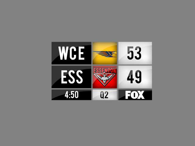
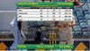
More white in the scoreboard for ODIsView attachment 316050
You really have to wonder why they're still worrying about the 4:3 safe zone in 2016. All other sports scorebugs got past that years ago.
Channel 9 are terrestrial and it's a high volume event, so more likely to have people in remote areas, elderly, etc. using 4:3 TVs, plus pubs and other public places like RSLs who may be using those TV's. Don't know why everyone is so up in arms about safe zones over the air. YouTube and stuff sure, bugger it use the whole screen, but when we're talking these big FTA draws, why not keep it safe?You really have to wonder why they're still worrying about the 4:3 safe zone in 2016. All other sports scorebugs got past that years ago.
I actually love the graphics but hate how low the "OVERS" line is. Only gripe with this package.More white in the scoreboard for ODIsView attachment 316050
- Thread starter
- #717
You really have to wonder why they're still worrying about the 4:3 safe zone in 2016. All other sports scorebugs got past that years ago.
Is it possibly because it gets shown in other countries where 16:9 isn't necessarily the widespread standard? I reckon I've seen non-Australian cricket from around the world shown on Fox which always just uses the host broadcasters graphics and is often 4:3 safe. Might be a mandate from the ICC?
- Moderator
- #719
Channel 9 are terrestrial and it's a high volume event, so more likely to have people in remote areas, elderly, etc. using 4:3 TVs, plus pubs and other public places like RSLs who may be using those TV's. Don't know why everyone is so up in arms about safe zones over the air. YouTube and stuff sure, bugger it use the whole screen, but when we're talking these big FTA draws, why not keep it safe?
I actually love the graphics but hate how low the "OVERS" line is. Only gripe with this package.
Agree to an extent, but it didn't stop Seven from switching to 16:9 scorebugs in their footy coverage in 2013. Plus analog TV is dead ergo 4:3 TVs are dead (unless you have a set-top box for an old CRT tele and they can display letterbox 16:9 anyway)
My TV is 16:9 but overestimates it's size ( ), so the safe zone thing is nice to have.
), so the safe zone thing is nice to have.Spanna_
The secret ingredient is crime
When you vote One Nation out.I don't like it.
With the new broadcasting rights for next season, will we see some updated scorebugs from Ch 7 and Fox Footy?
RedmanWasHere
Rarely in kitchens at parties.
- Aug 23, 2010
- 26,860
- 29,579
- AFL Club
- Essendon
- Other Teams
- Exers, Gryffindor, Rich+Ess AFLW, Tassie
With the new broadcasting rights for next season, will we see some updated scorebugs from Ch 7 and Fox Footy?
Channel 7's are badly needed.
Fox Footy's are 2 years old but definitely need a new bug.
Their font and graphics annoy me.
MKMatty
Busy Vibin’
I hope so in the case of 7, I'm rather a fan of Fox Footy's current package though. It's their ridiculous logo that needs work.With the new broadcasting rights for next season, will we see some updated scorebugs from Ch 7 and Fox Footy?
- Moderator
- #725
I hope so in the case of 7, I'm rather a fan of Fox Footy's current package though. It's their ridiculous logo that needs work.
Fox Footy's set prior to last was perfect. I hate the flags thing and the fact that they still haven't updated West Coast's tri-panel graphic is just annoying
Similar threads
- Replies
- 8
- Views
- 561
