Workshop Vexillology - A Place for Flags

Remove this Banner Ad

Oct 27, 2016
5,942
10,635
AFL Club
Collingwood
Other Teams
Packers, Raptors, Renegades
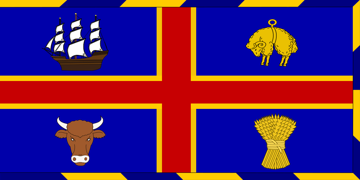
Vexillology

Thought this area of graphic design needed it's own space for designing and discussion. Feel free to post anything flag related into this thread, whether it be a design you have created for an existing, historical or even fictional country/entity. Could be news about a flag change, anything really

Flags are a huge passion of mine, and probably what got me into caring about footy jumpers in the first place. After all, what is a guernsey other than a banner that has been turned into a wearable cloth :p

download.jpg


Log in to remove this ad.

I can almost put every flag with its country, until I get to the Middle East ones and the ones that are just the Union Jack and the Coast of Arms on the flag. Don't just copy your neighbour, flippin' well be original.

Because of this, my twin sister showed me a flag quiz thing to do and I was acing it until these questions came up...
facepalm..PNG double facepalm.PNG
And at that point, I decided to never leave Sporcle.
 
I can almost put every flag with its country, until I get to the Middle East ones and the ones that are just the Union Jack and the Coast of Arms on the flag. Don't just copy your neighbour, flippin' well be original.

Same with me, but it is the African nations (mostly the central ones) that stuff me up.
 
I'll just share some of my favourite/least favourite flags and flag emblems:
Cyprus Emblem:
After working on my FIRA design, I've got to know a bit more about the country's symbolism. This coat of arms features a dove contained within a yellow copper shield, with wreaths surrounding it. The colours balance quite well together. The dove looks very good as well, so much so as I've featured it in my logo for Cyprus United. Honestly don't know why this isn't on their flag instead of the emblem of the island. 7/10.
cyprus-coat-of-arms.png

Byzantium Banner:
Probably my favourite flag from the Dark-Ages period. The colours compliment well, and the symmetry of the B-shaped firesteels really did set it apart from the messy flags of the time. It is fairly simple, but it does the trick. 8/10
51WEoxoK2PL._SX425_.jpg

Kazakhstan Flag:
Really love the colours, teal is fairly unique on flags. The way the eagle wraps from under the sun is really well done, probably should be a bit bigger on the flag. The pattern to the left, representing the culture and history of the Kazakh people looks somewhat out of place but does make it more recognisable when looking from afar. 6.5/10
255px-Flag_of_Kazakhstan.svg.png


South Africa's Old Emblem:
One of the most peculiar emblems I've seen on a flag. These three flags (UK, Orange Free State and Transvaal respectively) were featured in the centre of South Africa's old flag and were supposed to represent the country's British and Afrikaner heritage. The design of this is very odd, having a flag inside a flag is a huge nono, let alone 3. The execution of this, as well as the historical context behind it make me rank this low. 3/10.

za)1928.gif
 
Last edited:
Cyprus Emblem:
After working on my FIRA design, I've got to know a bit more about the country's symbolism. This coat of arms features a dove contained within a yellow copper shield, with wreaths surrounding it. The colours balance quite well together. The dove looks very good as well, so much so as I've featured it in my logo for Cyprus United. Honestly don't know why this isn't on their flag instead of the emblem of the island. 7/10.
cyprus-coat-of-arms-png.608966
A couple of interesting things about Cyprus' flag and colours. The first one being that the name is Greek for 'copper', so they've put the silhouette of the nation in a copper colour on the flag. The other is the fact that the designer purposely didn't use red or blue (national colours of Turkey and Greece) and settled on neutral colours to promote peace between the two ethnic groups.
Also... Apparently neither of the two ethnic groups like it, haha :D

One of my favourite flags would have to be South Africa's current one.
The red white and blue on the flag are ordered much like the Dutch flag, the green black and yellow could be considered the colours of the African National Congress, the political party Mandela was associated with. As well as this, the V turning into a Y shows the unity between the two sets of people post-Apartheid. It's done so well.
 
Yeah the African/Arab nations are the ones that take the longest to distinguish. This is attributed to the fact that they mostly utilise the pan-African colours (Red, green, black, yellow) and Pan-Arab colours (Black, Green, White, Red). With most flags following a tri-colour design this can make things real difficult. As long as you know what to look for in terms of emblems and other symbolism, they all start to make some sense.
 
Yeah the African/Arab nations are the ones that take the longest to distinguish. This is attributed to the fact that they mostly utilise the pan-African colours (Red, green, black, yellow) and Pan-Arab colours (Black, Green, White, Red). With most flags following a tri-colour design this can make things real difficult. As long as you know what to look for in terms of emblems and other symbolism, they all start to make some sense.
Exactly. With these:
Jordan has a red triangle the white star.
Palestine has Jordan's flag without the star.
Sudan has Palestine's with a green triangle.
UAE doesn't have a triangle on the left, but a rectangle.

With the other similar ones:
Bahrain has a red base.
Qatar has the maroon base.
 
Basic Flag Facts that everyone should know.

1. The only national that is not a rectangle or square is Nepal.
2. Denmark have the oldest national flag.
3. Red and white are the most common colours used on a flag.
4. The Paraguay and Saudi Arabian flags are different on the reserve side.
5. Libya's flag was one colour (green) until 2011.
6. Purple does not feature on any flag.
7. At the 1936 Olympics Games in Berlin, it was discovered that Haiti and Liechtenstein had the exact same flags.
 

(Log in to remove this ad.)

FLAGS FOR DUMMIES

Ireland is Green, White, Orange from Left to Right
Cote d'Ivorie (Ivory Coast) is Orange, White, Green from left to Right.

Netherlands, The and Luxembourg are the same Red, White and Blue from Top to Bottom but Luxembourg has Light Blue instead.

Monaco is a square with a Red top half and a white bottom half. Indonesia is the same but a rectangle. Singapore is the same as Indonesia but with a moon and stars in the top-left corner.

Chad has a slightly darker shade of Blue compared to Romania, while Moldova is the same but with their coat of arms.

Liechtenstein and Haiti still have the Red top half, Blue bottom half but Liechtenstein now has a crown in the top-left corner while Haiti has a white box in the middle with their coat of arms.

Senegal and Mali are the same Green, Yellow and Red from Left to Right but Senegal has a green star in the middle.

Venezuela is Yellow, Blue, Red from Top to Bottom with White stars in an arch in the Blue section. Ecuador is Yellow Top Half with Blue on top Red in the Bottom half with the Coat of arms in the middle. Columbia is the same as Ecuador but without the coat of arms.

Russia is plain White, Blue, Red. Slovakia and Slovenia are the same but with coat of arms on the left, Slovakia being red with a white cross while Slovenia is blue with white snow mountains and 3 yellow stars
 
Last edited:
Exactly. With these:
Jordan has a red triangle the white star.
Palestine has Jordan's flag without the star.
Sudan has Palestine's with a green triangle.
UAE doesn't have a triangle on the left, but a rectangle.

With the other similar ones:
Bahrain has a red base.
Qatar has the maroon base.
I forgot to mention them but pan-Slavic and former-Gran Colombian flags, while not as numerous, are still difficult to tell apart at first.
 
gonna guess that a lot of folks on here are subbed to the Vexillology subreddit, but if you aren't, you need to see this:

The California flag has got to be one of my favourites, there's just something awesome about the colours and the big * off bear in the middle! I got a beanie with it on while I was there last year, but my biggest problem is finding clothes to match with white, green, red and brown as well as the fact that it is awkward wearing my headphones with a beanie, seriously considering shelling out for a pair of airpods so that I can wear a beanie :tearsofjoy:
 
One thing that prompted me to create this list is that for just over 8 months now I've been collecting 5ft x 3ft flags. They aren't anything too high quality, just your regular polyester flags.

I've got about 8 of them now, with two more on the way hopefully by Australia Day. Got me hands on an Australian Red Ensign Flag, technically Australia's first flag. As well as the American 'Betsy Ross' Flag, the iconic revolutionary flag with the stars in a circle.
 
Speaking of American flags:

Melbourne's flag isn't too horrific. I'd say the way the St. George's Cross is done well for something which was ripped off England (who ripped it from Genoa). The emblems probably need a makeover, not the best job done there. Maybe use as little of the colour palette as possible, as stated in the video, the less colours the better. Other than that, for a flag you'd hardly ever see let alone wave, it's alright.
static1.squarespace.jpg
 
Many have probably come across these already but for those who haven't, these are the flags of the 15 counties of Liberia. I am not kidding.

Apart from the painfully obvious lack of designing skill, notice how even the Liberian flag, which features on each flag, is inconsistent with its placement and size. Truly disgusting.

we0tzbfywhtz.png

Maybe we should have a comp to give the Liberian flags a makeover.
 
Melbourne's flag isn't too horrific. I'd say the way the St. George's Cross is done well for something which was ripped off England (who ripped it from Genoa). The emblems probably need a makeover, not the best job done there. Maybe use as little of the colour palette as possible, as stated in the video, the less colours the better. Other than that, for a flag you'd hardly ever see let alone wave, it's alright.
View attachment 609146
To bad Melbourne City user this as inspiration.
 
Melbourne's flag isn't too horrific. I'd say the way the St. George's Cross is done well for something which was ripped off England (who ripped it from Genoa). The emblems probably need a makeover, not the best job done there. Maybe use as little of the colour palette as possible, as stated in the video, the less colours the better. Other than that, for a flag you'd hardly ever see let alone wave, it's alright.
View attachment 609146
Yeah, same with Adelaide. Same style, even same elements, but with a bit more PiZaZz. The outside bordering looks to be from the National Coat of Arms (which is on Adelaide's Coat of Arms too).
1200px-Flag_of_Adelaide.svg.png
Australian_Coat_of_Arms.png
Escudo_de_Adelaida.png
 
Taken way too long for this thread to be created!!

Came here to post the City of Adelaide flag. Actually had implemented it in my Location based guernsey for NAFLR (before I had to pull out), maybe 2019-20 will be the year for me.
 

Remove this Banner Ad

Back
Top