We need a rebrand

Remove this Banner Ad

summerthebat

Premiership Player
Apr 8, 2007
3,269
2,575
Teenage Mountain
AFL Club
Fremantle
No better time than now to get the members excited for next year, because not much else will.

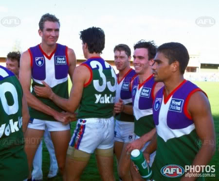
The chevron's are vapid, they've run their race. The colour scheme is dull, becoming more and more washed out and it stands for nothing. I'm almost at the point where I'd prefer a play on the original jumper, at least it was uniquely ours, someone thought about the design in a metaphorical sense.

On reflection, we've continually watered down the unique things we did, so we couldn't be made fun of. From the anchor in the rock, Johnny & Jenny Doc replacing Grinder, it's a miracle the song has survived despite it almost being turfed.

At the end of the day, we still get shat on, so the idea of become a meek, unseen outfit isn't doing it for me anymore.

Never forget someone decided to put a graphic of a stadium on our jumper, but purple, red and green is too ugly.
5DimDy6p.jpeg
 

Log in to remove this ad.

What mate?

Why would you change arguably the best design in the comp? Just coz to get the members' attention? Well those members can get out if that's what they need to rejoin.

The day we redid the logo and chevrons was the day this club became professional. Strong solid colours with a great simple logo .

The anchor has been done, its childish and the butt of jokes. No thanks
 
No better time than now to get the members excited for next year, because not much else will.

The chevron's are vapid, they've run their race. The colour scheme is dull, becoming more and more washed out and it stands for nothing. I'm almost at the point where I'd prefer a play on the original jumper, at least it was uniquely ours, someone thought about the design in a metaphorical sense.

On reflection, we've continually watered down the unique things we did, so we couldn't be made fun of. From the anchor in the rock, Johnny & Jenny Doc replacing Grinder, it's a miracle the song has survived despite it almost being turfed.

At the end of the day, we still get shat on, so the idea of become a meek, unseen outfit isn't doing it for me anymore.

Never forget someone decided to put a graphic of a stadium on our jumper, but purple, red and green is too ugly.
giphy.gif
 

(Log in to remove this ad.)

The chevrons are yawn city, come to terms with it, address it.

So are sashes, stripes, columns and hoops. I don't see many teams rushing to rebrand because they're 'bored'. Current design is good. I wouldn't be against the original away strip as some sort of heritage jumper though.

The Song on the other hand...
 
You guys should add green red and white back to the socks, gives you a nautical feel, without looking like Christmas colours or clowns
Like 90 percent purple with white green red trim
 
Jumper is fine.

Dump the song. As much as I want to Freo to win, I cringe every time they have to sing the song.

The rubbish options they came up with years ago was terrible. No surprise Eski mojo hasn’t had a decent song since you could tell they were out of ideas.
 
Look at the dainty Freo boys coming in their all white & purple chevron away kit.

K.I.S.S.

Seems and odd thing to call "dainty". Also seems a very peculiar choice of insult in 2018.

Jumper is fine.

Dump the song. As much as I want to Freo to win, I cringe every time they have to sing the song.

The rubbish options they came up with years ago was terrible. No surprise Eski mojo hasn’t had a decent song since you could tell they were out of ideas.

The eskimo joe version wasn't bad. I feel like we voted for the 3rd of 2 options with the redo of the original: It dumped the best parts and brought the more cringeworthy elements sharply into focus
 
Like most here, I'm a big fan of our current jumper. The design is simple and will age very well. The club logo is great too.

The club should revisit the changing of the club song in the near future though, it's always been a little too bland.
 
I didn't even know that character from the 90s (The beanie one with the bird on his shoulder and who had those dolls made) was called Grinder.
 

Remove this Banner Ad

Back
Top