TheLoungeLizard
The world's most handsome man
- Thread starter
- #26
IMHO 2005 beats 2018
Follow along with the video below to see how to install our site as a web app on your home screen.
Note: This feature may not be available in some browsers.
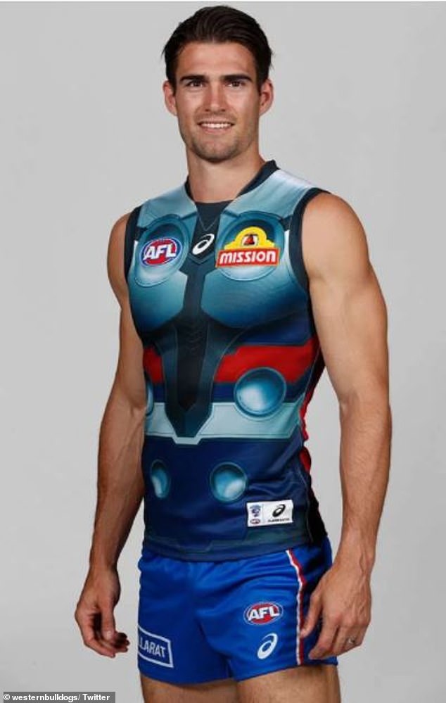
LIVE: St Kilda v Western Bulldogs - 7:30PM Thu
Squiggle tips Saints at 51% chance -- What's your tip? -- Team line-ups »
IMHO 2005 beats 2018


has to be post 2000
Y’all didn't read the OP?1978 to mid 1990's. Still wore proper jumpers with CFC monogram added. Changed around late 90's i think
Read title and ignored OP own little weird idea that not fit with title of thread.Y’all didn't read the OP?
Reading is for nerdsY’all didn't read the OP?
Read title and ignored OP own little weird idea that not fit with title of thread.
DoneTheLoungeLizard Change the thread title to ‘What’s The Best Your Clubs Jumper Has Looked Since 2000’
I would never have even looked, if it was called that at the time.TheLoungeLizard Change the thread title to ‘What’s The Best Your Clubs Jumper Has Looked Since 2000’
Looks more dark purple'01 for mine - classic V neck design, good sponsor integration and a much better/deeper shade of maroon... also start of the 3-peat
View attachment 1297620

View attachment 1304350
Should be our away guernsey set up from now on except against Geelong and North Melbourne for obvious reasons
That was always my least favourite Port strip among the originals. I personally thought the Ansett Cup one, with the lightning bolt down the middle, was the best actual footy jumper. Until the chevron came along anyway. My Port pick would be early chevron with the full black back. I know the number panel is supposed to be a pear thing but all black with white numbers just looked so much more badass.In the AFL this is the best we've looked. Peak Nike, peak design, red vodafone logo looks great. I like this get up more than the bars tbh but we have bigger fish to fry and sort the bars out first before wearing anything else as a throwback kit.
View attachment 1300089
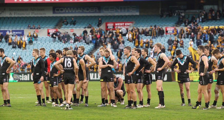
The 1 teal bolt complimented the 2 white bolts with Port's first away uniform, and really stands out more than the chevron designs. Also, too much teal just doesn't look good.That was always my least favourite Port strip among the originals. I personally thought the Ansett Cup one, with the lightning bolt down the middle, was the best actual footy jumper. Until the chevron came along anyway. My Port pick would be early chevron with the full black back. I know the number panel is supposed to be a pear thing but all black with white numbers just looked so much more badass.
This would be my Port pick. All black, slick as. Back sponsor matches the colour scheme. Perfect.

The only reason I had it as post 2000 too folks was so we all didn't chose a basic home kit from the 70s
I wanted to know the best it's looked since templates and sponsors became a thing ' make it more interesting