Which club has the worst guernsey?

Which club's guernsey is the worst?


  • Total voters
    1,603

Remove this Banner Ad

This poll does not lie.
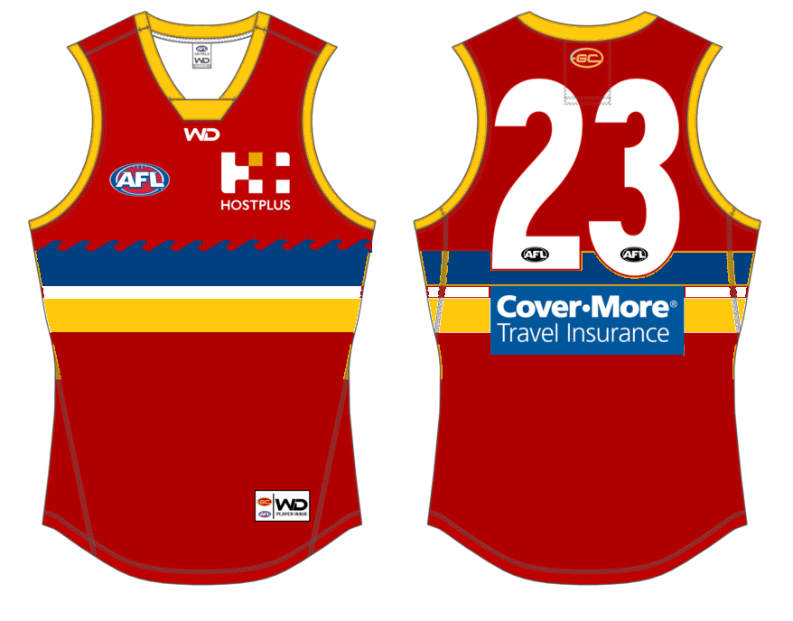
Gold Coast is simply the worst jersey, probably in all of Australian sports with Hawthorn's ugly brown and gold the only other jersey in serious contention.
Surprised to see Port with 18 votes ... while I have a bias for Richmond's jersey, I think Port is right up there as the best.
Mind you, the Tigers' clash jersey is a disgrace ... and to think we won a grand final in it!
Richmond's clash guernsey is the biz. Yellow and black with a sash, what's not to love?
 

Log in to remove this ad.

Surprised to see Port with 18 votes ... while I have a bias for Richmond's jersey, I think Port is right up there as the best.
Mind you, the Tigers' clash jersey is a disgrace ... and to think we won a grand final in it![/QUOTE]

I agree with that - that Canary yellow - doesnt represent anything about the RFC

KB hated it - but you were ordered to wear a clash jumper

What i would have liked to see happen - when you won the premiership - the players quickly change into their traditional jumper ( which has got 100 years of history - and is Richmond ) and then receive their medals

Not that fat pale yellow shiit which represents nothing
 
With no bias towards team performance, i think the voting system is on track with this one:
  • Gold Coast - Understandably it was probably made to appeal to a growing Asian audience but it's an optical migraine at best
  • Adelaide - A chaotic mess of colours sends my OCD and anxiety into overdrive
  • Hawthorn - Brown doesn't really need any commentary and speaks for itself... but then to pair it with Gold... where's the vomit emoji?
Worth a mention: There aren't many sporting teams that go with horizontal stripes and for good reason. The Geelong players have always been made to look fatter than what they truly are.
Says more about you than the Crows.
You do realise that the reason for the choice is that they are the State colours?
 
GC design is basic boring crap. Worst by a mile.
Purple is a joke, but Freo's new strip looks good, they should stick with it. The anchor look was lame.
Hawks is a traditional strip, dont mind it that much tbh.
Ive always liked Carltons jumper, just hate carlton.
 
Gold Coast, easily. Western Bulldogs have the best. Simple and effective.

Hawthorn's colours are ugly, but if you see vertical gold and brown stripes you immediately associate it with them. It serves the function of what a uniform is supposed to do and gives them an identity.

Gold Coast's jumper just looks like a training top that you give to half the team so you don't need to play skins in 38 degree heat during pre season. It's simple which is a good start but there's nothing striking about it. Bit of gold down the side, gold numbers, GC on the front. Similar works for Carlton but Gold Coast don't have 100+ years of history to draw on. I don't love the GWS design but the colours are unique and the big G is noticeable. Gold Coast need an identity and they don't really make good use of the gold or 'Gold Coast' or 'Suns' in the design.

I'd actually like to see them do something like the Atlanta Hawks:

Atlanta-Hawks-New-Uniforms.jpg


Home: Red with GCS and a small front number
Away: White with Gold Coast and a small front number
Third: Black with Suns and a small front number

Something like that.
 
Hawthorn have disgusting colours but for a Geelong v Hawthorn game somehow it all comes together.
Gold Coast’s colours look weak.
Yes we both know how to entertain the masses when we come together. Kept footy interesting for a long time now while most teams just fap about. I love our guernsey it blends beautifully with premiership cups which it what it is all about after all. That cannot be argued.

Not to brag but the combination brown/gold and silver of the cup is lust-have fashion.

1550032260206.png
1550032293816.png
1550032336638.png
 

(Log in to remove this ad.)

It's HAWTHORN, it's always Hawthorn! These new teams might join up and appall us with their fashion disasters like GWS and The Suns, Freo tried hard to challenge guernsey awfulness with their sbysmal colour change, but nobody is a match to the epitome of bad colour schemes the Hawthorn Football Club...
 
Gold Coast/Hawthorn/GWS being the worst 3 in that order is no shock because that's my order too, but I'm surprised at the dislike for the SA teams' Guernseys. Adelaide's is iconic (and the Geelong v. Crows matchup is one of my favourite guernsey matchups in the AFL), whilst Port's is a clean design.
 
Won us a few handy frees though :p
I guess there’s only so many times you can look at premiership stuff and not come around to the jumper, and I’ve gone past that number.

I'm sure had we been beaten that day (thankfully not), there would be no love for it.
I actually wore that jumper as a player back in the day and I can tell you we were not the envy of anyone!
 
Hawthorn have the worst colours but the worst guernsey is GC. It’s terrible. Their colours have no strong contrast, and the design isn’t even really a design... just a logo on a jumper.

This was my attempt

Wakai sorry to bastardise your jumper, as you can tell I have no clue when it comes to this stuff but just had an idea.

Went with a slight twist, the beach theme

1GFNxgO4_o.png
 
Last edited:
Back
Top