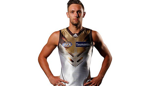
Which club has the worst guernsey?

Which club's guernsey is the worst?


  • Total voters
    1,603

Remove this Banner Ad

Five horse race.
Crows, Dockers, Hawks, Gold Coast and Port Power. I actually do not mind the McDonald's look of Gold Coast as much as others.
Surprised licorice allsorts Crows jumper not a clear leader. Guess many more partial to lollies than potato fries.
 
I tend to cut the Gold Coast and GWS a bit of slack, as teams are allowed to take a bit of time to settle on a decent jumper. Which is why I picked the Crows, they have no excuse after all this time, i mean, WC even started with a decent one but took a twenty odd year sojourn through some ordinary designs just so we couldn't be accused of being lazy and boring.
 

Log in to remove this ad.

People: "Hawthorn have the worst colours and the ugliest guernsey"

Hawthorn: "O RLY?"

Cj2T37jWsAA3p1r.jpg


People:

giphy.gif
 
All of Melbourne's home jumpers have been excellent.

All of Melbourne's away jumpers with the exception of the royal blue one have been vomitous.

Very true - need a separate poll for away jumpers I think.
 

(Log in to remove this ad.)

As long as the guernsey has either a traditional sash, plain stripes, chevrons, or a monogram, then it will look fine. After that it's just a personal taste of colour combinations. Port Melbourne's guernsey that they wear in the VFL looks great.
 
I really like the traditional Adelaide Crows guernsey, it looks neat and smart. But then again, I also like the Romanian flag.
 
Back
Top