Navigation
Install the app
How to install the app on iOS
Follow along with the video below to see how to install our site as a web app on your home screen.
Note: This feature may not be available in some browsers.
More options


You are using an out of date browser. It may not display this or other websites correctly.
You should upgrade or use an alternative browser.
You should upgrade or use an alternative browser.
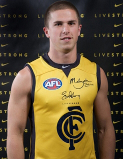
Which guernsey - new 2017 clash Guernsey post #152
- Thread starter My name geoff
- Start date
- Tagged users None
Lookin like Claremont out here
- Sep 28, 2014
- 650
- 1,747
- AFL Club
- Carlton
Well why not have the song redone too ffs. Sacrilege!!!So we revert back to an uglier monogram just because we happened to be wearing it when we were successful?
This is what I mean by nostalgizers.
Also we just won a spoon with our new old logo. Maybe we should re-design again?
Retro logo is 2016 logoWait. I'm confused.
I like the OLD logo (the 'pointy' one)
Do I vote for 2015 or 2016? The captions on the pics are confusing
Curved logo is 2015 logo
Grew up with the 'curved logo', and that's the one I prefer. Remember drawing the logo in the margins in primary school. Had a couple of Carlton fans as teachers that encouraged it too.
It still looks classy as *, and I appreciate the history we have with what we've got now, but personal preference is still the former. Probably a demographic thing, though given that we only used that logo for less then a generation it'd be hard to see us reverting back to it.
It still looks classy as *, and I appreciate the history we have with what we've got now, but personal preference is still the former. Probably a demographic thing, though given that we only used that logo for less then a generation it'd be hard to see us reverting back to it.
I grew up with the curved monogram as well, but I prefer the bold one we have now.
The only infuriating thing for me is the lack of continuity between the guernsey and the logo..
The only infuriating thing for me is the lack of continuity between the guernsey and the logo..
GCNavyBlue
Cancelled
- Jan 23, 2010
- 781
- 1,271
- AFL Club
- Carlton
You youngins are good wit technology, download some games onto ur vhs player or something?! N good for u being a bagger thru our shittest timesI was 2 at the time so no, I do not remember the "glory days".
- Dec 8, 2007
- 4,282
- 7,874
- AFL Club
- Carlton
- Other Teams
- Chicago Bulls
Just because something appears "modern" doesn't mean its the better option.
Modern art is rubbish, people used to paint images and landscapes and immerse works designed to stir real emotion and make you think. One article in the Age last week had some dude in a man bun, dressing up a mannequin to look like a dead child with a print out of Bill Shortens head next to it.
That last rant describes how I feel about the monogram we just got rid of.
wackle69
Senior List
- Nov 2, 2013
- 216
- 385
and move the training base to Windy Hill.Well why not have the song redone too ffs. Sacrilege!!!
Sent from my iPhone using Tapatalk
Space Cadet
All Australian
- Feb 24, 2015
- 855
- 2,346
- AFL Club
- Carlton
Too young for any real memories in the old monogram, but I do associate it with all the footage I've seen of us winning flags, being dominant etc.
The modern one just felt like a smoother, cleaner version that had less character imo. Like someone took the old one and clicked a few buttons on photoshop that round out the edges to make it look nicer (which I don't like).
Though I also liked this monogram so maybe ignore my opinion.

The modern one just felt like a smoother, cleaner version that had less character imo. Like someone took the old one and clicked a few buttons on photoshop that round out the edges to make it look nicer (which I don't like).
Though I also liked this monogram so maybe ignore my opinion.

Why are you taking it so personally? Did you design the curved one?Yep the 3 teams we beat last year were quivering in their boots at the sight of the mighty CFC monogram.
The current jumper is widely accepted as aesthetically and figuratively better than the comic sans curved one.
The curved one looks better only when placed in the wreath.
Why are you taking it so personally? Did you design the curved one?
Because we had the best jumper in the league and chucked it for no reason.
The new generation could have taken the jumper and righted the wrongs of the past and brought some pride to the jumper but instead we just changed it as a cheap stunt to sell more jumpers.
The current jumper is widely accepted as aesthetically and figuratively better than the comic sans curved one.
The curved one looks better only when placed in the wreath.
I will accept that the symbolism behind the old logo is more powerful due to the club's history but there is not a chance that it is 'widely accepted' that the old logo is aesthetically better. Would love a poll of people with no connection to the AFL and just judging the logo's on a purely aesthetic basis.
If anything we should have kept this one. It is what the old/current one was always meant to be before technology allowed for it to grace the guernsey.
My issue is with the redesigned 'curved' version of this. Happy for it to be in the wreath but on the jumper it looks weak.
Still think we did the right thing reverting to a clean/uniform version of the heritage monogram.

I think it's perfect.
My issue is with the redesigned 'curved' version of this. Happy for it to be in the wreath but on the jumper it looks weak.
Still think we did the right thing reverting to a clean/uniform version of the heritage monogram.

I think it's perfect.
Why are we even going back to this discussion? Has something changed.
I like the current logo and not because of any silly tradition.
I like it because it's angry, tough, determined......................but it has to be raised and not just flat printed.
The other one is flaccid, insipid....................and nice. Yuck!!
Still think the current logo can be improved though. I have the designs.
Post them then.
My name geoff
Premiership Player
- Jul 2, 2015
- 4,523
- 6,097
- AFL Club
- Carlton
- Thread starter
- #70
This is why we are going back to this discussion, because the current guernsey is not perfect yet!Why are we even going back to this discussion? Has something changed.
I like the current logo and not because of any silly tradition.
I like it because it's angry, tough, determined......................but it has to be raised and not just flat printed.
The other one is flaccid, insipid....................and nice. Yuck!!
Still think the current logo can be improved though. I have the designs.
I think the current monogram is a bit too big or something?
If anything we should have kept this one. It is what the old/current one was always meant to be before technology allowed for it to grace the guernsey.
.
Yep agree, this monogram was great
Masqualero
Club Legend
- Jul 2, 2015
- 1,658
- 2,231
- AFL Club
- Carlton
VHS... vaguely remember having to rewind the tape every time I borrowed one from the video rental store.You youngins are good wit technology, download some games onto ur vhs player or something?! N good for u being a bagger thru our shittest times
Port Adelaide still haven't recovered, apparently!Yep the 4 teams we beat last year were quivering in their boots at the sight of the mighty CFC monogram.
This is the finest guernsey I've ever seen. Nostalgia aside, I've no idea why people adore the current ugly blob monogram so much.If anything we should have kept this one. It is what the old/current one was always meant to be before technology allowed for it to grace the guernsey.
Similar threads
- Replies
- 87
- Views
- 6K
- Replies
- 0
- Views
- 420
- Replies
- 89
- Views
- 4K
- Replies
- 228
- Views
- 12K
