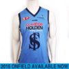
Which guernsey - new 2017 clash Guernsey post #152

Which guernsey do you prefer?

  • 2015

    Votes: 13 16.5%
  • 2016

    Votes: 66 83.5%

  • Total voters
    79

Remove this Banner Ad

i don't understand this overprotectiveness of the guernseys tbh, it's not as if the clash jumpers are unrecognizable as Carlton jumpers. soccer teams have 3 kits, NBA teams seem to have 3 or 4 during a season. I don't see why the jumper is so sacred that we s**t our pants when we need a white version of it.
Spot on. You don't.
 
We haven't had a good clash jumper and I can't understand why we haven't used a warm natural tone rather than a stark white.

It makes for a huge difference and just adds depth to the overall look. Omo white is just, too..........white. :)
To be honest, the baby blue one wasn't far away. Had we taken a different approach and worn white shorts - instead of the baby blue - it wouldn't have been quite so jarring.

But you're right, the white is just lazy. And boring. Why not use a bit of orange/yellow a la our old uniform.
 

Log in to remove this ad.

View attachment 325825

Not the best example of the natural I'm thinking about as this one is a little too red.
A bluer natural would be more fitting.

.....and keep it simple unless you're going to do something revolutionary.
By simple I mean; no navy bands...no navy trims....just Navy CFC & Natural body.
not sure what that thing is meant to represent but it best go back on the sheep
 
Here's some old designs I've created in the past as clash designs (ignore the 150 years text on some of them). Would the 'Traditionals' be happy with something like these? Imagine the current monogram on them...

As much navy as practical, yet employing the old guernsey design:
Carlton clash MM.png
Two takes on the old Carlton design when we first joined the VFL:
Carlton 2014 Chamois2.png Carlton 2014 Chamois.png
Here's that yoke design I described earlier on a previous page:
Carlton clash yoke.png
Sturt's useless 'V' clash design which was useless and unneeded, yet pretty nifty:
Carlton away V.png
And a classic take on Blackburn Rovers' kit, but for Carlton:
Carlton clash Blackburn.png
 
pls no to the Rovers' kit. My eyes. The goggles, they do nothing.
Combining our best and (subjectively) worst clash jumpers! :D

They all just go away from the regular 'inverse' design we are currently using. I see no problem with it, but a bit of change is good every now and then!
 
Here's some old designs I've created in the past as clash designs (ignore the 150 years text on some of them). Would the 'Traditionals' be happy with something like these? Imagine the current monogram on them...

As much navy as practical, yet employing the old guernsey design:
View attachment 325929
Two takes on the old Carlton design when we first joined the VFL:
View attachment 325931 View attachment 325932
Here's that yoke design I described earlier on a previous page:
View attachment 325933
Sturt's useless 'V' clash design which was useless and unneeded, yet pretty nifty:
View attachment 325935
And a classic take on Blackburn Rovers' kit, but for Carlton:
View attachment 325936
I like this one the most out of the ones you posted. I would buy that guernsey.
cfc clash.png
I really like the combo of the navy and grey.
All bias and poor MS Paint skills aside, I'm actually starting to dig the little mock up I did the other day. If we could get away with keeping the front as classic as possible, with just some small intrusions of grey on the side and the shoulders.
If it was to stay as basic and close to the original as possible, I'd go with something like mine, but if it had to be more detailed and intricate, then I'd go with yours.
cfc jumper grey.JPG

You also look like you spent more than the 5 mins that I spent.... and possibly have much more skill :p
 

(Log in to remove this ad.)

I like this one the most out of the ones you posted. I would buy that guernsey.
View attachment 326089
I really like the combo of the navy and grey.
All bias and poor MS Paint skills aside, I'm actually starting to dig the little mock up I did the other day. If we could get away with keeping the front as classic as possible, with just some small intrusions of grey on the side and the shoulders.
If it was to stay as basic and close to the original as possible, I'd go with something like mine, but if it had to be more detailed and intricate, then I'd go with yours.
View attachment 326095
Thanks mate! Yeah, all the credit to the Double Blues for that design, an absolute cracker!

Personally I'm not too sure of the grey back. I can try mock up on an actual person how that would look if you'd like, but I don't think the AFL want a full navy front and a full grey back.. West Coast's old home jumper had that issue.
If anything, make the WHOLE jumper grey and have navy detailing, maybe with white shorts? :)
You also look like you spent more than the 5 mins that I spent.... and possibly have much more skill :p
Nothing more than experience, my friend :D
 
Back
Top