can't beat this...


Follow along with the video below to see how to install our site as a web app on your home screen.
Note: This feature may not be available in some browsers.
I would cringe every time I seen it if that was our logo. It kind of reminds me of that outlined Hawks logo from a couple of years back.
I don't mind the Wests Tigers logo design, I think something like theirs would suit Richmond a bit more than an outlined tiger.
I do remember seeing it on here, I have not seen it anywhere else though which leads me to think it has not been released yet. It wasn't bad, not fierce enough thoughRichmond have a new logo, it was found online a few months back and Richmond asked to have it taken down from memory.

I quite like the Saint's logo. The "older" teams are generally the best, although I'm not unhappy at all with Port's.
But why oh why did Melbourne change something like this:
to something as cringeworthy and overdone like this:
Damn, dudes, who said anything about racism? The cronulla comment was a joke.
I just think it's totally pointless on an emblem for a football club that plays in a league composed entirely of other Australian teams. Why not whack one on every single club logo?
It's just a bit 'I'm going to wear an Australian flag to the big day out'. A bit bogan. A bit collingwood, I guess.
I quite like the Saint's logo. The "older" teams are generally the best, although I'm not unhappy at all with Port's.
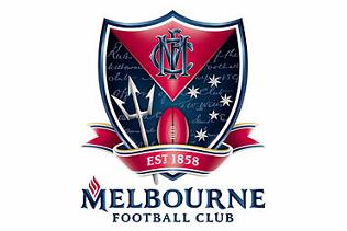
But why oh why did Melbourne change something like this:
to something as cringeworthy and overdone like this: