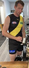
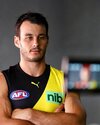
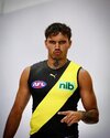
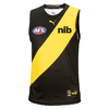
Roast why did the RFC allow the green nib logo to desecrate our sacred yellow sash

Remove this Banner Ad

Tiger_Gas

The king of CUB
Feb 6, 2022
526
1,863
safeway car park
AFL Club
Richmond
as a long time member of this wonderful football club I will not stay silent on this! this is ridiculous !

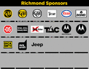
it actually looks worse than I imagined.. good luck to the club for getting an extra couple of bucks out of nib but they aint selling any of these guernseys so maybe they should have taken less from a black sponsor so that we don't loose sales due to the hideous green nib logo that now desecrates our sacred yellow sash


6E9DE801-5973-47C5-B525-155A4FFBBE19.jpeg 26A8911C-4DFE-44BA-BE8E-296F4563518C.jpeg D42792E3-413C-42DD-8C24-4066B2A40BD2.jpeg A7943D86-B1DB-4B57-9A4C-407A0EA6B4D9.jpeg 54B8EF4A-79C0-4D9A-A4E6-76140CDFD4CE.jpeg E157598E-5378-4EA6-9791-EB2E2A0F0E66.jpeg
 

Log in to remove this ad.

  • Thread starter
  • Banned
  • #5
Should have looked like this —

View attachment 1325997
and there should be clear rules set by the club re what goes on the front of the sacred yellow sash .... no wild colours allowed

how is it that we have had a black sponsor on the front of the sash for 26 years + without issue and now suddenly we have this green abomination !
 
I'm not horrified by it, though would prefer it not be there.

I'm more incensed by the big blue LATITUDE across the back, that looks horrible.
That one doesn't bother as much because it's so obvious it's just a sponsor logo stuck on. I'm really struggling with the nib one because the light green background is close enough to our yellow to make it look like a printing error rather than intentional.
 

(Log in to remove this ad.)

Its an adjustment from the front, but it isnt as cheap or as bad looking as AMART with the druggles (for example). Plus the grren is in a similar hue to our vibrant yellow. Its very 2020s, and the club would be wrapped with that.

For mine the vivid blue on the back is more striking.
 
Its an adjustment from the front, but it isnt as cheap or as bad looking as AMART with the druggles. Plus its in a similar hue to our vibrant yellow.

For mine the vivid blue on the back is more striking.
reckon its much worse than druggies amart and at least they have the fujitsu away option for people to buy. havent seen one of their fans wearing the a mart one
 
as a long time member of this wonderful football club I will not stay silent on this! this is ridiculous !

it actually looks worse than I imagined.. good luck to the club for getting an extra couple of bucks out of nib but they aint selling any of these guernseys so maybe they should have taken less from a black sponsor so that we don't loose sales due to the hideous green nib logo that now desecrates our sacred yellow sash

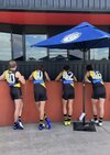
View attachment 1325971View attachment 1325972View attachment 1325973View attachment 1325974View attachment 1325975View attachment 1325976
We talked about this months ago fella, where you been, locked in a dungeon?
 
Gee, it ain't as bad as a lot of you are bitching about. They paid us a decent wedge to get their logo on the jumper. Sure if it were black it would look great but they have their rules as I am sure we have had ours. At least the yellow is a real yellow and not the sh*t from 2011 to 2016
yellow was only bad in 15/16 when they used shitty faded material. before that it was the yellow that we have worn for most of our history. we even had a specific pantone
 

Remove this Banner Ad

Back
Top