Certified Legendary Thread #ReturnTheWings, Part 2: Job Done!

Remove this Banner Ad

Status
Not open for further replies.
The thing that struck me with AFLX, other than how nice the new jumpers looked, was how well the new logo worked in the media. I.e. the eagle head and font was clearly visible in the vs mock-ups they used on the AFL website. The old logo was miniaturized to fit in
Agree, especially when we played Adelaide. The eagle looked strong and bold even when small, and even more so compared to Adelaide's dated looking crow.
 
The thing that struck me with AFLX, other than how nice the new jumpers looked, was how well the new logo worked in the media. I.e. the eagle head and font was clearly visible in the vs mock-ups they used on the AFL website. The old logo was miniaturized to fit in
That's what makes the logo so much better. The previous one looked so embarrassing on new media. The iOS app tile for example looks sick. It's just a far better bit of design.

Literally the only issue with it is that it shares some resemblance with the Hawks and Crows logos (understandable given the animals they represent).
 

Log in to remove this ad.

Agree, especially when we played Adelaide. The eagle looked strong and bold even when small, and even more so compared to Adelaide's dated looking crow.

Saying that though, the crows rebranding was one of the weakest and most disappointing logos of all them. Their swooping crow with the colours out of the tail was epic.
 
I watched the AFLX games again last night, is it just me or are the ISC guernseys really long?

our club has been slack this season regarding the player profiles. Usually they have sorted out very early in Jan but with less than a week to go till our first jlt game, we are yet to update them. Would have thought they would be on to this considering the sponsor change, logo and jumper changes.

The media team have been trash post Christmas. They were doing well up until the Christmas break but since returning they’ve been terrible except for the live AFLX training videos. They didn’t even finish off the 2017 player highlight videos, they got about 10 players in and stopped :rolleyes:
 
I watched the AFLX games again last night, is it just me or are the ISC guernseys really long?

I know for other teams in the past ISC offered players the choice of "plus length" on their jumpers. Means they can go one tighter but not have it ride up, could be the case here.
 
Still have the Tri panel on the fox footy scorecard.... 3 years after we ditched it

Fox Sports refreshed their package only a few days ago. Fox Footy is still using the old graphics for JLT. Once AFL 360 starts for the year the new graphics will be used. Tri panel will be gone by then. Graphics will be similar to Super-Rugby where it go back to Team logos and colour coded score graphics. The previews of upcoming games and programs actually show the new graphics.
 

(Log in to remove this ad.)

Fox Sports refreshed their package only a few days ago. Fox Footy is still using the old graphics for JLT. Once AFL 360 starts for the year the new graphics will be used. Tri panel will be gone by then. Graphics will be similar to Super-Rugby where it go back to Team logos and colour coded score graphics. The previews of upcoming games and programs actually show the new graphics.

Cheers for the update Robbo.
 
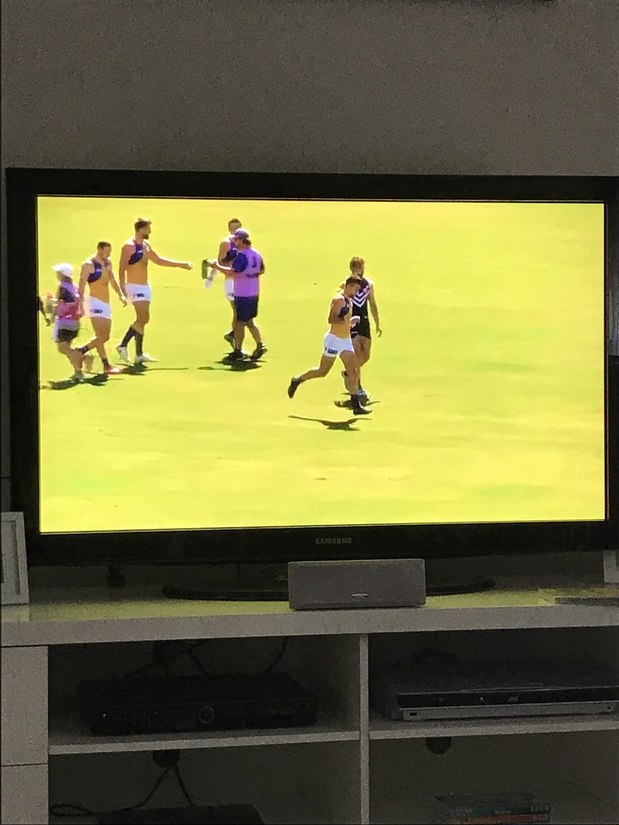
After having a look at the live stream of the scratch match derby, and only having the wide camera angle, it’s clear that the new logo and yellow guernsey is a massive fail. From a distance, you can only see the blue wings contrast with the yellow, the head is completely lost. The wings guernsey is always meant to have the third bit of contrast in the centre where the head goes.

If your new logo doesn’t work as in inverse, design a different logo that does.

Sick of the muppets running these things. No attention to detail.
Can't see why they can't just make the logo blue on the yellow peril.
 
DXaNgBwU8AAhvxO.jpg
 
Hmmmm that really sucks. Just make the eagle head solid blue.

It feels like a lot of these design decisions are made on a screen without any consideration to how it will be applied IRL
 
Status
Not open for further replies.

Remove this Banner Ad

Back
Top