Certified Legendary Thread #ReturnTheWings, Part 2: Job Done!

Remove this Banner Ad

Status
Not open for further replies.
Nah we’ll get it. I’ll wait until I see something on the eagles team store site before I believe it.

Also seems strange to use the burger on all other merch except the jumpers?? If they’re worried about not being able to see it, why use it on official merch likes the polos and training gear which will be viewed on TV also?

I’d be extremely surprised if the HJs burger logo wasn’t on the front of the jumper.


On iPhone using BigFooty.com mobile app
 
Maybe they’re in the process of changing their logo so this is just a placeholder

Heard they’re removing Olde English cheese from their burgers too. campaigners
 
Maybe they’re in the process of changing their logo so this is just a placeholder

Heard they’re removing Olde English cheese from their burgers too. campaigners

I doubt it, because the 2019 gear has all been produced with the burger logo.

Honestly I think it’s just a 5 minute job from ISC where they’ve chucked a wordmark over the existing SGIO logo because they couldn’t be arsed making a new mock-up. That would explain the lack of gold premiers logo as well.


On iPhone using BigFooty.com mobile app
 

Log in to remove this ad.

I doubt it, because the 2019 gear has all been produced with the burger logo.

Honestly I think it’s just a 5 minute job from ISC where they’ve chucked a wordmark over the existing SGIO logo because they couldn’t be arsed making a new mock-up. That would explain the lack of gold premiers logo as well.


On iPhone using BigFooty.com mobile app

Prepare to be extremely surprised.
 
I doubt it, because the 2019 gear has all been produced with the burger logo.

Honestly I think it’s just a 5 minute job from ISC where they’ve chucked a wordmark over the existing SGIO logo because they couldn’t be arsed making a new mock-up. That would explain the lack of gold premiers logo as well.


On iPhone using BigFooty.com mobile app

Most of the guernseys ISC produce look like a 5 minute job... this being true and nobody even realising there should be a gold logo on it would not surprise me in the least!
 
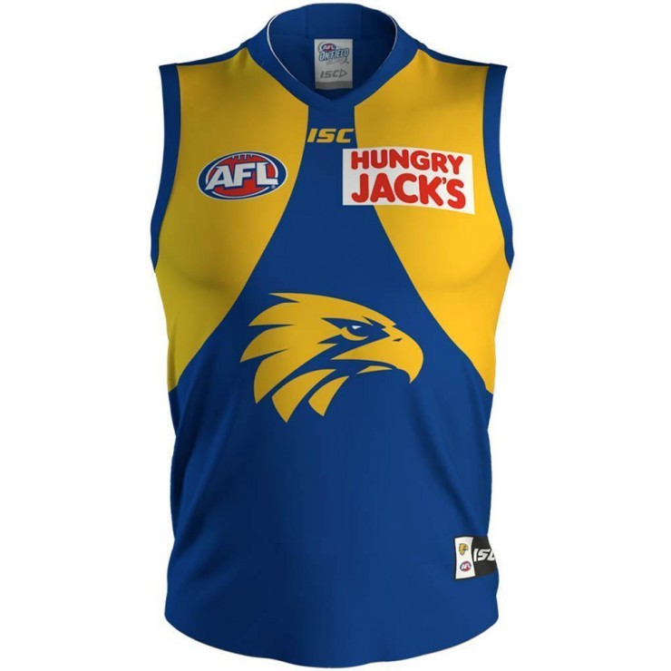
who’s got the skills to overlay an ISC image of our 2018 home guernsey, with this HJs mock up one?? I’d guess that the white box covers the old SGIO exactly, whereas the burger logo wouldn’t. This is why I’m still holding out hope that it’ll be the burger and not the text box
 
who’s got the skills to overlay an ISC image of our 2018 home guernsey, with this HJs mock up one?? I’d guess that the white box covers the old SGIO exactly, whereas the burger logo wouldn’t. This is why I’m still holding out hope that it’ll be the burger and not the text box

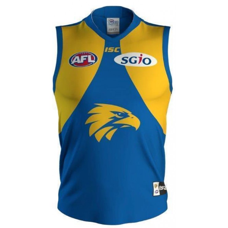
It's new artwork. The AFL logo is in a different position, and the top of the SGIO oval would protrude above the overlaid HJ box. Get a ruler and line it up with the top of the SGIO logo and see how much space there is to the bottom of the ISC logo.

Also the eagle head is bigger on 2019.

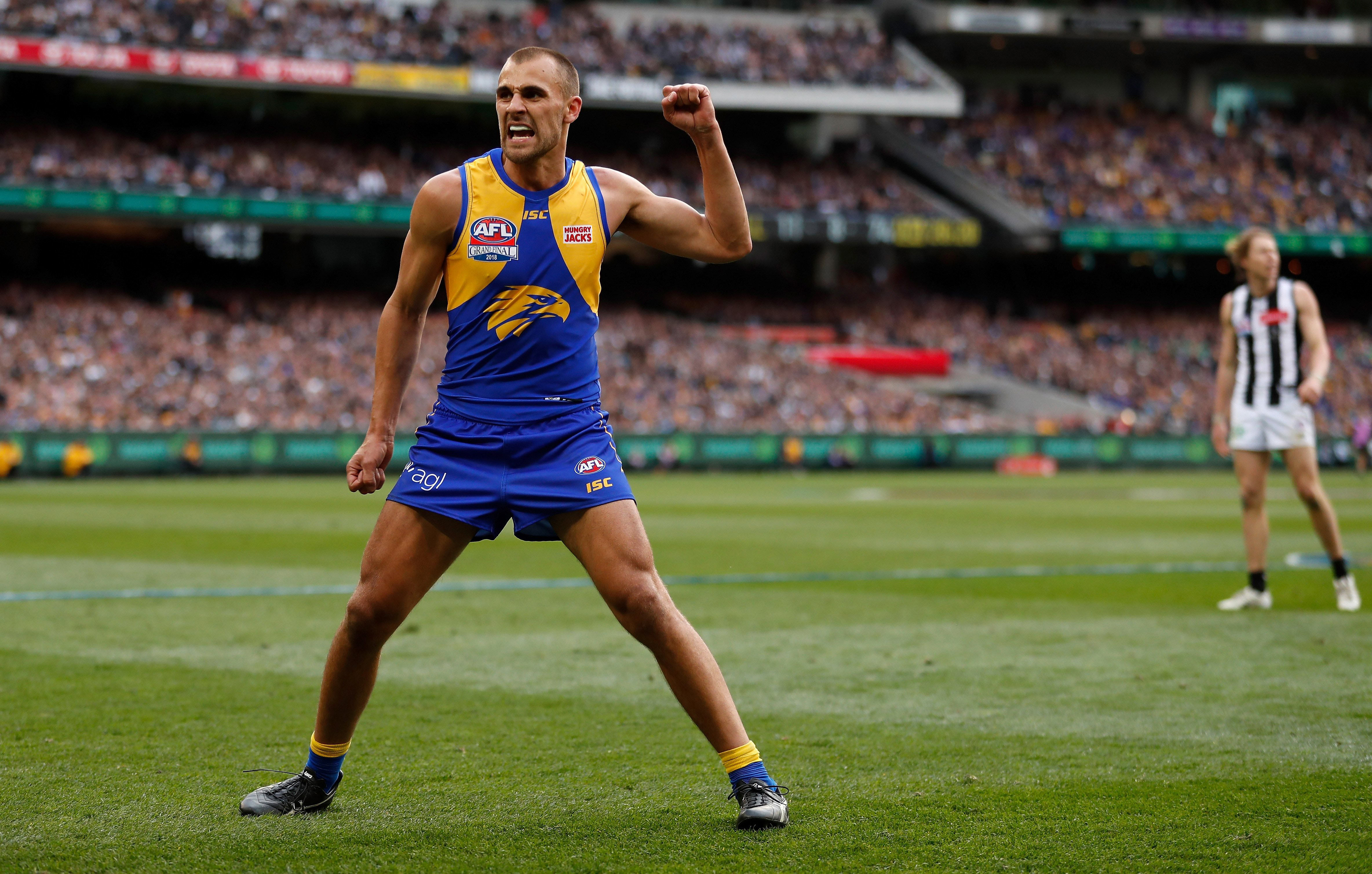
WC18JSY01M-WEST_COAST_EAGLES_2018_ON_FIELD_GUERNSEY_-_FRONT.jpg
WC19JSY01M-FRONT__978224356.jpg
 
I can't fathom that that is how HJ's would want their logo to be displayed.

I don't have any theories as to how it happened, but the HJ's box surely won't end up on the 2019 guernseys. (That's just my guess, we will find out in the fullness of time)
 
Hungry Jack's wordmark a lot more legible and easier to read/recall than the burger.

It's a complete departure from HJ's branding. The burger logo is instantly recognisable, even with the less legible text. I can't recall seeing an advertisement without it (billboard/bus stops/print etc).
 

(Log in to remove this ad.)

The only way it makes sense to change is if the homes now have HJ's front and back with burger at the back and the aways have Lendi front and back...

Strange to change now given the burger sat alongside the new lendi logo during the draft. That being said the club is not as anal about this sort of stuff as we are


IMG_9266.JPG
 
Fox Footy currently showing us v Essendon 2013. Those jumpers look seriously terrible. The colours get washed out, and they just flat out don't work. Especially when you look at what we now wear.
 
It's a complete departure from HJ's branding. The burger logo is instantly recognisable, even with the less legible text. I can't recall seeing an advertisement without it (billboard/bus stops/print etc).

I wouldn't say complete departure, it's just a part of the logo isolated and enlarged. Was also used on the back of guernseys from 2003 to 2011.

I'd prefer the burger on the front, but this is what HJs were working with trying to get some name recall from that logo:

BITM8YA.jpg


dBcE7IW.jpg


VgBtukd.jpg
 
Yeah I think it’ll be less offensive the more we see it. It’s just a strange choice to go from the logo to the words. I actually quite liked the red box after a while after hating it at first, so will probably be the same with this
 
It's new artwork. The AFL logo is in a different position, and the top of the SGIO oval would protrude above the overlaid HJ box. Get a ruler and line it up with the top of the SGIO logo and see how much space there is to the bottom of the ISC logo.

Also the eagle head is bigger on 2019.

WC18JSY01M-WEST_COAST_EAGLES_2018_ON_FIELD_GUERNSEY_-_FRONT.jpg
WC19JSY01M-FRONT__978224356.jpg

The HJs wordmark looks fine lol, got a bit of a retro feel to it. The only injustice is the lack of gold logo so far. Also going by the two jumpers side by side it looks like next year's blue could be a little darker?

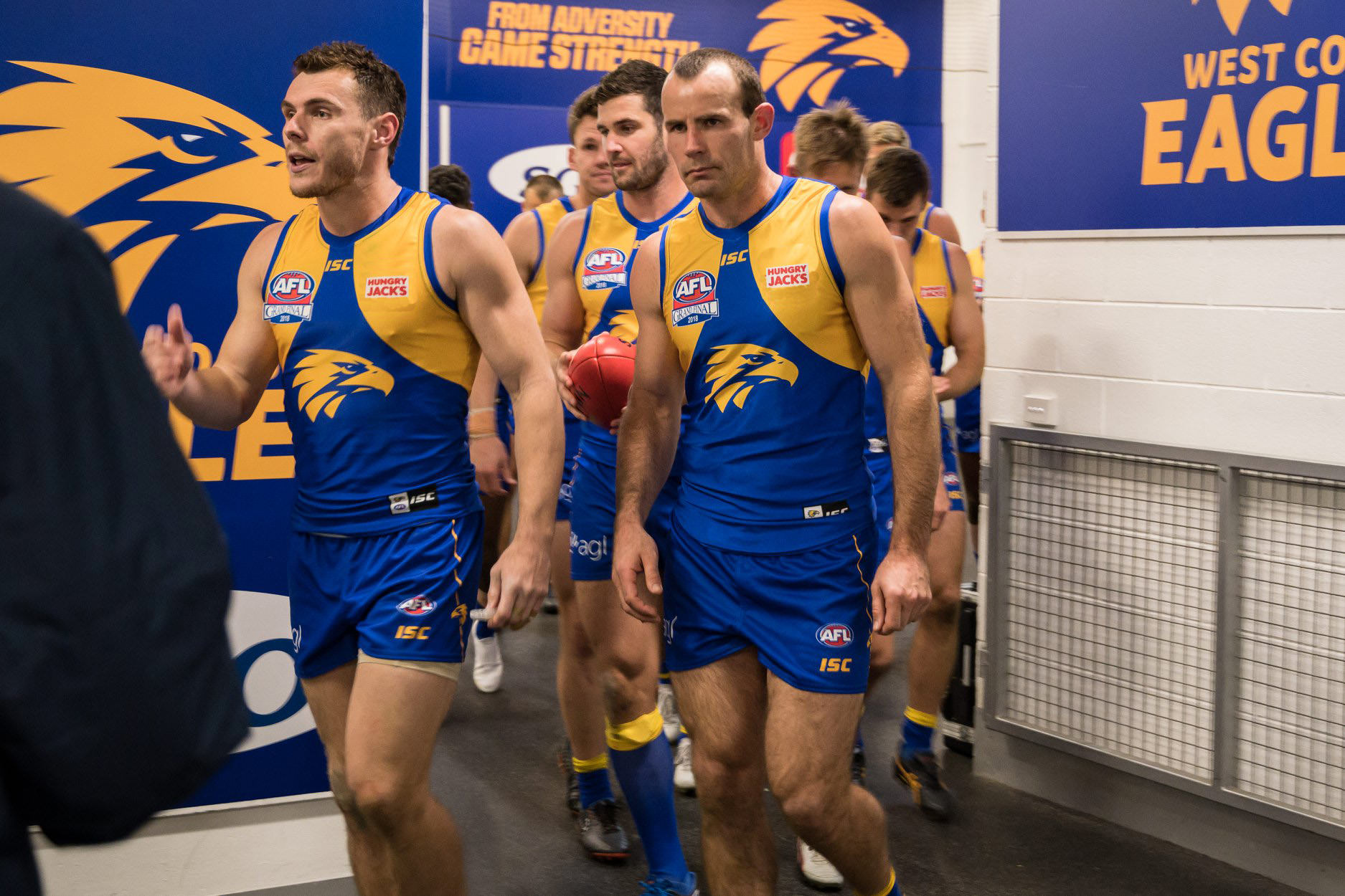
The 2018 mock up looks like a more accurate representation of what the boys were wearing this year IMO (sans the HJ’s logo of course).
 
no gold logo I'm skipping next year's guersney , I just buy another premiership Guernsey to wear to games next year. all the other clubs have released theirs, maybe why ours is taking so long is they want to get the premiership merchandise out the way before Christmas!
 
Status
Not open for further replies.

Remove this Banner Ad

Back
Top