Certified Legendary Thread #ReturnTheWings, Part 2: Job Done!

Remove this Banner Ad

Status
Not open for further replies.
Nah the ampersands have always been there since the OG I think

I meant the ampersands were added on the OG for aesthetic reasons.

The fact that we used an ampersand ('&') after each name had a purely formal reason. When we put the four names under each other, without the ampersands, we thought the name 'George' was sticking out too much, as this word was the longest. We solved this by putting the name 'George' at the bottom on the list, and adding ampersands to all the other names. This way, the list of names looked more even. That's how the ampersands were introduced in the design.
 
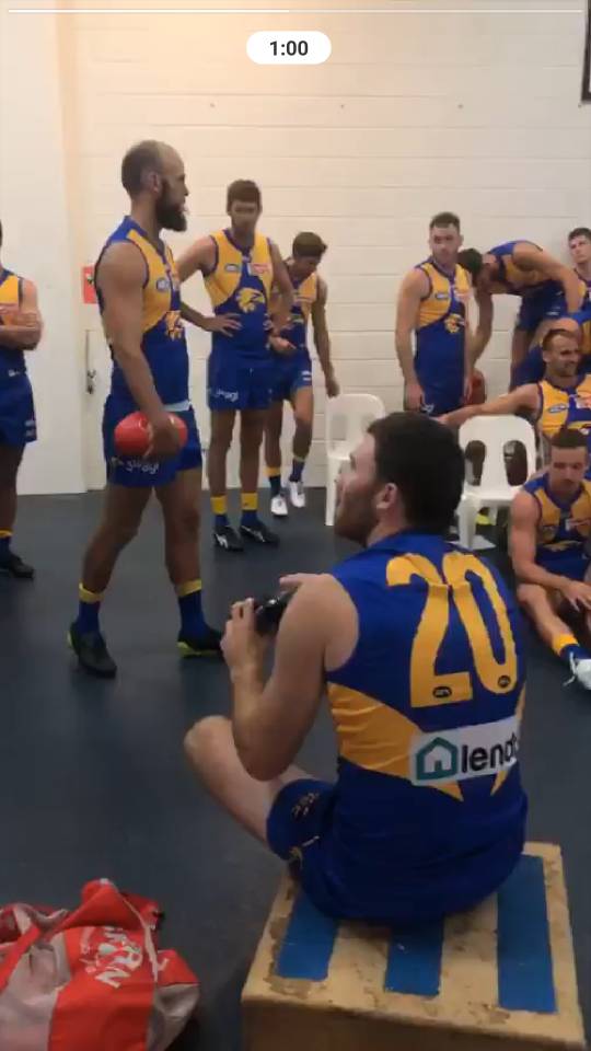
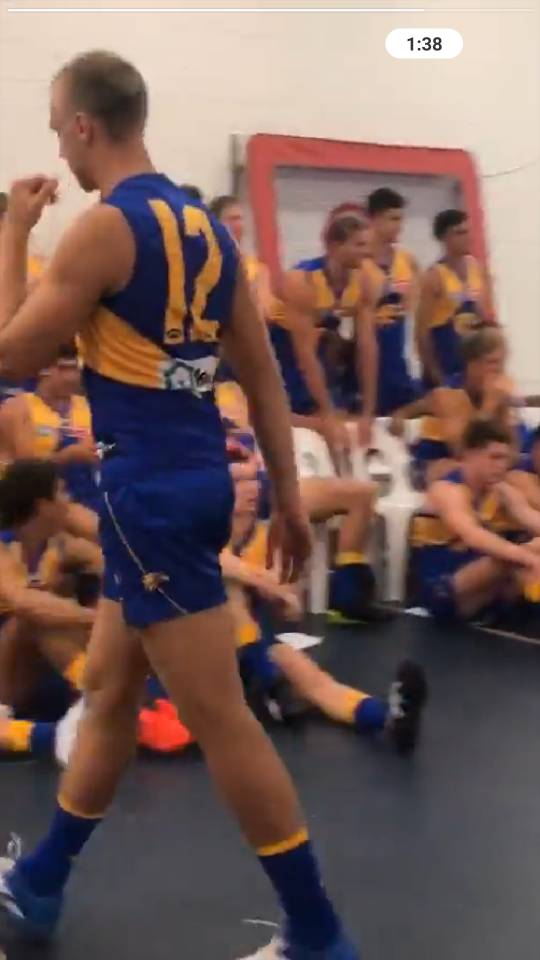
From the club's Instagram live video. Looks like they've fixed the small numbers issue.
67167c145fef016918f96233f6380b5e.jpg
 

Log in to remove this ad.

Yeah they had it fixed on the 2018 homes later in the season, it was just the aways where some numbers in the 20s seemed to have an issue. I'm guessing they just wore the same guernsey throughout the season, or something.

Good work on the logo on the shorts!
 
Bloody Hungry Jacks ruining what could’ve been a completely perfect set of jumpers (even without SGIO) hope it goes back to the burger in 2020 for our 3 peat

I think it looks OK....it's just really HUGE and literally hits the middle of the jumper. I understand why Hungry Jacks would want people to see it but when it's that big, it kinda makes the GOLD AFL LOGO look a bit tiny ("GOLD AFL LOGO"...…….I like saying THAT!!!!)

Anyone else think Lendi should be an inch lower?
NOOOOOOOOOO!!!!!!!!!!!!!!!!!!
 
Might just be my eyes but to me the wings look deeper and bigger on the side of the body. I don't mind the HJ logo as the white background means it doesn't stands out too much despite its size.
 
From the club's Instagram live video. Looks like they've fixed the small numbers issue.
67167c145fef016918f96233f6380b5e.jpg

They’re still too narrow but I’ll take it, at least we’re the same as all the other ISC teams now.

The black AFL logos look pretty average, should be royal or white


On iPhone using BigFooty.com mobile app
 
They’re still too narrow but I’ll take it, at least we’re the same as all the other ISC teams now.

The black AFL logos look pretty average, should be royal or white


On iPhone using BigFooty.com mobile app

Yeah ISC stretches their numbers too vertically compared to Puma - very annoying. At least they are consistently sized across all players for 2019.
 

(Log in to remove this ad.)

Also i think the guernseys look great. Both sponsors are the same shape now (rectangle).

Wasn't the biggest fan of the oval SGIO on the back, and the square HJ's used to block the wing tips.

Do agree the HJ's on the front is a little large (covering too much royal blue), but it brings that retro vibe with the word text making a return.

644917.jpg
 
Better than last year, but I still think the colours look a little off (not as deep compared to Puma), ISC have that problem with pretty much all of their teams, though.


The HJ's logo change is baffling, though. They use the bun logo on the polos and on the NBL courts.
 
Don’t mind it. Lots of teams have massive logos. It sucks but it’s just one of those things you have to cop with commercial sports
 
Status
Not open for further replies.

Remove this Banner Ad

Back
Top