HoneyBadger35
The Big Kahuna
- Aug 11, 2011
- 26,472
- 71,700
- AFL Club
- West Coast
- Moderator
- #1,651
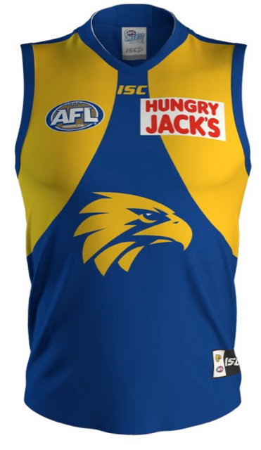
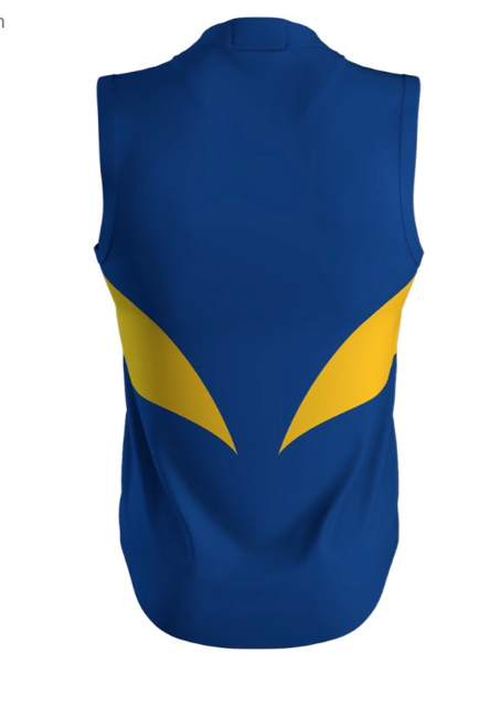
A slightly smaller HJ’s box logo would be optimal. Looks retro af. Wing tips 10/10.
Amazing jersey, just wish the HJ box was a touch smaller.
Amazing jersey, just wish the HJ box was a touch smaller.