Certified Legendary Thread #ReturnTheWings, Part 2: Job Done!

Remove this Banner Ad

Status
Not open for further replies.
Still better than the tripe.

The early 2000's wings hold a special place for me because they're what I grew up with, and what I watched us win our first flag in. I'm only 20 so my earliest memories of West Coast are pretty much watching the 2005 grand final.

If we could put the new logo on the last revision of the Puma wings it'd be perfect tbh. ISC wings are just a little too fat and look horrid on the back, but they're still pretty good.
I grew up with the 80s/90s wings. Fat and glorious.
 
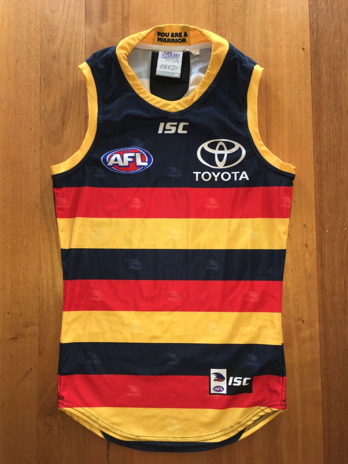
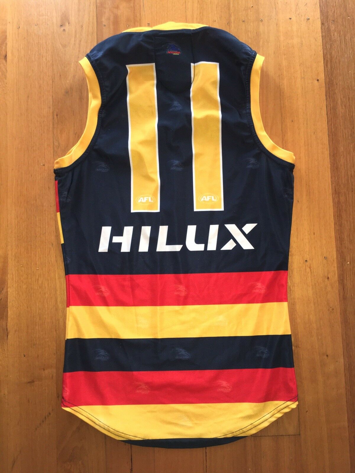
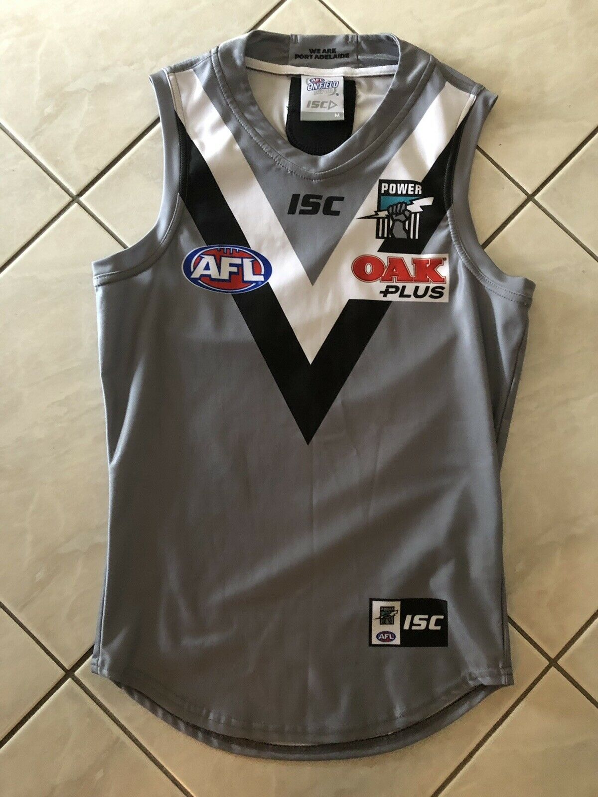
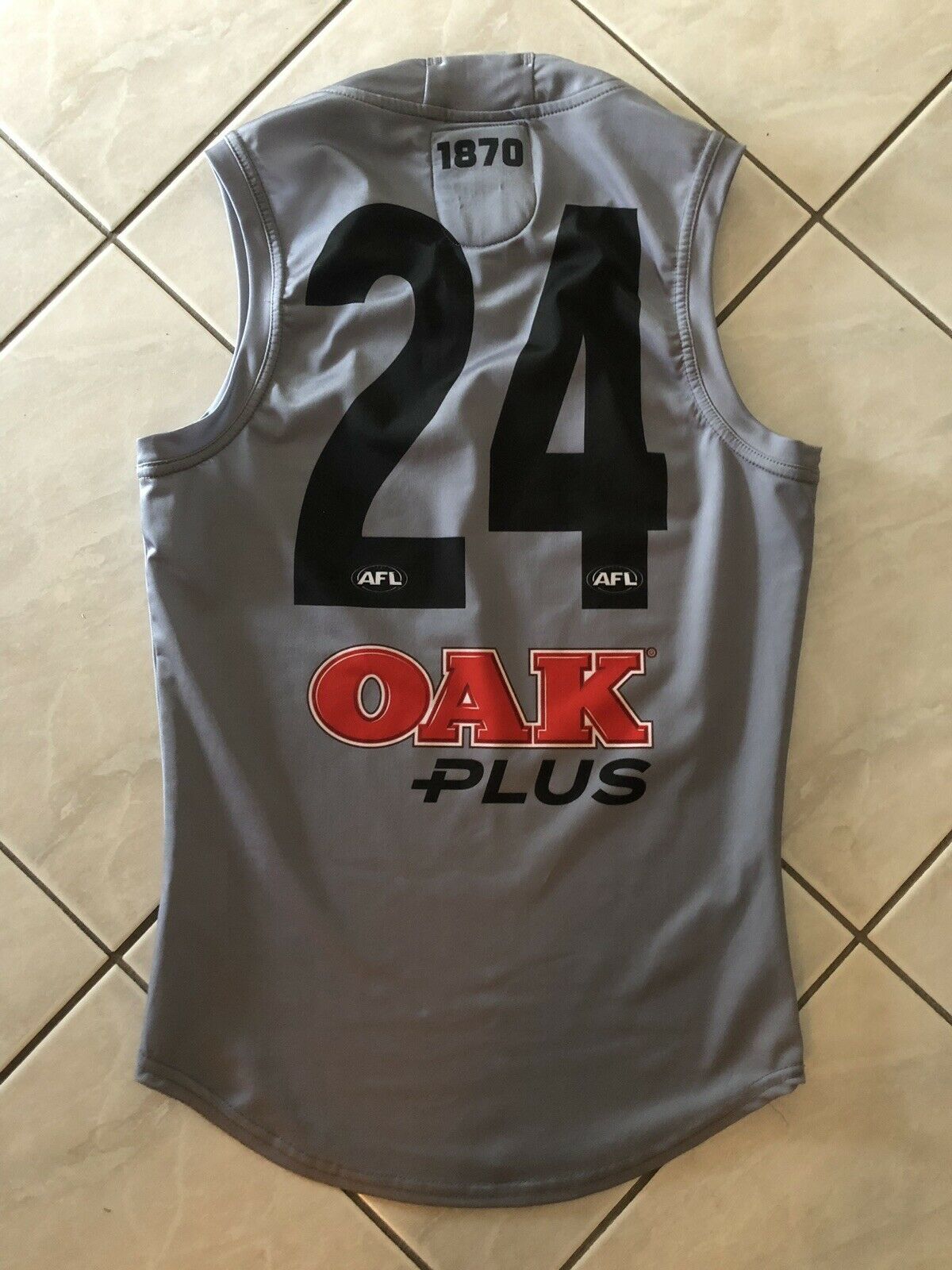
What I do like about the ISC 2018 guernseys is that the club just kept them as pure footy guernseys, no tat and little chintzy s**t like some slogan on the inside neck or logo or founding year above the number, and no poorly implemented watermark.

Look at what the Adelaide teams opted to go for - just unnecessary clutter.

Gu58qKs.jpg


bO4mhOn.jpg


XYu3O4n.jpg


dy9RCmN.jpg
 

Log in to remove this ad.

What I do like about the ISC 2018 guernseys is that the club just kept them as pure footy guernseys, no tat and little chintzy s**t like some slogan on the inside neck or logo or founding year above the number, and no poorly implemented watermark.

Look at what the Adelaide teams opted to go for - just unnecessary clutter.

Gu58qKs.jpg


bO4mhOn.jpg


XYu3O4n.jpg


dy9RCmN.jpg
I've always wondered why ISC player issues taper off at the bottom like that.
Also loving how the tag inside the neck still seems to be a lucky dip of the old and new.
 
What I do like about the ISC 2018 guernseys is that the club just kept them as pure footy guernseys, no tat and little chintzy s**t like some slogan on the inside neck or logo or founding year above the number, and no poorly implemented watermark.

Look at what the Adelaide teams opted to go for - just unnecessary clutter.

Gu58qKs.jpg


bO4mhOn.jpg


XYu3O4n.jpg


dy9RCmN.jpg
Just feel as though Adelaide need to ditch the white number outline and that Port jumper needs a White out line on the numbers
 
Just feel as though Adelaide need to ditch the white number outline and that Port jumper needs a White out line on the numbers
Go one step further and keep the black numbers but give it a white number panel.

Actually, why don't they just make the whole guernsey white instead of grey?

Oh wait...
 
Go one step further and keep the black numbers but give it a white number panel.

Actually, why don't they just make the whole guernsey white instead of grey?

Oh wait...
The white jumper was a great clash jumper - was no reason to mess with it. But yep, if they have grey, may as well have their 'traditional' white number panel on it.
 
Off the topic of Port jumpers. I still hate the Hungry Jacks text. I thought I’d get used to it, but it’s still s**t. Especially seeing so much footage of late from the Gf, the burger just worked so much better. I honestly think we need a petition to return the buns!
 
Off the topic of Port jumpers. I still hate the Hungry Jacks text. I thought I’d get used to it, but it’s still s**t. Especially seeing so much footage of late from the Gf, the burger just worked so much better. I honestly think we need a petition to return the buns!
I actually think the burger stands out more for HJs aswell. You don't even have to read it to know it's Hungry Jacks
 
I actually think the burger stands out more for HJs aswell. You don't even have to read it to know it's Hungry Jacks

Exactly. Surely that’s what marketing is all about?? Having a logo or symbol that people recognise straight away, without having to read it. Even reading the words hungry jacks, I feel like it’s less about the actual brand and it’s more about the words, if that makes sense? Like I look at the burger logo and actually think of the place, but when I read the red text, it’s just that, text. Stupid decision and hope it changes back
 

(Log in to remove this ad.)

Off the topic of Port jumpers. I still hate the Hungry Jacks text. I thought I’d get used to it, but it’s still s**t. Especially seeing so much footage of late from the Gf, the burger just worked so much better. I honestly think we need a petition to return the buns!

I’ve come to terms with it. Was firmly against it at first but it looks far less offensive on the actual jumpers than it did in the mockups.

I prefer this setup to the big red HJs box we had on the back last year. Looked 10x worse.


On iPhone using BigFooty.com mobile app
 
Interesting topic, because I was just wondering where to ask my Rick the Rock question - which is: WTF is he called Rick the Rock? He's an Eagle, not a Rock.

To answer yours though, he is a wedge tail, as per his profile page:
https://www.westcoasteagles.com.au/fan-zone/kids/meet-the-mascots
Yeah but have you seen what a wedge tail looks like?


They're not white.


He got that name cause he used to sell Benny Cuz rocks of coke back in the day.
 
Status
Not open for further replies.

Remove this Banner Ad

Back
Top