
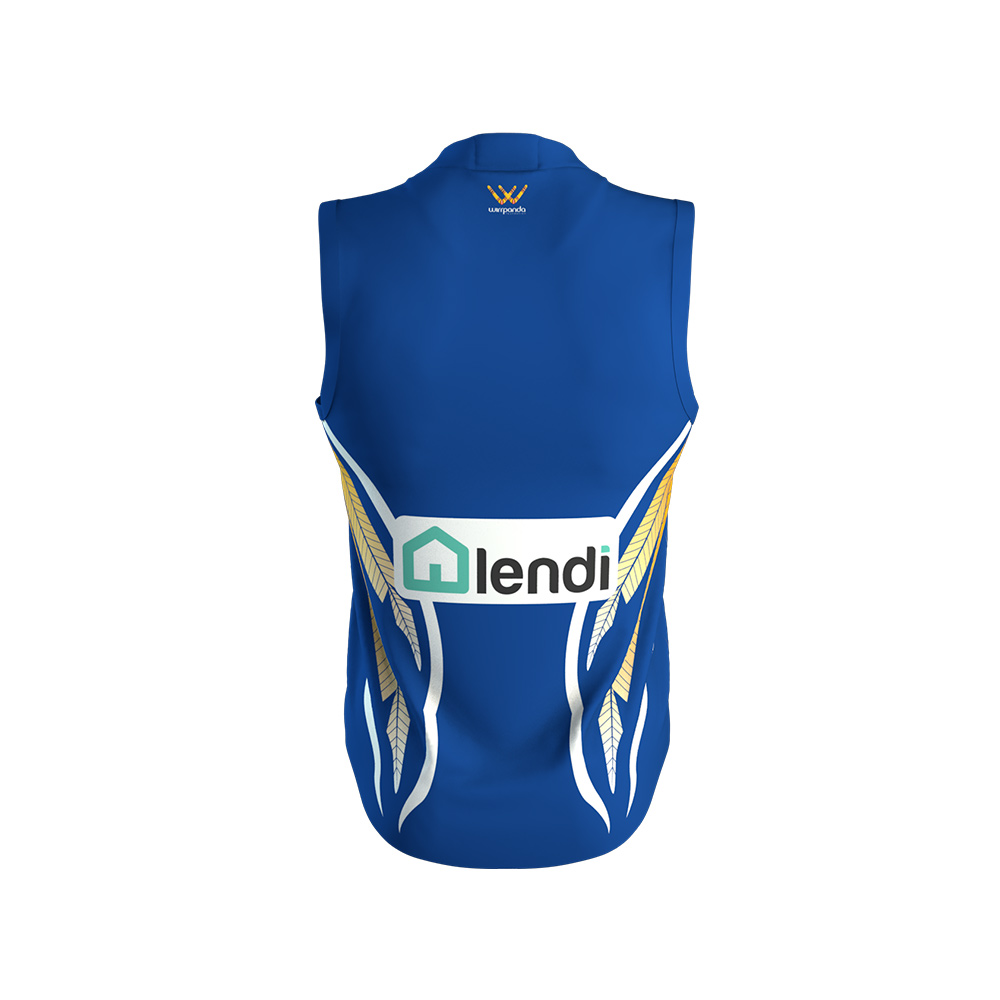
Wirrpanda foundation tag on it, so i guess it's the Indigenous jumper.Saw the same thing on the FB page
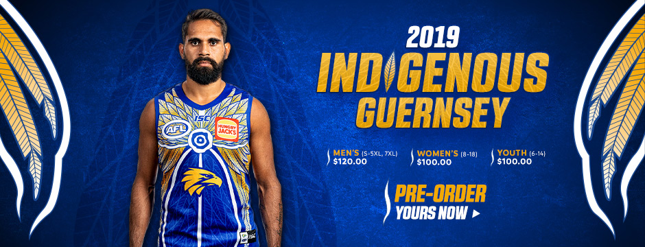
Anzac or Indigenous Guernsey?
Navigation
Install the app
How to install the app on iOS
Follow along with the video below to see how to install our site as a web app on your home screen.
Note: This feature may not be available in some browsers.
More options
You are using an out of date browser. It may not display this or other websites correctly.
You should upgrade or use an alternative browser.
You should upgrade or use an alternative browser.
Certified Legendary Thread #ReturnTheWings, Part 2: Job Done!
- Thread starter QS
- Start date
- Tagged users None
- Status
- Not open for further replies.
")
- May 28, 2010
- 1,709
- 2,132
- AFL Club
- West Coast
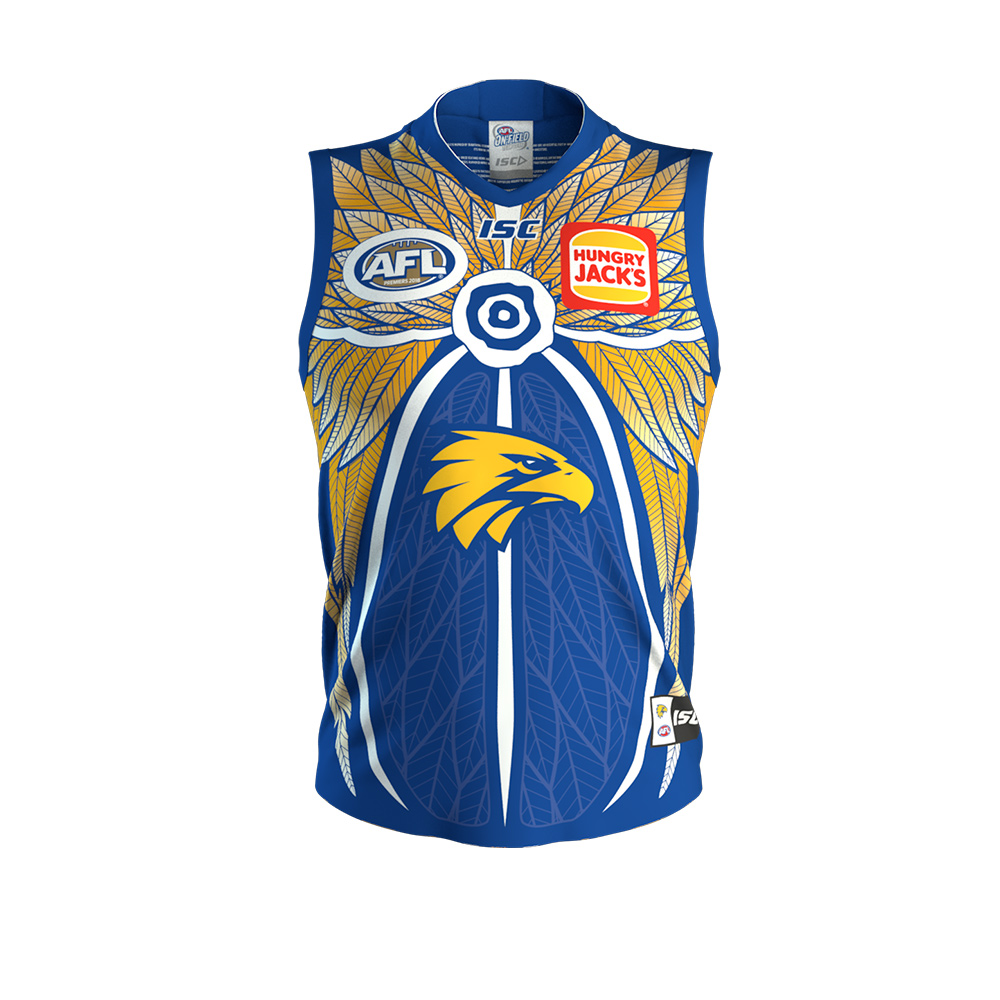
That’s a wings Indigenous guernsey, with feathers for the wings! Awesome.
twinkletoes#17
Coaster
That’s a wings Indigenous guernsey, with feathers for the wings! Awesome.
Wings wings

- May 28, 2010
- 1,709
- 2,132
- AFL Club
- West Coast
- May 28, 2010
- 1,709
- 2,132
- AFL Club
- West Coast
The burger is back!
- Jan 16, 2019
- 794
- 957
- AFL Club
- West Coast
very strange that the burger logo is back hmmm
Looks great. Side view Is even nicer!


Best guernsey we’ve ever had, might just be the best in footy history. Wow.
On iPhone using BigFooty.com mobile app
On iPhone using BigFooty.com mobile app
HoneyBadger35
The Big Kahuna
- Aug 11, 2011
- 26,472
- 71,695
- AFL Club
- West Coast
- Moderator
- #1,859
I like it, but I’m not sure why. It’s incredibly busy and I hate busy designs...and yet there’s something about it I like.
God bless our colours.
God bless our colours.
Carbine Chaos
The Gaff-er
- Apr 1, 2009
- 63,858
- 93,936
- AFL Club
- West Coast
- Other Teams
- Perth FC, Everton, Delhi
Looks fantastic.
burger is so much better. I know I won't let it go, but the red text is just horrible. Completely ruins the jumpers this year. Looks especially s**t on the clash. Wish they'd just bite the bullet and returnthebuns mid season
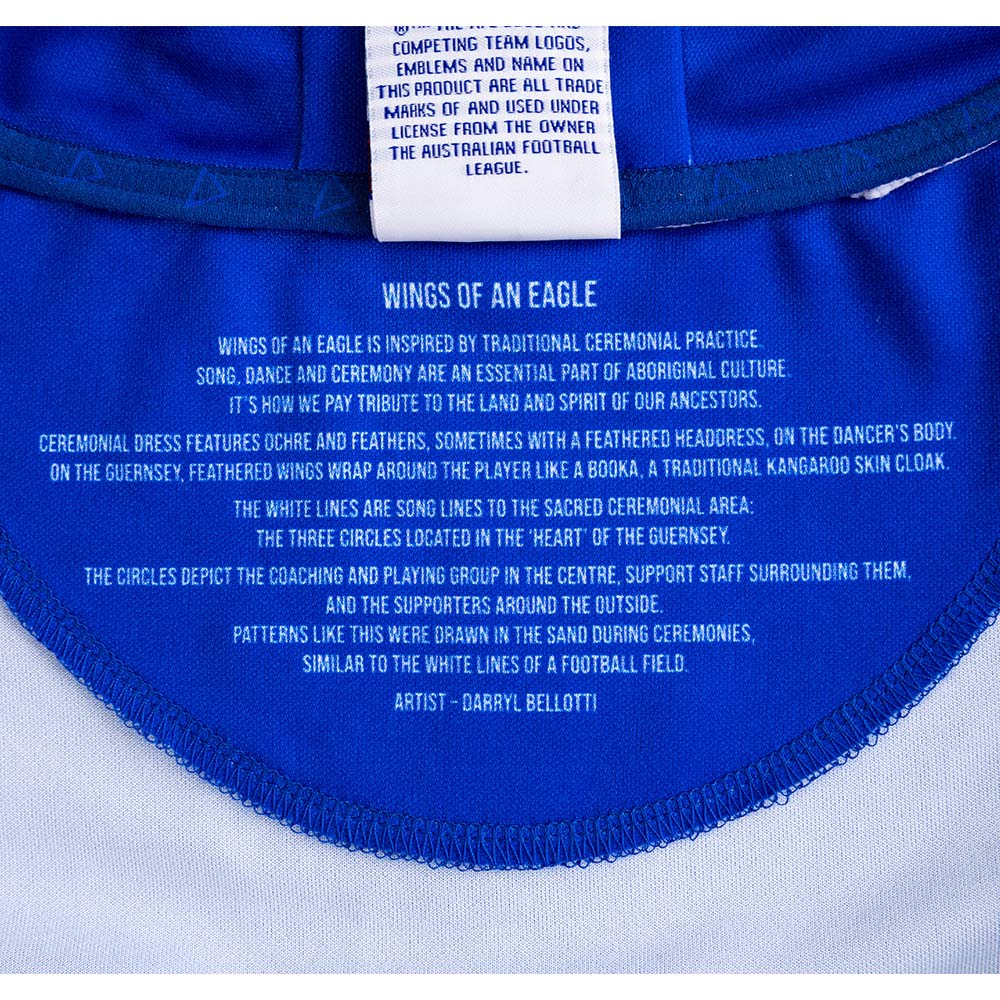
Eagle head could do to be a little bigger too. I don't really like the use of white, since we've moved away from white as part of our colours, but get the meaning behind it from the little spiel on the inside collar. All in all it's pretty bloody good, and easily the best Indig design we've ever had
Chappy McChap
Debutant
- Aug 20, 2017
- 76
- 93
- AFL Club
- West Coast
Why are the buns back?
Why are the buns back?
The word mark would cover up part of the design, I would think.
On iPhone using BigFooty.com mobile app
- Sep 8, 2011
- 10,984
- 10,942
- AFL Club
- West Coast
Agree the artist should have done an eagle head, alternatively we should have left it blankI like it but the eagle logo doesn’t match the design plus I don’t like the white circle around the AFL logo. Otherwise it’s sick. Reminds me of some sort of armour off a Zelda game
Love how it incorporates wings
- Jun 26, 2011
- 3,337
- 7,300
- AFL Club
- West Coast
- Other Teams
- Perth Wildcats, Perth Lynx
No-carb diets like Atkins are back out of vogue. The burgers are better … with buns.Why are the buns back?
That's a damn good looking guernsey.

Girls wings look alright on the back, much less offensive than they were on the female academy ISC jumpers. Much nicer cut than the ISC gear too
Our girls will look the goods next year.
On iPhone using BigFooty.com mobile app
- Sep 8, 2011
- 10,984
- 10,942
- AFL Club
- West Coast
Not a fan of the bigger logo
Chappy McChap
Debutant
- Aug 20, 2017
- 76
- 93
- AFL Club
- West Coast
Sh*ts me that the design of our jumper never takes precedence over the apparel logo. How WIDE is the 'wing gap' at the collar FFS.
Sh*ts me that the design of our jumper never takes precedence over the apparel logo. How WIDE is the 'wing gap' at the collar FFS.
Agree, would’ve been nice to see the Cotton On logo up on the shoulder like the WAFL jumpers so the wings can be designed properly.
Overall it’s a small issue really. For a first jumper it’s pretty good.
On iPhone using BigFooty.com mobile app
The AFLW kit looks cool, royal blue is mint.
I hate the numbers on the AFLW jumpers though, looks so cheap.
I look back at games where we are wearing the table cloth and want to vomit. The changes made to it in 2007 actually made it worse. Even the royal with white outlines, whyyyy. So glad the club actually listened to the fans for a change.
I hate the numbers on the AFLW jumpers though, looks so cheap.
I look back at games where we are wearing the table cloth and want to vomit. The changes made to it in 2007 actually made it worse. Even the royal with white outlines, whyyyy. So glad the club actually listened to the fans for a change.
Last edited:
Looks good. Just wish the wings started at the top of the shoulder not halfway down the chestView attachment 669888
Girls wings look alright on the back, much less offensive than they were on the female academy ISC jumpers. Much nicer cut than the ISC gear too
Our girls will look the goods next year.
On iPhone using BigFooty.com mobile app
- May 28, 2010
- 1,709
- 2,132
- AFL Club
- West Coast
The AFLW kit looks cool, royal blue is mint.
I hate the numbers on the AFLW jumpers though, looks so cheap.
I look back at games where we are wearing the table cloth and want to vomit. The changes made to it in 2007 actually made it worse. Even the royal with white outlines, whyyyy. So glad the club actually listened to the fans for a change.
The white clash was first worn in 2010. Do you mean the tri-panel? The change in 2007 to the home was to bring it in line with the away, which made sense but I agree it made for a worse guernsey design.
- Status
- Not open for further replies.
Similar threads
- Replies
- 338
- Views
- 13K
- Replies
- 225
- Views
- 10K
- Replies
- 1K
- Views
- 28K
- Locked
- Replies
- 1K
- Views
- 42K
