wazzaisachamp
Debutant
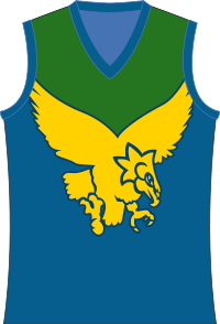
So it looks like the Woodville-West Torrens Eagles have released a permanent new gold guernsey. What are peoples thoughts?
I'm not a huge fan, looks a bit weak for mine. Think it would look better if it was more blue/green.
Thoughts?
http://www.sanfl.com.au/news/club_news/177/
I'm not a huge fan, looks a bit weak for mine. Think it would look better if it was more blue/green.
Thoughts?
http://www.sanfl.com.au/news/club_news/177/