


fancyscum
Radical Crommunist
This is the height of design analysis.Do u go 4 hawks?
the gold Geurnsy is like mad cool compared to their white one with a few floggen letters!
Follow along with the video below to see how to install our site as a web app on your home screen.
Note: This feature may not be available in some browsers.
This is the height of design analysis.Do u go 4 hawks?
the gold Geurnsy is like mad cool compared to their white one with a few floggen letters!
She's only 2 years younger than me... The world is doomed.This is the height of design analysis.


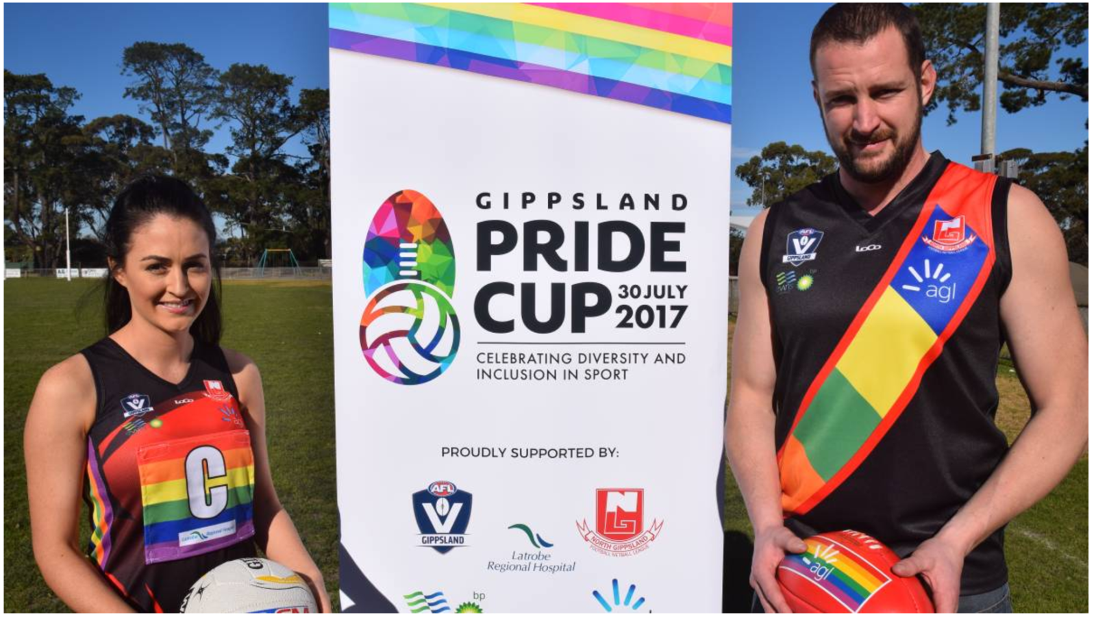
Completely cocked up the order of colours on that sash. Don't remember old mate Roy?Just saw this on fb...

So token gestures aren't exclusive to the AFL then....Just saw this on fb...
Ahhh, the ol' piss stain clash.View attachment 393304
View attachment 393305
Can't believe this monstrosity hasn't made an appearance. The worst home, away or clash in vfl afl history IMO

Ahhh, the ol' piss stain clash.
I reckon it's up there with this mess:
Its like someone in the Puma factory circa mid 2000s just discovered the gradient tool and went ballistic with both of these kits.Ahhh, the ol' piss stain clash.
I reckon it's up there with this mess:
delet this.Ahhh, the ol' piss stain clash.
I reckon it's up there with this mess:
Kindly leave, sir.Ahhh, the ol' piss stain clash.
I reckon it's up there with this mess:
You embarrass yourself!Ahhh, the ol' piss stain clash.
I reckon it's up there with this mess:
Not at all, my club made a special Beyond Blue jumper, and another club in my league made an ANZAC jumper. Token gestures, nothing but PC gone made amirite?So token gestures aren't exclusive to the AFL then....
Well that's a surprise to me - people actually like that gradient? Come on, pretty much any of the solid block blue and gold designs smash that one out of the ballpark!
Mate, the Ochre is an absolute GOAT.
Get your head straight.
So token gestures aren't exclusive to the AFL then....
Gen y give me the shits, you just dont mess with the ochre!!!
Probably likes a good tri-panel too!!!!!
Reminds me of the old seattle supersonics jersey hahaNagle college:
View attachment 388560

Are those different coloured side panels?
