- Jan 9, 2013
- 2,977
- 4,719
- AFL Club
- West Coast
- Other Teams
- Perth Scorchers, South Fremantle
I stand by my choices. To me they are the worst. 
Follow along with the video below to see how to install our site as a web app on your home screen.
Note: This feature may not be available in some browsers.

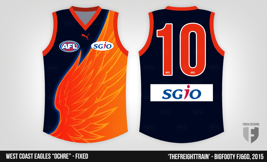
I think it would have looked pretty good if we used a light grey but I think the club mantra was to use the darkest grey we could get away with to keep it similar to the home jumper.They grey one worked to a degree but still had a dark appearance.
It was essentially the same idea as Fitzroy's jumper. Just with a bigger, not as good logo.
Reply to anyone who disses the Ochre, and you get carded.Time for a new rule: Diss the Ochre, and you get carded.
No leniency. Any response = instant card.Depends on how good or crap the reply is, with leniency granted depending on the level of sarcasm and smart-arse comments.
There was a whole "it's broke, fix it" comp on the Ochre
Come at me.
Calm down, Kim Jong-Un.No leniency. Any response = instant card.
I liked the innovation of the colours and gradients, but it was not fit for purpose (as an away or clash), ochre was not a West Coast colour & the eagle looked a bit deformed (or it had a beer gut!). Good pre-season jumper, but that's it. So card me!Time for a new rule: Diss the Ochre, and you get carded.
See this is wrong, the logo was good for what they had to work with back then.
It entailed everything in one sweet as late 80's logo, the state shape, the koala head, the double b and the location of the club.
What else could you need?
I liked the innovation of the colours and gradients, but it was not fit for purpose (as an away or clash), ochre was not a West Coast colour & the eagle looked a bit deformed (or it had a beer gut!). Good pre-season jumper, but that's it. So card me!
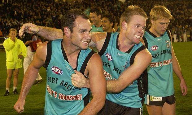
Blame Collingwood for that one, although a certain Swans supporter on here will tell you it's our own fault.Port wore this one in a game once, has to be a contender:


He really should have seen someone about that...He said the balls were stiff and hard
I liked this one.