Navigation
Install the app
How to install the app on iOS
Follow along with the video below to see how to install our site as a web app on your home screen.
Note: This feature may not be available in some browsers.
More options
-


LIVE: Richmond v Melbourne - 7:25PM Wed
Squiggle tips Demons at 77% chance -- What's your tip? -- Team line-ups »


You are using an out of date browser. It may not display this or other websites correctly.
You should upgrade or use an alternative browser.
You should upgrade or use an alternative browser.
Resource www.footyjumpers.com
- Thread starter Mero
- Start date
- Tagged users None
Jack Stevens
#2 Ticket Holder
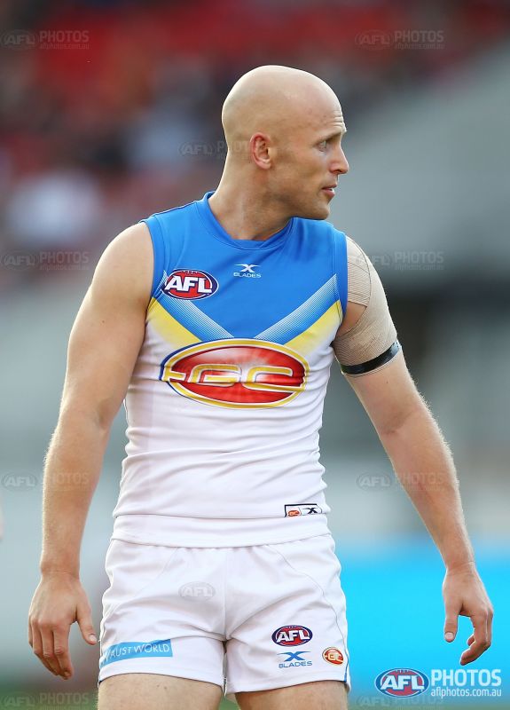
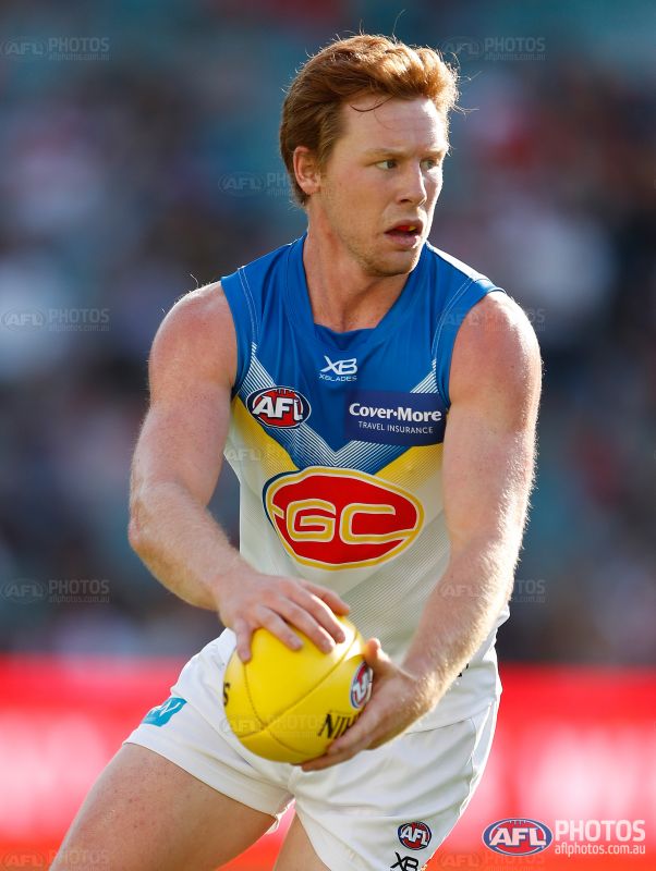
Is the red back still being used? I thought it was only brought in to limit exposure to the Bintang, surely the royal blue is a better option.
SaadyArmy
Team Captain
- Jan 31, 2017
- 357
- 389
- AFL Club
- Gold Coast

You have made a slight gradient in the suns logo. There is no gradient in both guernsey's logos on the front.
Also, there are no grey chevrons on the 2017 suns clash.
The sunbeams need to be removed from the 2018 clash
also were you going to class the GWS guernseys they wore in AFLX as preseason?
Covermore also needs to be added to the Suns sponsors
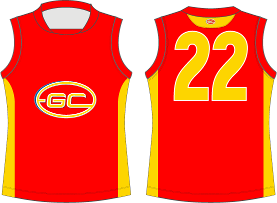
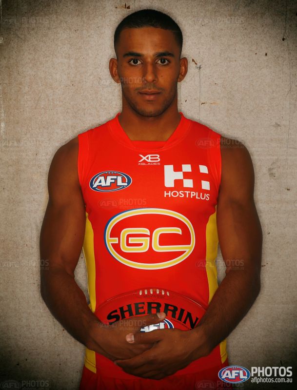
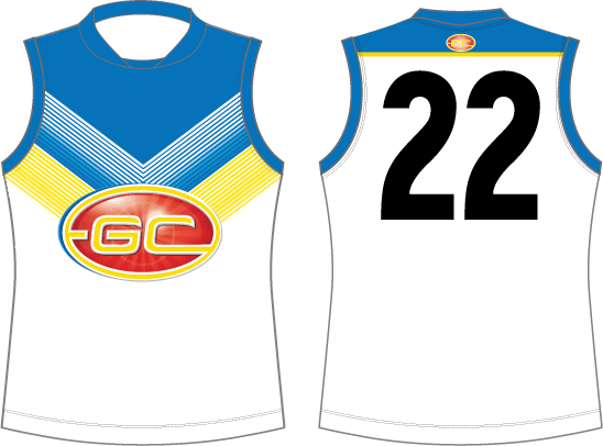
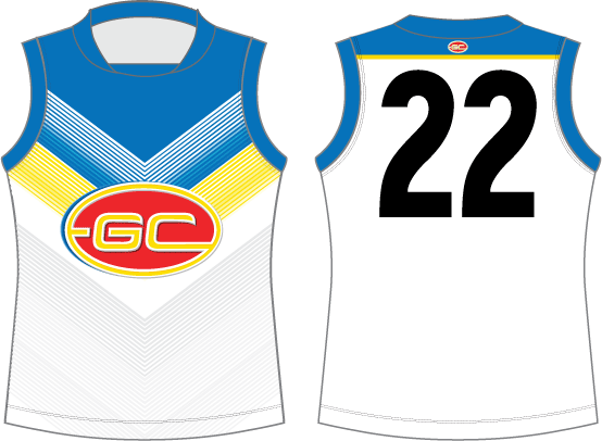
2018 XBlades logo is white not yellow

On iPhone using BigFooty.com mobile app
plus the austworld logo is now in a box the same like our polo
plus the austworld logo is now in a box the same like our polo
- May 25, 2009
- 4,014
- 2,765
- AFL Club
- Port Adelaide
I was having a look at the Carlton section and in the All Uniform section I noticed some of the thumbnails linked to the wrong jumper
These were the ones I noticed. The red year is what it links too.

Love your work Mero, keep it up!
These were the ones I noticed. The red year is what it links too.

Love your work Mero, keep it up!
Mero
Norm Smith Medallist
- Thread starter
- #6,658
Thanks for that.I was having a look at the Carlton section and in the All Uniform section I noticed some of the thumbnails linked to the wrong jumper
These were the ones I noticed. The red year is what it links too.
View attachment 478965
Love your work Mero, keep it up!
Further proof I'm more footy historian than web developer.
This has now been fixed.
Klim
Brownlow Medallist
- Sep 17, 2013
- 12,532
- 10,363
- AFL Club
- Sydney
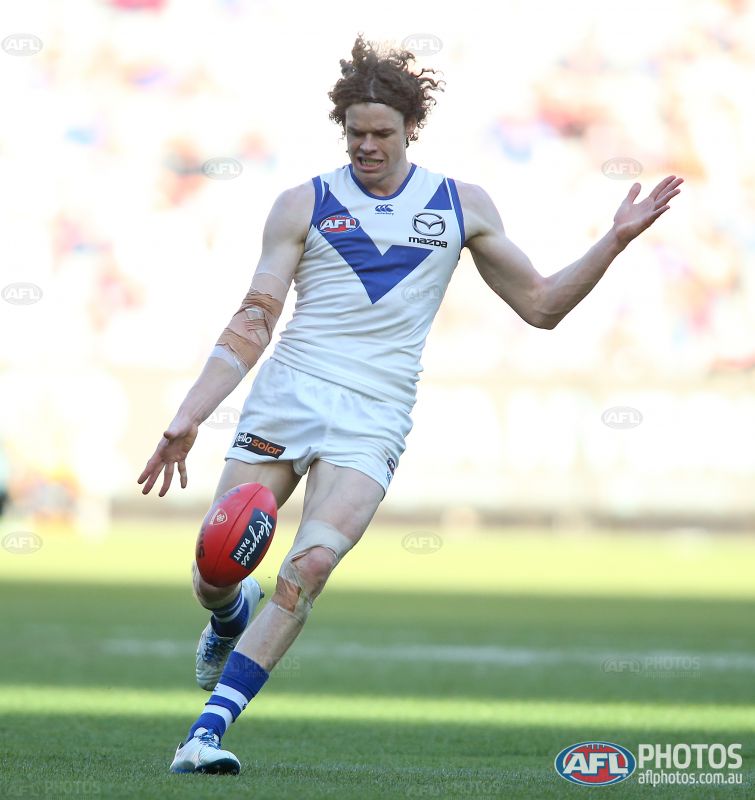
And the V doesn't touch the shoulder panels. Only the cuffs.Mero North Melbourne jumper needs white piping next to cuffs. Also is it just me or have they also removed the Kangaroo watermark?
Javelin
All Australian
- Jun 6, 2013
- 849
- 1,116
- AFL Club
- West Coast
Seems to me North changed a lot of things. I could be wrong, but I also got the impression the stripes on the back stopped much lower than the design indicated as well. (Yes, I realise the below image has the jumper bunched a little, but I don't think that matters too much in this instance.)Mero Also is it just me or have they also removed the Kangaroo watermark?
Mero North Melbourne jumper needs white piping next to cuffs. Also is it just me or have they also removed the Kangaroo watermark
Its not a watermark, its embossed into the fabric. Its there, but its so hard to see that it might as well not be.

Mero
Norm Smith Medallist
- Thread starter
- #6,664
Version on the website now looks like this:
http://www.footyjumpers.com/images/North-Clash-2018.gif
PS thanks for the tip off, I wasn't able to see the game and it would have stayed as presented by the club in the original design.
http://www.footyjumpers.com/images/North-Clash-2018.gif
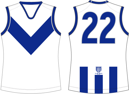
PS thanks for the tip off, I wasn't able to see the game and it would have stayed as presented by the club in the original design.
- May 25, 2009
- 4,014
- 2,765
- AFL Club
- Port Adelaide
I found these with Google
http://footyjumpers.com/North-Adelaide.htm
http://footyjumpers.com/Norwood.htm
and I realize that Port's entire history is in their AFL section and I was wondering if you had done any other SANFL teams or if you had any plans to in the future?
http://footyjumpers.com/North-Adelaide.htm
http://footyjumpers.com/Norwood.htm
and I realize that Port's entire history is in their AFL section and I was wondering if you had done any other SANFL teams or if you had any plans to in the future?
I started researching for Sturt, but I haven't gotten back into it as of yet.I found these with Google
http://footyjumpers.com/North-Adelaide.htm
http://footyjumpers.com/Norwood.htm
and I realize that Port's entire history is in their AFL section and I was wondering if you had done any other SANFL teams or if you had any plans to in the future?
- May 25, 2009
- 4,014
- 2,765
- AFL Club
- Port Adelaide
Yeh Im doing a fantasy/what if portfolio at the moment a bit like Fizzler's and Ive found a few bits and pieces for a few of the teams but its only stuff that is relevant to the early 80's, which is when my league forms. How much have you done for Sturt?I started researching for Sturt, but I haven't gotten back into it as of yet.
I've only worked out different jumper elements like the monogram, collars and whether it's a lace-up or not.Yeh Im doing a fantasy/what if portfolio at the moment a bit like Fizzler's and Ive found a few bits and pieces for a few of the teams but its only stuff that is relevant to the early 80's, which is when my league forms. How much have you done for Sturt?
The closest I got to the early '80s at the time was 1974-1975, which had another monogram that wasn't the usual "heritage" monogram you see around. Light blue base, vertical navy/black laces (no bar running vertically down the jumper), thin navy collar and cuffs. Navy shorts, not sure about the socks just yet.
Here's the image of the monogram here..
http://nnimgt-a.akamaihd.net/transf...512de.jpg/r99_0_3163_5390_w1200_h678_fmax.jpg
Note that the top of the F is spiky behind the S, as opposed to it being curved. I'm not quite sure when it changed to the other one, though.
Also, my research says they were playing in that same style/design since 1965.
Last edited:
- May 25, 2009
- 4,014
- 2,765
- AFL Club
- Port Adelaide
Yeh nice.I've only worked out different jumper elements like the monogram, collars and whether it's a lace-up or not.
The closest I got to the early '80s at the time was 1974-1975, which had another monogram that wasn't the usual "heritage" monogram you see around. Light blue base, vertical navy/black laces (no bar running vertically down the jumper), thin navy collar and cuffs. Navy shorts, not sure about the socks just yet.
Here's the image of the monogram here..
http://nnimgt-a.akamaihd.net/transf...512de.jpg/r99_0_3163_5390_w1200_h678_fmax.jpg
Note that the top of the F is spiky behind the S, as opposed to it being curved. I'm not quite sure when it changed to the other one, though.
Also, my research says they were playing in that same style/design since 1965.
It looks like that same jumper design that you have posted might have been still around in 1983. I reckon you probably have already seen this photo but it is from 1983 after Davies kicked 15 against West Adelaide
http://cdn.newsapi.com.au/image/v1/3079956614e73523156a2d9dc9924217?width=650


- Moderator
- #6,671
Mero,
Melbourne 2018 ANZAC Jumper released. It looks like the bottom of the red V has been 'roughed up' to make it look like a trench.
Once I get one, I will confirm
View attachment 484906View attachment 484907
Nice and understated, much better than the paint-dipped version of last year. Why the Zurich box still exists... I'm not sure.
TheLoungeLizard
The world's most handsome man
Google Imaging their logo it seems it's a light blue/navy blue on white so it's a natural inverse.Nice and understated, much better than the paint-dipped version of last year. Why the Zurich box still exists... I'm not sure.
Seems a blue box is closer to their image and nicer than a white box (although I don't mind white boxes on Melbourne's kit, the old Hankook logo looked right)
Why the Zurich box still exists... I'm not sure.
I'm 99.9% sure that the Zurich logo has to be placed on a contrasting single colour to the logo.
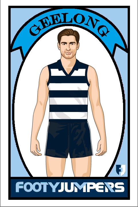
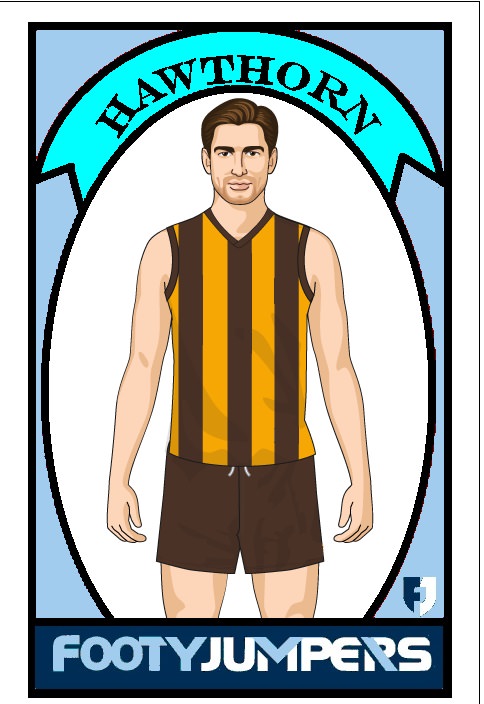
One thing I would like to see is a change made to the footy cards that label the teams.
I created a couple how I see them being made. They also have the player being the player from the jumper pictures, and the cards are labelled footyjumpers.com.
I created a couple how I see them being made. They also have the player being the player from the jumper pictures, and the cards are labelled footyjumpers.com.