Resource www.footyjumpers.com

Remove this Banner Ad

Going by the logo on the jacket, I'd say the thin part of the 'A' and the line through the middle needs to be completely black.

View attachment 617558

Same goes for the bottom of the 'L'

View attachment 617556

along with the lines that come off the 'E'

View attachment 617557

and also the top of the 'T'

View attachment 617555

Now that I've seen it, it does look strange. But maybe that's how it was? If there was white in all parts of the letters it would show on the jacket

I can almost guarantee you the text in that Viatel logo will be all black. Thats just what embroidering looks like from behind.

Case in point: a similar era Crows Adidas jacket. No white to be seen on the Camry text or Adidas logo, but the “fill” between the outlines are white on the back. Check any embroidered item you have and you’ll probably see similar.


435F2E83-0E47-4E3F-A3FF-85B916AD8AD0.jpeg 086BD0FA-09F5-4C91-85FF-BAB03128D976.jpeg
 
yeah came in here to post that!

Looks like tearaway backing, however the 'inbetween' lettering is hard to weed out. Would say the same thing in the lettering being completely black.
 

Log in to remove this ad.

I can almost guarantee you the text in that Viatel logo will be all black. Thats just what embroidering looks like from behind.

Case in point: a similar era Crows Adidas jacket. No white to be seen on the Camry text or Adidas logo, but the “fill” between the outlines are white on the back. Check any embroidered item you have and you’ll probably see similar.


View attachment 617641View attachment 617642

Hadn't given that much thought, but having a look at my Cats polo it makes sense

Picture1.png

I was never into textiles and sewing, but, you learn something new every day :thumbsu:
 
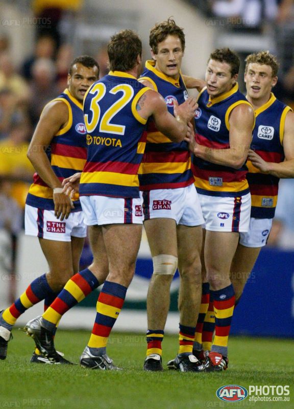
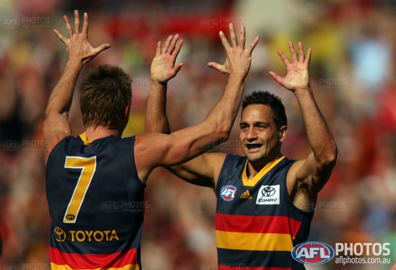
In reference to the Adelaide sponsors backs, a unique version of the Toyota logo was used from 2001-2009. It had a different (and skinnier) font.
168148.jpg

127581.jpg

159649.jpg

1549860966713.png
For comparison, this is the 'normal' Toyota logo that has the wider text.
Toyota-Logo-Transparent.png
 
Sorry Mero, Also for Melbourne
  1. the 2009 PreSeason had the Bushfire appeal detail
  2. 2010 Home didn't have the red dots under the A, E & Y
  3. 2014 White Clash had the black ahg font
 

Attachments

  • 2009 Preseason PI - #37 Matthew Warnock - Back.JPG
    2009 Preseason PI - #37 Matthew Warnock - Back.JPG
    135.6 KB · Views: 153
  • 2010 Home PI - #37 Max Gawn - Back.JPG
    2010 Home PI - #37 Max Gawn - Back.JPG
    130.4 KB · Views: 185
  • 2014 Clash White PI - #39 Neville Jetta - Back.JPG
    2014 Clash White PI - #39 Neville Jetta - Back.JPG
    148.9 KB · Views: 171
I can almost guarantee you the text in that Viatel logo will be all black. Thats just what embroidering looks like from behind.

Case in point: a similar era Crows Adidas jacket. No white to be seen on the Camry text or Adidas logo, but the “fill” between the outlines are white on the back. Check any embroidered item you have and you’ll probably see similar.


View attachment 617641View attachment 617642

Yep that's correct. cannavo acutally still I think owns this track top?


Pedantic stuff coming through - sorry in advance

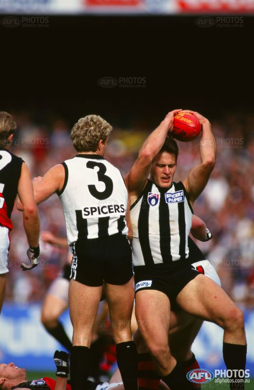
Spicers had a much thinner font

28498.jpg


Viatel - was 1998 not 1999

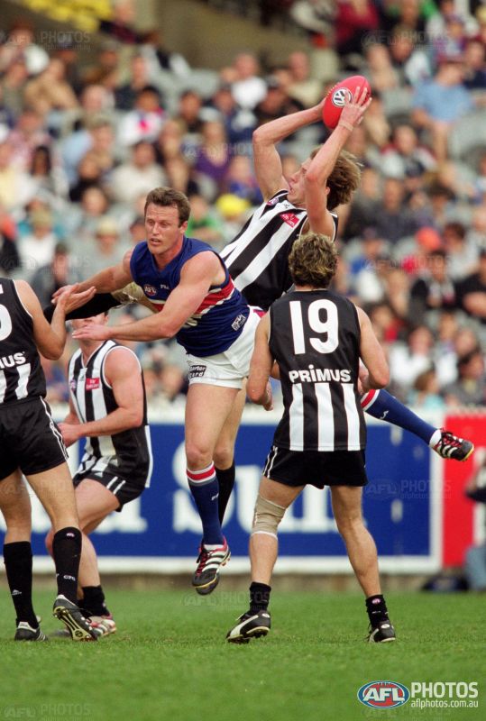
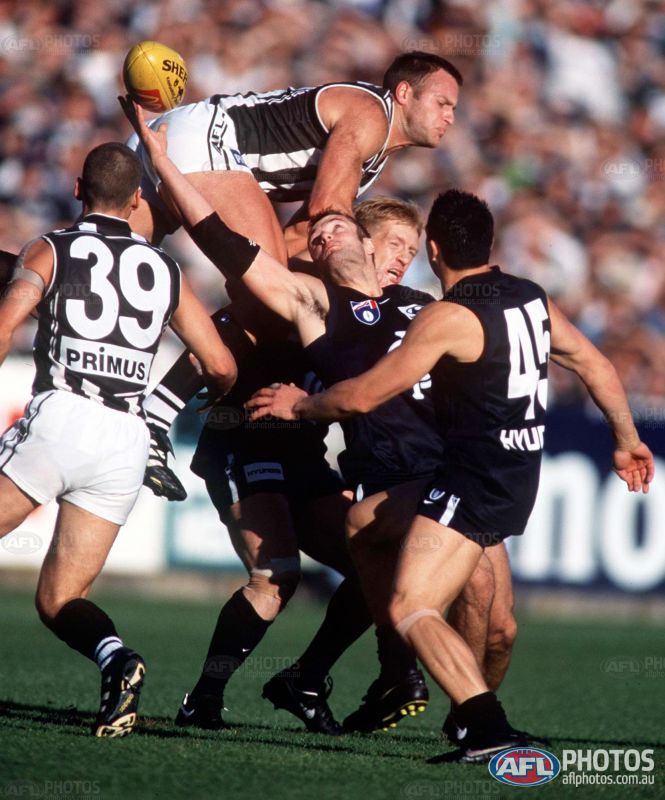
Primus font on the back was different to the one on the front - less squished - more like this but taller and slightly less slanted
primus-telecom-logo-png-transparent.png


143682.jpg


163397.jpg


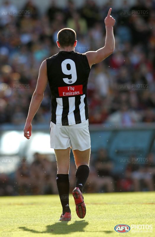
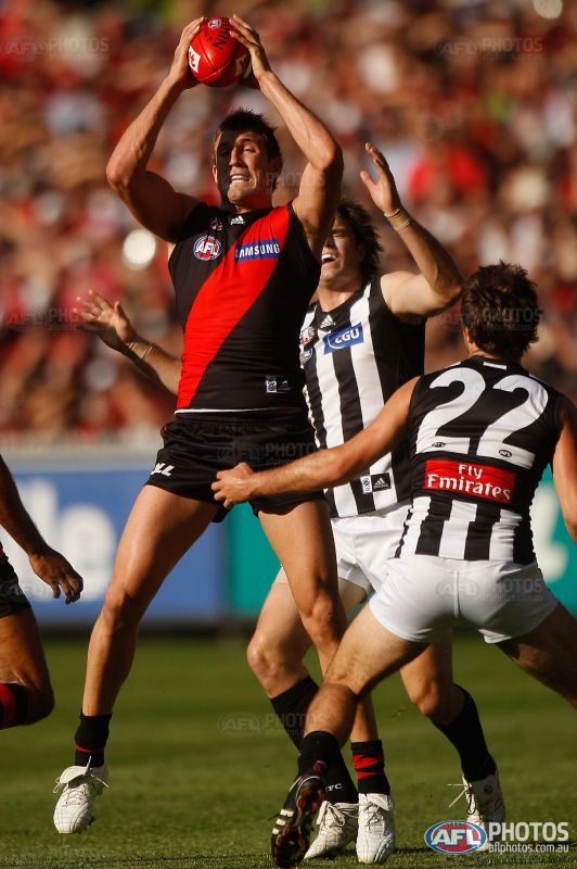
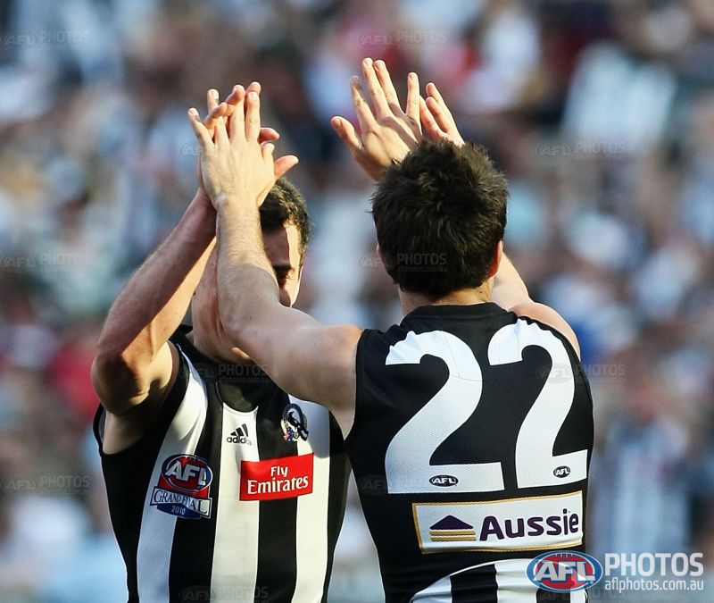
Note differences in Fly Emirates logo stretching and spacing

This is 2007-08
159578.jpg


This is 2011-12
228511.jpg


This is 1998-2000
29116.jpg


Aussie had a yellow border in 2010

219553.jpg


That's all for now :)
 

(Log in to remove this ad.)

Hey Mero, I came across this on the grams:
View attachment 619839
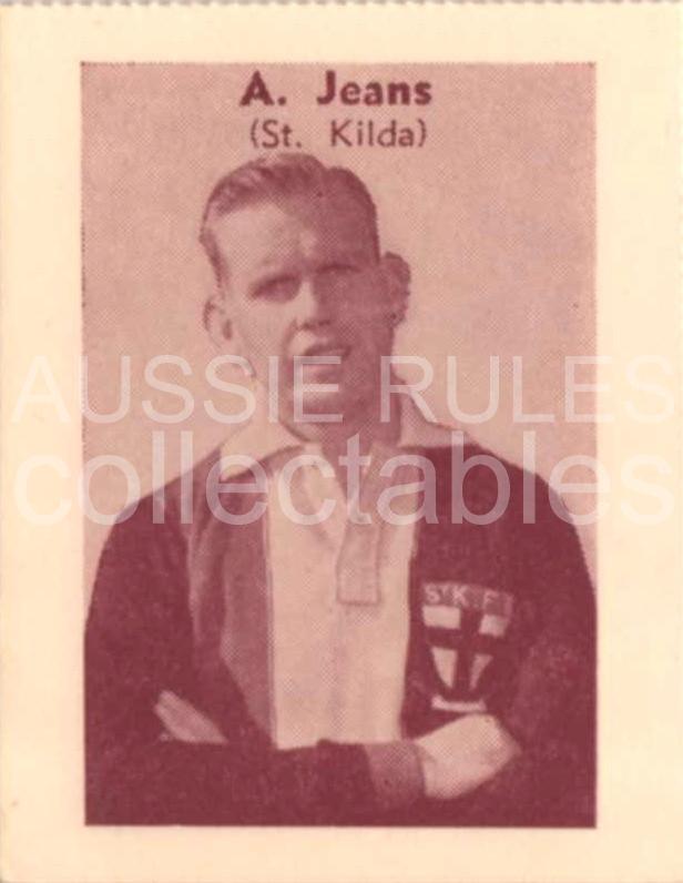
The person who runs the page stated that the two red ribbons were only ever used in 1958, the year Neil Roberts won the Brownlow. I can't seem to find any definitive confirmation of the crest's use in that sole year.
loadImg.php

Most players wore the same jumpers every year, unless they won the premiership, or if the board decided on new designs.

The best footy card version I can find from 1958 season looks like it's red on one side and black on the other.

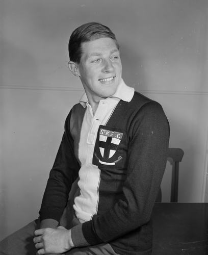
The pic she supplies of Neil Roberts is of a professional shot at a studio, but the jumper looks brand new and unused. (Note the crease in the sleeve like it's been folded like that)
I'd also note the logo in the pic supplied is much larger on the Black material than the one shown in colour.
Neil Roberts' logo takes up most of the Black cloth.
The one in the image maybe half...? But then, perhaps it was folded, there appear to be fold marks

927440-small.jpg
 
Last edited:
Great find Spanna_! Based on that, I would suggest that the "gradient" be made less fluid and more of a sequence of individual colour bands (similar to what is used for the front patch), and that the font should not be bold.
Remember buying the book at a swap meet a few years ago and wondering what the weird Collingwood sponsor was haha. Glad to help out, surprised I was able to recall such an obscure item.
 

Remove this Banner Ad

Back
Top