Mero
Norm Smith Medallist
- Thread starter
- #7,551
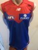
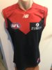
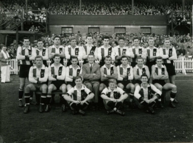
They have (had) one of these jumpers at the club.something else i wanted to ask about was this one:
View attachment 763689
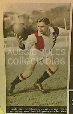
I was just wondering where you sourced the design from. the only picture i've been able to find of this jumper is this one:
View attachment 763690
and the NMFC monogram looks a bit different. would you just put this down to inconsistency between jumpers?
When I interviewed Father Gerard Dowling at the club in about 2007 he showed it to me, and I traced that image to make the jumper