Resource www.footyjumpers.com

Remove this Banner Ad

Back again.

It appears that in 1986 most North Melbourne players wore guernseys with eight blue stripes, instead of six.
View attachment 783105

The six-striped variation (FootyJumpers 1981–95) was more common again from 1987 but some of these eight-striped guernseys appeared now and then.

Cheers, Lemon Boi :lemon:
The 80s were a period of lace-ups, and different sizes of jumpers all offering different variations.
Lace-ups tended to be wider stripes than regular acrylic jumpers, and larger sizes often mean more stripes than some of their teammates.
Smaller size jumpers would have only had three stripes.

But I'll have a look and see.
There's not that many games from 86 to review the North jumpers online.
I do actually have a version of it
North-1986.gif
 
Last edited:
Looked through YouTube, Trove & Footy Record online all evening.
Came to the conclusion in agreement that the 1986 jumpers are a new design.
The stripes are actually thinner than the 1985 jumpers, and therefore all jumpers had stripes on the sides of the jumper.
The next year (1987) it appears the side stripes were removed, even though the stripes on the front were no wider than before.
This marks the first season of North wearing Blue stripes on a White jumper.
The Home page has therefore been amended.
http://www.footyjumpers.com/kangarooshome.htm

All Uniforms have been updated as well:
 
Last edited:
It's a shame they can't seem to get consistent stripe width right on printed form fitting jumpers, that was a great look. I'd like to see a return to 6 wider stripes, to get rid of the big white voids on either side of the jumper (like how hawthorn and collingwood's stripes are.) but this would also be a great change and would set us apart. Of course, every VFL/AFL flag we've ever won was in a 6 stripe jumper so maybe that ship has sailed.

I think that this guernsey worn by Malcolm Blight has six blue and six white stripes of even width all the way around with blue centered down the front and a number panel on the back. Instead of a white panel down the side there is a white stripe.
NM 1977.jpg

Cheers, Lemon Boi :lemon:
 

Log in to remove this ad.

Back again, again.

Melbourne’s royal blue guernsey appears almost sky blue on FootyJumpers compared to the more Footscray blue it appears in photos.
ME 1985 FJ.png ME 1985.jpg

Cheers, Lemon Boi :lemon:
 
That's another group of files that have been overwritten with an older version.

This is what those images looked like 3 years ago.
I've uploaded the current version of the 1975-1986 uniforms and they're all in the same Blue as Footscray and North wore in the same era.
1574441597877.png 1574441643800.png
I'll post them here to show the differences.
Version on the site was the Lighter Blue, it should now be the White shorts version.

Thank you for bringing it to my attention.
 
1574927650706.png
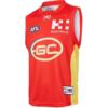
Gold Coast Suns have worn their guernsey with the transparent Hostplus logo including the font from 2016-2019
1574927699807.png

They have also worn Covermore for away matches from 2018- present
1574927741889.png

From 2020, the Suns will have the Hostplus logo with a navy box around it
1574927799731.png
 
Back again, etc.

On FootyJumpers, longies disappear in the early 1960s as more players began to wear sleeveless guernseys in most matches.
But what about the matches when more than half the players on one team wore longies? Shouldn’t their avatar be in a longy for that match?

An example of this is Round 19 1981 when twelve Richmond players wore longies due to the wind at Moorabbin.
Another such match was Round 11 1989 when thirteen Brisbane players wore longies due to the wretched conditions at the M.C.G.

I believe it is necessary to display these rare occurrences on your website; I consider them equal to “one-off” matches such as that Orange Kangaroos match in 2000.

Here are the basic designs, modified from your template to include sleeves, shorts and socks.
RI 1980a.png BB 1989a.png

Cheers, Lemon Boi :lemon:
 
Just found a few things that need correcting xo

Port clash needs a white number panel
20191201_120119.jpeg

Brisbane Yoke is supposed to finish under the cuffs
20191201_120128.jpeg

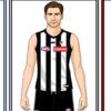
Collingwood is supposed to have a fake rounded cutout at the top of the middle stripe to replicate the 2010 adidas collar
20191201_120057.jpeg

You have the 2019 richmond guernsey where the 2020 guernsey should be
20191201_120110.jpeg
 
Just found a few things that need correcting xo

Port clash needs a white number panel
View attachment 787462

Brisbane Yoke is supposed to finish under the cuffs
View attachment 787464

Collingwood is supposed to have a fake rounded cutout at the top of the middle stripe to replicate the 2010 adidas collar
View attachment 787465

You have the 2019 richmond guernsey where the 2020 guernsey should be
View attachment 787466
Fantastic, thanks for that.
All updated.
 

(Log in to remove this ad.)

Mero the information caption given for the new Port Adelaide logo says it will be worn by both AFL and SANFL clubs, it should read as "teams" not clubs.

Sent from my SM-G950F using Tapatalk
 
Mero the information caption given for the new Port Adelaide logo says it will be worn by both AFL and SANFL clubs, it should read as "teams" not clubs.

Sent from my SM-G950F using Tapatalk
It is one club with multiple teams.
If only the AFL team were wearing the logo then it would be a team logo
 
Problemo, señor…

ME 2000 GF.png ME 2000 GF.jpg

White shorts, not navy.
And the logos on Melbourne’s yoke look too high (or the yoke is too low).

Cheers, Lemon Boi :lemon:
 
The Kangaroos also wore striped socks in Round 6 against Collingwood.
CW KA 2000 6.jpg

And Port Adelaide wore teal socks against St Kilda in Round 11.
SK PA 2000 15.jpg

:lemon:
 
Last edited:

Remove this Banner Ad

Back
Top