Resource www.footyjumpers.com

Remove this Banner Ad

I know that colours can’t be 100% accurate (from dye to guernsey to photo to internet) but I believe Fitzroy had navy blue yokes prior to the mid 1960s before brightening to royal blue in 1968 (with the addition of the Lion emblem).

View attachment 874676

I may be wrong, however.
I think you're right, it's a great pick up.
Most sources talk about colour TV making Fitzroy change but from that jumper, and footy cards online it does look Royal Blue from 1968.
http://aussierulescollectables.com.au/ - Footy cards online
 
I think you're right, it's a great pick up.
Most sources talk about colour TV making Fitzroy change but from that jumper, and footy cards online it does look Royal Blue from 1968.
http://aussierulescollectables.com.au/ - Footy cards online

I noticed in footage that their yoke was a much lighter shade than their maroon body.


Also, this confused me – Maroon with red sleeves?
Murray.jpg
 
Last edited:

Log in to remove this ad.

North Melbourne seemed to have a thin blue line at the bottom of their guernsey in 1974, like Hawthorn did in 1971.
NM 1974.png
 
I noticed in footage that their yoke was a much lighter shade than their maroon body.


Also, this confused me – Maroon with red sleeves?
View attachment 874743
I'd say someone's had that made.
They never wore Maroon with Red sleeves in games
 
This match shows that North Melbourne had adopted thinner blue stripes in 1973, with almost no stripe down the sides.

Basically what you’ve made for 1974 without the bottom stripe.

Sensational Seventies footage shows Doug Wade training in the pinstriped guernsey but all match footage of North shows the newer design.
 
Last edited:
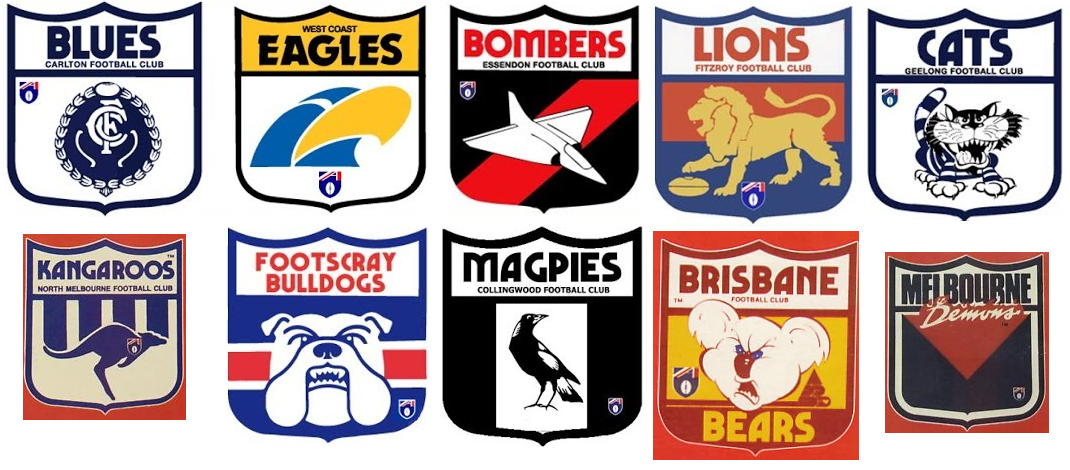
Hey Mero I was wondering if you're willing to update a few of the team logos from the early 90's which included the then-new AFL logo on them? The small AFL logos are in different positions altogether compared the old VFL logos. Please allow me to attach some examples.

L27pJEk.png
 

(Log in to remove this ad.)

Just while we're on the topic of logos, I have a few questions/queries/comments about the Cats logo page:

- The description for our 2000-2007 logo is a little off. The logo itself didn't feature under the sponsor logo on the jumpers until 2001, however it was seen on club merchandise from around 1994

- Does our secondary logo count as an official logo for the page, given it's use on ISC/Cotton On merchandise, as well as on our jumpers?

- Just on a by-eye comparison of the Wikipedia version and the FJ.com version of our current primary logo, the shield has a thinner navy stroke on Wikipedia (and other places using the navy 'CATS' version) compared to the FJ.com version
 
Footscray guernseys either had larger numbers, or higher bands, or wider bands as the number always covered the red band:

1954 Grand Final –
View attachment 878521


Some links:

1961 Grand Final

Round 8 1968

Round 16 1973
I took some screen caps and used them to re-create the jumpers.
I think the bands are OK, but the numbers were slightly bigger and lower.
So I've updated the images on the site to show larger numbers that were slightly lower on the jumpers.
 
Any word on the team logos Mero mate? Sorry if it seems a bit pedantic, I totally understand the primary focus of the site is footy jumpers. It's just the majority of these logos are of date by several years.
 
Hey Mero I was wondering if you're willing to update a few of the team logos from the early 90's which included the then-new AFL logo on them? The small AFL logos are in different positions altogether compared the old VFL logos. Please allow me to attach some examples.

L27pJEk.png

The magpies one here is fake. I’m sure if you were able to source all the correct logo positions for each year (the footy record is your best bet there) then Mero would oblige. I think it’s just a matter of having the research completed
 
The magpies one here is fake. I’m sure if you were able to source all the correct logo positions for each year (the footy record is your best bet there) then Mero would oblige. I think it’s just a matter of having the research completed
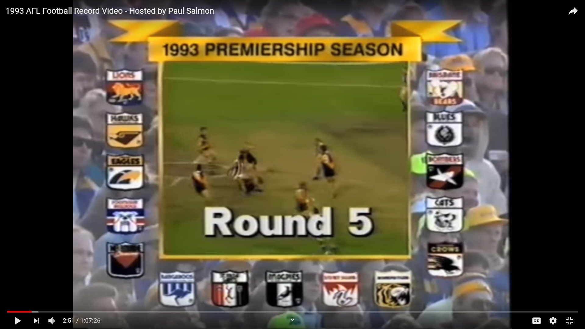
Yeah, that maggies logo looked a bit odd to me too. I few months ago I attached a screenshot taken from an official AFL video. I'm betting that all of the logos in this picture are 100% accurate. It also features the Hawthorn logo, which once again has the AFL logo moved to a different position than the old VFL logo. Plus Richmond's is slightly different to the logo seen on FJ.com

STcU6za.png
 
Haha that pies one is mine. Amazed how often my retro vfl shield portfolio designs pop up randomly
Seems like it was used by some fellow who uploads old footy matches to youtube as a thumbnail.l That's where I happened to see it anyway!
 
I know that you are updating colours, but I noticed these:

Both from 1982
1590059276668.png 1590059282128.png

1995 (was polyester lighter? / socks)
1590059677432.png 1590059685954.png

This bright blue is a menace.
1590059759288.png
 
Well, looks like the logos aren't a priority. It's a bit mind boggling that this doesn't get any attention, let alone any acknowledgement.
 

Remove this Banner Ad

Back
Top