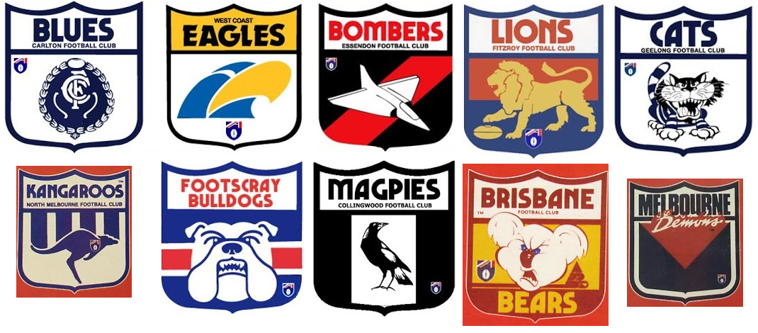
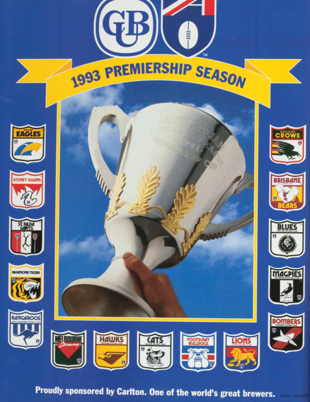
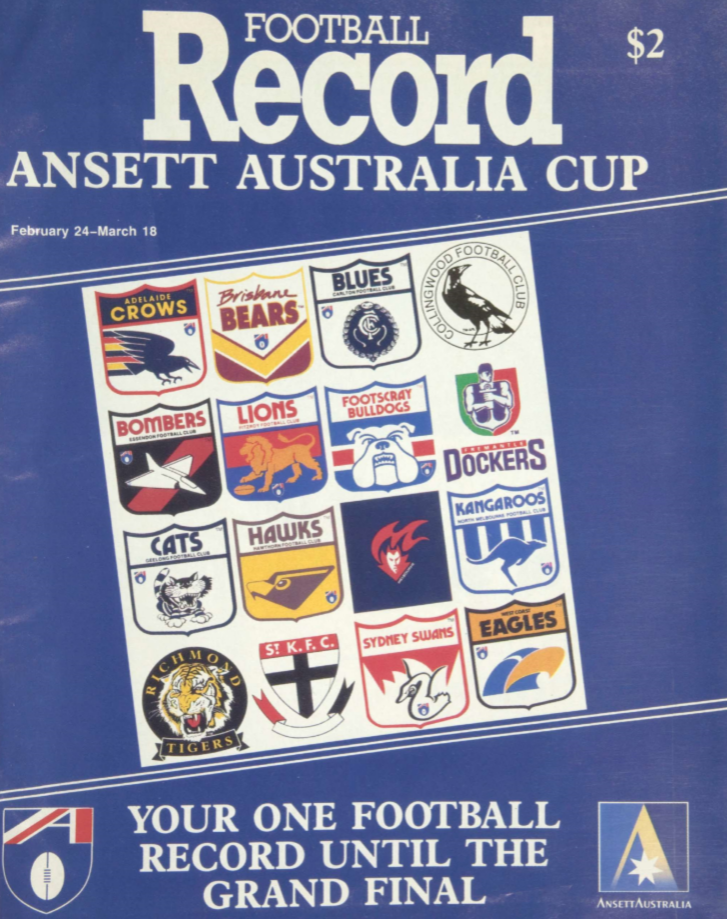
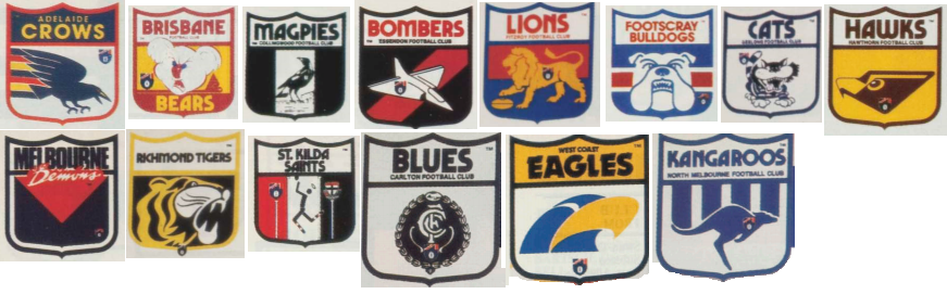
To be fair, it is "footyjumpers.com" but I'm sure it'll get looked at eventually. Seems to be just the placement of the AFL logo for the VFL teams by the looks of thingsWell, looks like the logos aren't a priority. It's a bit mind boggling that this doesn't get any attention, let alone any acknowledgement.
")