Navigation
Install the app
How to install the app on iOS
Follow along with the video below to see how to install our site as a web app on your home screen.
Note: This feature may not be available in some browsers.
More options


You are using an out of date browser. It may not display this or other websites correctly.
You should upgrade or use an alternative browser.
You should upgrade or use an alternative browser.
Resource www.footyjumpers.com
- Thread starter Mero
- Start date
- Tagged users None


- Moderator
- #7,877
Looks like Carlton have added a name above the logo on the back of the jumper now although it appears Curnow didn’t have a name..
View attachment 901856 View attachment 901857
May I suggest "A MEMBER" for the graphic, Mero ?
Debutants just have SHINBONER on the back neck, probably just leave it at that on yours?
Also North have moved the EST 1869 to the bottom right of the back of the jumper - written sideways...
Just checked and It’s been there since Round 1 as well.

Just checked and It’s been there since Round 1 as well.

Last edited:
Mero
Norm Smith Medallist
- Thread starter
- #7,880
It's happening three times, the Essendon game was the first.Looks like Carlton have added a name above the logo on the back of the jumper now although it appears Curnow didn’t have a name..
View attachment 901856 View attachment 901857
Carlton to pay tribute to members with special match-day guernsey
Carlton to pay tribute to members with special match-day guernsey
 www.foxsports.com.au
MKMatty
Busy Vibin’

- Moderator
- #7,882
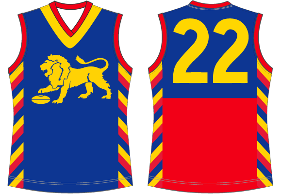
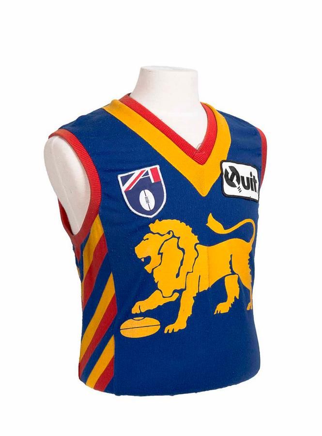
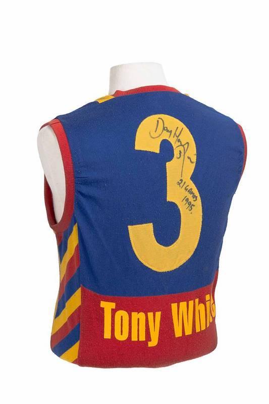
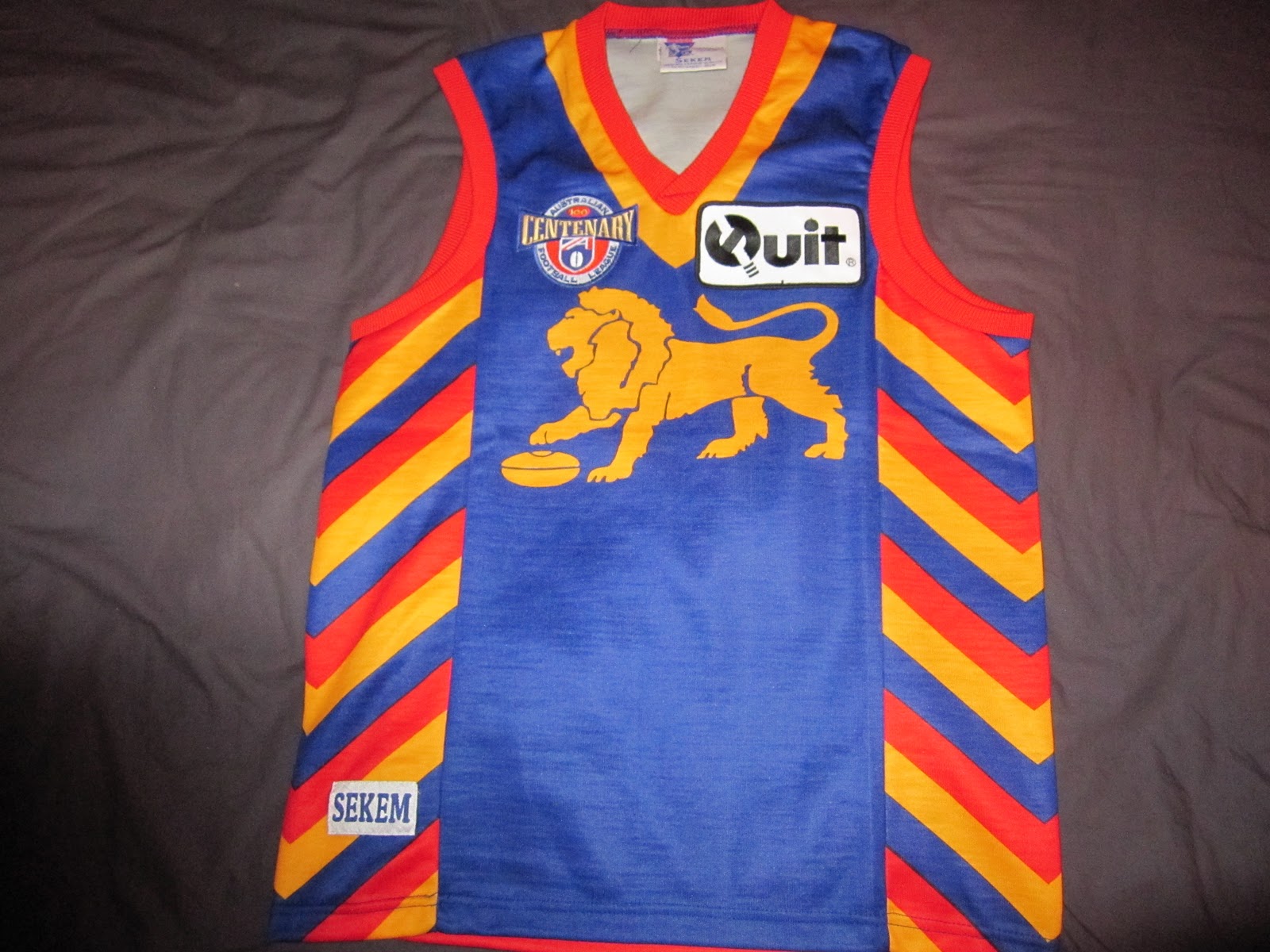
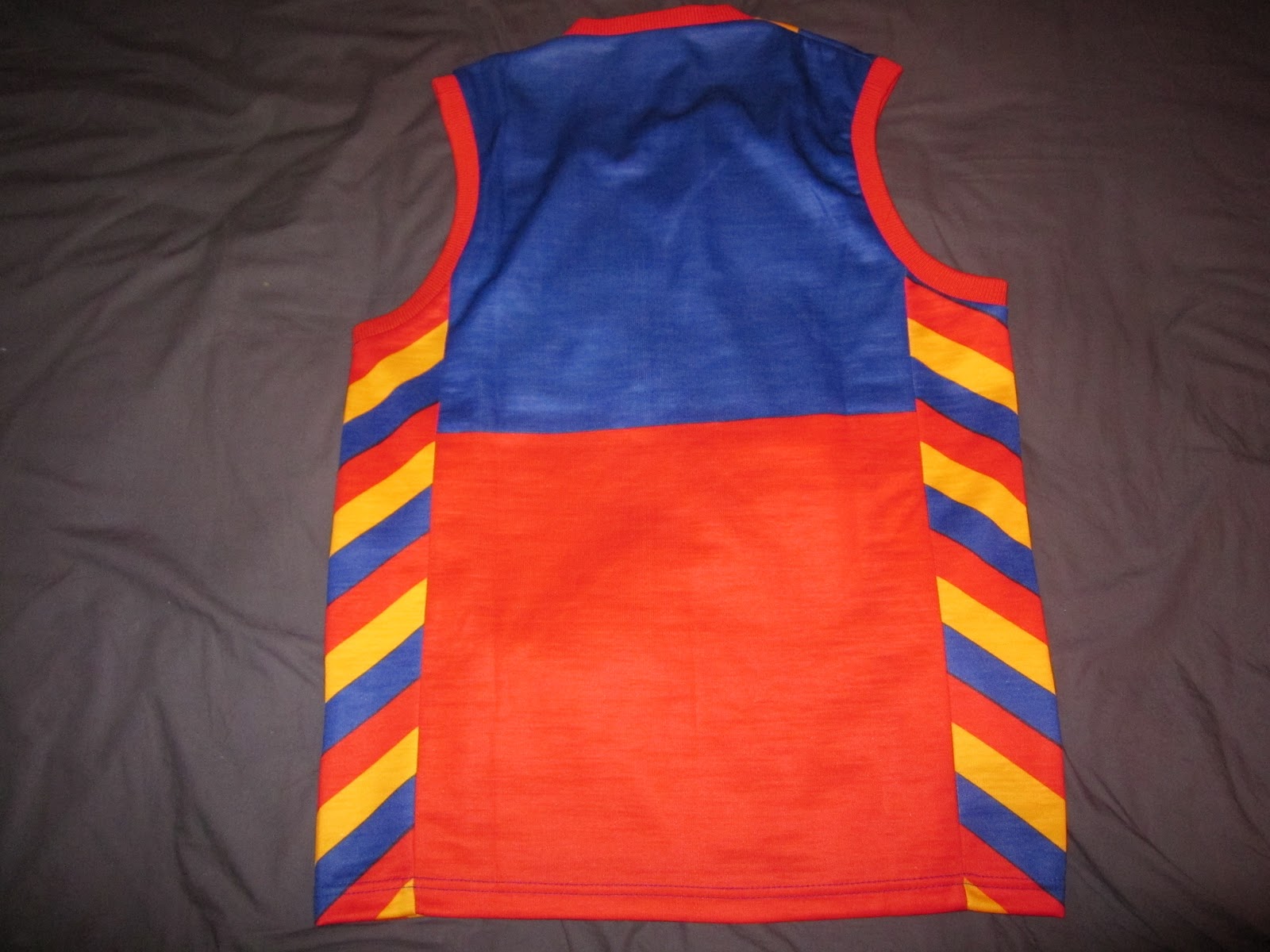
Was just having a look at some photos of the famous Fitzroy pre-season jumpers and noticed they were a little off on FJ.com (sizing of lion, width of stripes in comparison to cuffs, stripe order etc).
Here's the pics of each year for reference, vs. what's on the site. Cheers")
1995
1996
Here's the pics of each year for reference, vs. what's on the site. Cheers
1995
1996
the_cleaner
Senior List
- Jul 19, 2020
- 190
- 295
- AFL Club
- North Melbourne
Mero
Norm Smith Medallist
- Thread starter
- #7,884
That's the on-field logo. It's a secondary logo, not the official club logo.Mero
just a quick question as to why on the logo section you haven’t added the other geelong cats logo that they use a lot more like on all there media polos etc?
If I was to include it it then opens up logos like the Crows We Fly As One crow (which they use on their Clash jumper), West Coast Eagles gradient Eagle that they wore on the Tri-Colour and Ochre jumpers, the 'were they official, were they just merchandise logos?' of the 90s.
As seen on this coffee mug: https://www.redbubble.com/i/mug/Essendon-Shield-logo-by-footyjumpers/39909646.W3OIY?asc=u
I have drawn a line at Official Club logo. So the on-field cat doesn't qualify.
Attachments
- Mar 30, 2014
- 2,600
- 4,261
- AFL Club
- Brisbane Lions
- Other Teams
- Dolphins, Seattle Kraken
Also that Essendon logo is amazingly boring lolThat's the on-field logo. It's a secondary logo, not the official club logo.
If I was to include it it then opens up logos like the Crows We Fly As One crow (which they use on their Clash jumper), West Coast Eagles gradient Eagle that they wore on the Tri-Colour and Ochre jumpers, the 'were they official, were they just merchandise logos?' of the 90s.
As seen on this coffee mug: https://www.redbubble.com/i/mug/Essendon-Shield-logo-by-footyjumpers/39909646.W3OIY?asc=u
I have drawn a line at Official Club logo. So the on-field cat doesn't qualify.
the_cleaner
Senior List
- Jul 19, 2020
- 190
- 295
- AFL Club
- North Melbourne
ohh okay, was just curious that’s all. because i seem to see that logo that they use on their media polos a hell of a lot more then i do there other logo. not sure why they don’t use secondary logo full time. much better logo IMOThat's the on-field logo. It's a secondary logo, not the official club logo.
If I was to include it it then opens up logos like the Crows We Fly As One crow (which they use on their Clash jumper), West Coast Eagles gradient Eagle that they wore on the Tri-Colour and Ochre jumpers, the 'were they official, were they just merchandise logos?' of the 90s.
As seen on this coffee mug: https://www.redbubble.com/i/mug/Essendon-Shield-logo-by-footyjumpers/39909646.W3OIY?asc=u
I have drawn a line at Official Club logo. So the on-field cat doesn't qualify.
For those watching this thread but not necessarily across the board as a whole, head on over to this thread to wrap your ears around an in-depth podcast with the man behind footyjumpers.com himself, Mero!
Would you ever be open to changing your mind and taking Creamer's approach? I'm sure everyone around here would pitch in and create vectors. It would be a really cool project IMOThat's the on-field logo. It's a secondary logo, not the official club logo.
If I was to include it it then opens up logos like the Crows We Fly As One crow (which they use on their Clash jumper), West Coast Eagles gradient Eagle that they wore on the Tri-Colour and Ochre jumpers, the 'were they official, were they just merchandise logos?' of the 90s.
As seen on this coffee mug: https://www.redbubble.com/i/mug/Essendon-Shield-logo-by-footyjumpers/39909646.W3OIY?asc=u
I have drawn a line at Official Club logo. So the on-field cat doesn't qualify.
DiamondGuy
Le goûter qui »BANG«
- Sep 25, 2013
- 972
- 2,265
- AFL Club
- Geelong
- Other Teams
- Norwich, St Kilda
Just listening to the podcast and since Mero says he's happy for nitpicking in the name of "getting it right" I will bother when I see something.
Main thing here is the GF logo placement. But also Saints crest size. (I'd even say the cross is too thin for all seasons 1997-2002.)


The GF issue applies to 1998 as well and possibly other years.
Main thing here is the GF logo placement. But also Saints crest size. (I'd even say the cross is too thin for all seasons 1997-2002.)


The GF issue applies to 1998 as well and possibly other years.
Another quick one, the Yes logo above the numbers on the Crows home jumper is yellow, not white.


Mero
Norm Smith Medallist
- Thread starter
- #7,891
I don't disagree with you, I prefer it over the cat face one. However, I wanted to draw a line somewhere, and that one ends up on the other side of it.ohh okay, was just curious that’s all. because i seem to see that logo that they use on their media polos a hell of a lot more then i do there other logo. not sure why they don’t use secondary logo full time. much better logo IMO
Mero
Norm Smith Medallist
- Thread starter
- #7,892
All Crusader jumpers have been fixed, including adding the Sekem Yellow 2002 version.Just listening to the podcast and since Mero says he's happy for nitpicking in the name of "getting it right" I will bother when I see something.
Main thing here is the GF logo placement. But also Saints crest size. (I'd even say the cross is too thin for all seasons 1997-2002.)
View attachment 915692View attachment 915700
View attachment 915691View attachment 915703
The GF issue applies to 1998 as well and possibly other years.
Mero
Norm Smith Medallist
- Thread starter
- #7,893
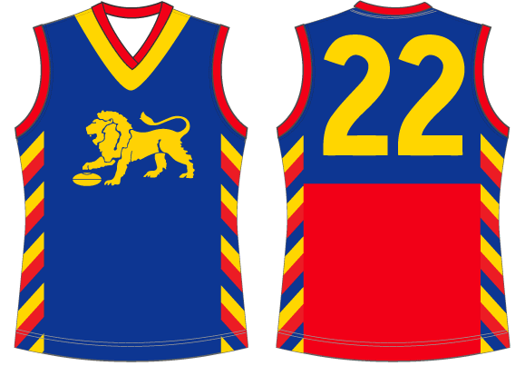
How do they look now?Was just having a look at some photos of the famous Fitzroy pre-season jumpers and noticed they were a little off on FJ.com (sizing of lion, width of stripes in comparison to cuffs, stripe order etc).
Here's the pics of each year for reference, vs. what's on the site. Cheers
1995
1996
DiamondGuy
Le goûter qui »BANG«
- Sep 25, 2013
- 972
- 2,265
- AFL Club
- Geelong
- Other Teams
- Norwich, St Kilda
They look fantastic! Could you beef them up on the "all jumpers" page too?All Crusader jumpers have been fixed
I've got another one while I'm nitpicking St Kilda. The crest patch worn 1987-1995 was not square, it had rounded corners.

As far as I can tell from some quick research, the change from square to rounded occurred at the start of 1987.
I think the crest patch is a touch small on the site. It's pretty big, it's much wider than the Philip Morris patch and the Snowdeli patch.
I'm sure you saw this news article in 2013 when the Saints uncovered a guernsey from 1888.
The thing is, it has a lot more stripes than the one on the site. He's holding it weirdly, but you can count 9 stripes on each side of the front.


Last edited:
DiamondGuy
Le goûter qui »BANG«
- Sep 25, 2013
- 972
- 2,265
- AFL Club
- Geelong
- Other Teams
- Norwich, St Kilda

Me again.
These are in the away section, but in 2001, this was definitely not a clash jumper! It was worn once, as a promotion, and it was a home game!
I suspect the colour is slightly off as well but I can't say conclusively as there is conflicting evidence. I think 2001 (and maybe 2002) was more of a "straight" or even a neon yellow and not a golden yellow (as shown). Looks like 2003 is definitely the correct golden yellow though. It's frustrating as the evidence varies widely between photos and videos (I'm sure Mero knows the feeling). In some it certainly looks fluoro. In others, not so much... but I definitely don't think it's a golden yellow.

If 2001 was a one-off, is 2002 as well?
EDIT: Brief discussion deleted. I looked up the Record from the game and bingo, the 2002 is definitely a clash, not a one-off promo.
Pura Milk must have been happy with that...
Last edited:
DiamondGuy
Le goûter qui »BANG«
- Sep 25, 2013
- 972
- 2,265
- AFL Club
- Geelong
- Other Teams
- Norwich, St Kilda
Last comment from me on this. I think all three of these are different yellows.
2001 (fluoro) and 2003 (golden) are looking good but I'd tweak 02 (neither fluoro nor golden). Of course, you've got the final call, Mero.

2001 (fluoro) and 2003 (golden) are looking good but I'd tweak 02 (neither fluoro nor golden). Of course, you've got the final call, Mero.

Last edited:
Mero
Norm Smith Medallist
- Thread starter
- #7,897
OK, so DiamondGuy .
Here's what I've changed.
Saints rounded crest with the rounded ends I found in the front of the R9, 1986 Footy Record.
So I've added it to all jumpers 1986 to 1995 when printed (sublimated) jumpers came in and they used the actual club crest.
Crusader now has a thicker cross in all images.
1886 jumper changed to allow for more stripes and no reinforcing.
Yellow jumpers. 2001 added to Promotional. 2001-02 Yellow lightened.
All changes are made to the Jumper in the section they belong to, and to the Uniform pages.
Last edited:
DiamondGuy
Le goûter qui »BANG«
- Sep 25, 2013
- 972
- 2,265
- AFL Club
- Geelong
- Other Teams
- Norwich, St Kilda
94, 95, 96 still have square corners under uniforms.
Last edited:
MKMatty
Busy Vibin’
Mero small change but the front sponsors for West Coast require a tweak. The Hungry Jacks logo you currently have labelled ‘2019-‘ was only used last year and the club has reverted the one one used for 2018 in 2020. Please amend so the white box logo shows ‘2019’, and the red box variant ‘2018, 2020-‘.
pedantic but accurate.
pedantic but accurate.
the_cleaner
Senior List
- Jul 19, 2020
- 190
- 295
- AFL Club
- North Melbourne
Hey Mero just noticed the ISC on the site is white when it’s gold on the shorts
