Resource www.footyjumpers.com

Remove this Banner Ad

I was doing the inside the collar thing, but then stopped.
I haven't bothered going back and taking it off the ones I've done, but I'm not adding them to the site moving forward.
As was pointed out to me, should I also include things like the club theme song which was inside the back of the Collingwood jumpers for many years?
I decided to ignore anything that is not shown when the jumpers are worn.
One day I'll get to taking them off the collars

PS The other changes are done.
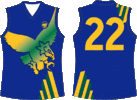
North Indig
Melbourne Clash
Geelong Retro
 
Hi Mero. The Fremantle indigenous jumpers seem to have a less obvious pattern on their shoulders than the original design (Sean Darcy's in the Round 10 game has a bit more detail though): see the AFL photo galleries for rounds 10 & 11. Also, there's a brighter midriff/waist band on the home indigenous jumper.
 

Log in to remove this ad.

Hi Mero. The Fremantle indigenous jumpers seem to have a less obvious pattern on their shoulders than the original design (Sean Darcy's in the Round 10 game has a bit more detail though): see the AFL photo galleries for rounds 10 & 11. Also, there's a brighter midriff/waist band on the home indigenous jumper.
Lightened the Mauve and fixed the shoulder striping on the Uniforms and the Jumper pages.
 
Hey mero,

Just on the 2022 crows indigenous jumper

Firstly on the indigenous page, you’ve got last years design duplicated

IMG_9767.JPG

And you’re missing the thin white outline on the numbers and the Crypto.com sponsorship above the numbers

IMG_9768.JPG

IMG_9766.JPG


Sent from my iPhone using BigFooty.com
 
Hi Mero, just been doing some SANFL research of my own and noticed a couple of mistakes on the Sturt page. Firstly the 2002 jumper should have a large blue collar. I've added one to the design I've used so you can see the difference. Secondly, Sturt didn't add the club logo on the side of the jumper until 2016. You should remove the logo from 2011, 2012-2013 and 2014 Thirdly, the 2011 jumper should have sturt.com.au in the left hand corner. I've attached a sample. Lastly, 2009-2010 should have 'Sturt FC' above the numbers. I've attached a reference. Cheers
 

Attachments

  • 2002.jpg
    2002.jpg
    38.3 KB · Views: 65
  • IMG_7706.jpg
    IMG_7706.jpg
    49.9 KB · Views: 43
  • IMG_7710.jpg
    IMG_7710.jpg
    213.8 KB · Views: 43
  • IMG_7687.PNG
    IMG_7687.PNG
    935.2 KB · Views: 47
Hi Mero, just been doing some SANFL research of my own and noticed a couple of mistakes on the Sturt page. Firstly the 2002 jumper should have a large blue collar. I've added one to the design I've used so you can see the difference. Secondly, Sturt didn't add the club logo on the side of the jumper until 2016. You should remove the logo from 2011, 2012-2013 and 2014 Thirdly, the 2011 jumper should have sturt.com.au in the left hand corner. I've attached a sample. Lastly, 2009-2010 should have 'Sturt FC' above the numbers. I've attached a reference. Cheers
Fixed.
Also, the Cellular One logo you're looking for is
Cellular-One.png
I can't make out the Green & Red logo
 
Last edited:
A number of clubs still need this years indigenous jumpers updated in their club jumpers indigenous section:
Brisbane, Collingwood, Bulldogs, North Melbourne and Melbourne.
 
New Podcast is up:
Episode 7 is mostly spent on the dramatic changes admitting the Eagles and Bears into the comp had on the look of footy.
 

(Log in to remove this ad.)

Found an error. Woodville West Torrens started wearing this jumper in 1998, not 1997. Cheers.
 

Attachments

  • B8F45ECB-8A3A-4915-9A03-C71944C5F908.gif
    B8F45ECB-8A3A-4915-9A03-C71944C5F908.gif
    28.6 KB · Views: 46
Again another enjoyable podcast episode Mero.

I was actually looking into the early seasons of West Coast (and Bears), can you explain how they allowed these short clashes back in the late 80s? Thought Geelong wearing home shorts against black or even against Dees was shocking enough but this really happened...

Going to be an interesting one next time with some of the awful jumpers you and Lachie pre-shadowed.

1655796803188.png

1655796695352.png
 
From 1985 the VFL decided to go with Coloured shorts in every game, except where the Away team wore the same colour as the Home team.
So for example Essendon only wore White shorts when Away to Collingwood, Richmond & StKilda.
In these days uniform expectations were faxed to the clubs on a Tuesday morning. I know this because my dad was a Property Manager at Essendon.
Here he is on-field at quarter time in the 1985 GF.
This faxing was probably maintained by some admin person at AFL House.
Whatever was going on, there was a mishmash of matchups during the 1987 season.
Melbourne for instance wore White shorts away to Footscray, but not Fitzroy.
North wore Blue shorts against Melbourne, but not Carlton.
 

Attachments

  • PA-025.jpg
    PA-025.jpg
    919.1 KB · Views: 68
Podcast Episode 8 is now uploaded
1990 - 1995
Adelaide & Fremantle join the comp.
Sublimated jumpers are available
Also available on Spotify & Apple Podcasts
 
Fantastic podcasts Mero! You mentioned we don't know where the 'barcode' magpie design came from, it was designed by the receptionist at Puma.

I was speaking to the head of the Puma coolmax jumpers of the time and they approached the Pies with 3 designs, two of them were terrible and the barcode design was the one Puma wanted them to pick! The receptionist would sit at the front desk and scribble out different ideas to help the graphic designers.
Apparently Hawthorn were more of a pain to work with in terms of creating a pre season design.
 
Podcast Episode 8 is now uploaded
1990 - 1995
Adelaide & Fremantle join the comp.
Sublimated jumpers are available
Also available on Spotify & Apple Podcasts
Good one. I wonder if you know why some football guernseys improve in quality around 1998. I noticed Port's guernseys from 1997 look like poor quality compared to the 1998 season, where it jumped in better quality. Basically, when the appeal logo starts to appear below the neck collar, in coincides with the quality of the guernseys improving.
 
Last edited:
Good one. I wonder if you know why some football guernseys improve in quality around 1998. I noticed Port's guernseys from 1997 look like poor quality compared to the 1998 season, where it jumped in better quality. Basically, when the appeal logo starts to appear below the neck collar, in coincides with the quality of the guernseys improving.
Thicker material weight & improvements in the printing (Dye) technology were the two obvious ones I noticed at the time.
 
Asking about this here because fj.com has a state of origin section, but I stumbled across this picture in an AFL article about Kelvin Templeton, is this actually against South Australia? Obviously that's the generic ANFC jumper but given SA and Vic don't clash is this just a mislabelled image of a different rep team that clashes with Victoria? I can't find video footage so hopefully someone can help. If it is in fact SA then it probably should go in the SoO section for them. 1656827211162.png
 

Remove this Banner Ad

Back
Top