lmach
Naitanui2Yeo
The shields are back.


Follow along with the video below to see how to install our site as a web app on your home screen.
Note: This feature may not be available in some browsers.


Love the logo!The shields are back.


Well, sorry but it's still heritage, ain't it?Gotta say...
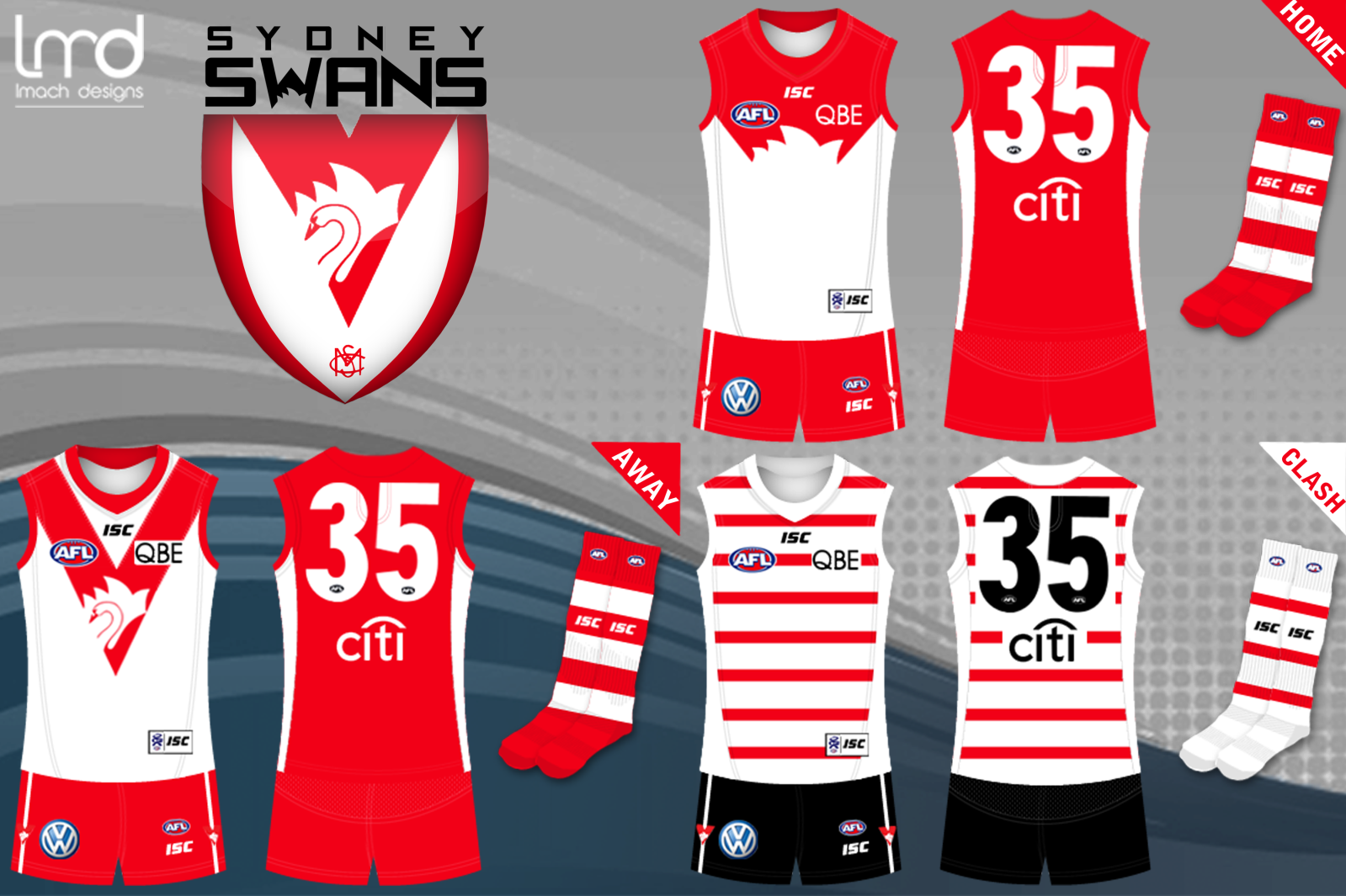
I don't really get the fascination with giving Sydney black shorts on a heritage or clash guernsey etc.
I mean it's not like South Melbourne weren't around to see red or white shorts.
That's amazing.
Cheers bud.That's amazing.

Love everything except the number box on the back. IMO it will look better if you have black numbers with a white outline or white numbers with a black outline.richmond clash

Love everything except the number box on the back. IMO it will look better if you have black numbers with a white outline or white numbers with a black outline.
Great work though[/quot yea and ill tryfix that up

Read the last sentence.
Ahh right cheers.Read the last sentence.

The shields are back.


Sorry to go off topic, i know it was against Collingwood but can anyone tell me what the W on the other player,(not Goddard) is,Reminder of how good it

Sorry to go off topic, i know it was against Collingwood but can anyone tell me what the W on the other player,(not Goddard) is,
After looking at the photo again I believe that is right, I thought it was the front of the jumper, I am now convinced it is the back, thanksNot 100% sure what the W is, it could be the "Wipe off 5" apart of the TAC campaign/sponsorship a few years back
Thanks mate. That Lions one was probably Workhorse's design on page three of this thread.Awesome work mate, I rekon more clubs should use shields/crests. I saw a lions one the other day and thought it looked awesome as well.
I wonder why they took 'Fortius Quo Fidelius' out of the logo for this jumper.Reminder of how good it looks:

It doesn't look too bad without it.I wonder why they took 'Fortius Quo Fidelius' out of the logo for this jumper.
Yeah true, but I wonder why they would just decide to take it out?It doesn't look too bad without it.
