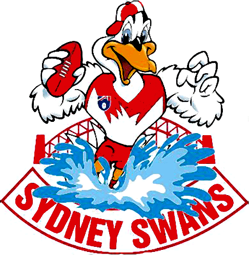
With so many clubs changing Logo's and marketing/merchandise becoming a crucial factor in the coming decade with more and more people "representing" their club when they step out of their house, it has made me wonder which team has the best logo and worst logo in the AFL.
I personally love the Geelong logo especially the one that is on their guernseys, and unfortunately hate the Adelaide logo though I love the team!
I personally love the Geelong logo especially the one that is on their guernseys, and unfortunately hate the Adelaide logo though I love the team!