Portfolio akkaps Um....

Remove this Banner Ad

Random title for a thread, I know, but I started with this concept before BigFooty in 2012 while I was stalking this board, and 'Um....' was the name I used for this back then and haven't had the need to change it.

I got the idea of this portfolio from the original versions of the NAFL and wanted to create my own version, with my own teams as at that time there was no NAFL competition running. I came up with names and colours for teams across Australia and New Zealand, and have finally been able to finish off my designs on a template I like.

I have taken some designs, team names and concept from some real life teams and some concepts from this board. I will explain all the connections between teams, and give credit where to due to the teams and people the require it.

All teams will come with a home kit and a clash kit, some teams will come with heritage/pre-season depending on other concepts that I could think of. As for logos, they are also limited to a few teams which was dependent on how much I could really be bothered creating them at the time and/or difficulty of what I had pictured it should be.

As you will see, I have taken team names and ideas from this league and used it around the board. I also have a similar version of this that goes world wide and international teams have been taken from that league.

I will be using random.org to sort the order of posting, instead of going alphabetically.

Teams:


Once I finish posting this portfolio, I will try to get back to my 'Countries of the World' portfolio which hasn't been updated for some time.
 
Last edited:
  • Thread starter
  • Moderator
  • #2
Darwin Kangaroos

Okay, so fist team off the rank are the Kangaroos. This was the last team name that I came up with. I had always thought that there were heaps of Kangaroos in Darwin so I decided upon this name.

The design is basically a rip-off of North Melbourne (even with the use of the Canterbury template), with the addition of Ochre/Orange which can be found on the NT flag.

Home:

The home jumper is a copy of the much loved Kangaroos away/clash jumper from 1996-2002, I have chosen to replace the white on front with the ochre so that it becomes a darker jumper. I was able to keep the number panel, which I think looks really good.

darwin_home.png

Clash:

Another copy of the current North home jumper with the addition of the ochre middle stripe and a full middle stripe that goes all the way to the collar.

darwin_clash.png

Logo:

My inspiration for this logo was also a former North logo, but I didn't want to have a direct copy of it.

darwin_logo.png


Font:
Skoda Pro ExtraBold

Sponsors:
The Ghan
Northern Territory Government
Darwin International Airport
 
Last edited:

Log in to remove this ad.

  • Thread starter
  • Moderator
  • #4
Tassie Devils

Originally the Hobart Devils, I decided to change the name to 'Tassie' just recently, you'll see the reason in my choice of sponsors and my logo

For the design of this team, I wanted to replicate the Tennessee Titans logo 'T' as best as I could. I also wanted to replicate this jumper I made for the same team in my NFL crossover portfolio. I have green in both my Tasmanian teams, with red and yellow being the differentiating factor for both of them. It's red for the Devils.

It's probably not that hard to guess what the other Tasmanian team will be called ;)

Home:

As much as I wanted to replicate the above linked jumper, red and green striped just did not work. Therefore I went with a watermarked green instead of the red. The red remains as the trim on the Adidas collar.

devils_home.png


Clash:

So basically, it's a recolour of the home jumper with a lighter watermark for the stripes.

devils_clash.png


Logo:

I went with a red 'T' so that it would stand out on the green jumper better. I also tried to fit the 'T' into a Tasmanian outline, but all the outlines on the google search were too intricate. I then tried to draw my own, but it looked terrible. I ended up putting a monogram and map within the 'T' on the logo.

devils_logo.png


Font:
FoglihtenNo07calt

Sponsors:
Gunns
Looney Tunes
Tasmanian Devil
 
  • Thread starter
  • Moderator
  • #5
Gold Coast Sharks

I have named this team after the Southport Sharks which is situation in the Gold Coast region. I also have a concept called the Gold Coast Angels (names after the Anaheim Angels) but that is no a different portfolio of mine.

The colour scheme is a direct rip off of the Cronulla Sharks, but the colours work so well together that I couldn't miss the opportunity to put them into this team. I tried to make a logo similar to this, but it just didn't work out that well.

Home:

For the home jumper, I wanted some kind of chevron design. I went with the former Bears design because I couldn't quite work out how to make a white version of what I originally intended as the home jumper. This alternate design, features as my heritage jumper for the Sharks in this portfolio.

gold_coast_home.png


Clash:

A white version of the of the home jumper, nothing too special about it.

gold_coast_clash.png


Heritage:

For this design, I wanted to mix this Cronulla Sharks jersey with the Southport Sharks jumper. And I really like the outcome.

gold_coast_heritage.png


Font:
King

Sponsors:
Sea World
Jupiters Casino
Gold Coast Convention and Exhibition Centre
 
  • Thread starter
  • Moderator
  • #6
Adelaide Stars

This team came about after seeing Mr Zero's Houston Stars, and thinking I could do better.

Originally the colours were going to be blue, yellow and red after the Adelaide Crows, but as the other Adelaide team is red and black, I dropped the red from the Stars design.

Home:

It is purely coincidental that this design is similar to the Essendon Doutta Stars jumper, but I went with it anyway.

stars_home.png


Clash:

The white inverse of the home jumper, the navy outline of the star is to help outline the star on the jumper.

stars_clash.png


Heritage:

This is intended more a pre-season jumper rather than a heritage jumper. The idea is taken from the pink and black Juventus jersey from a few seasons ago which feature a star in this manner.

stars_heritage.png


Logo:

I wanted to incorporate the star as the 'A' on the logo, and tried to play around with the old Dallas Stars logo, but it looked s**t. I was able to get the Stars logo done pretty quickly and made some adjustments to it for a Melbourne Stars logo competition run last year.

stars_logo.png


Font:
NFL Eagles

Sponsors
WestEnd
University of South Australia
Adelaide Metro
 
  • Thread starter
  • Moderator
  • #9
Newcastle Magpies

I named this side after the EPL club Newcastle Utd. Well duh. It was an easy choice and something I could work with.

Black and white were an easy choice for the colours for the Magpies, I also have a kit in Newcastle's traditional blue and red. I tried to recolour a black raven it make it black and white, but well... it just wasn't good enough.

Home:

White jumper and black shorts. what's so hard about that. It's also the basis of the Newcastle Utd design.

newcastle_home.png


Clash:

If Collingwood goes with the above for a home kit, I would love to see this as a clash jumper.

newcastle_clash.png


Heritage:

This could also be classified as a pre-season, but it's basically recoloured jumper with blue and red which are the traditional Newcastle, NSW colours. This had to be done.

newcastle_heritage.png


Font:
NFL Chargers 2007

Sponsors:
Newcastle Airport
The University of Newcastle
Wests
 
  • Thread starter
  • Moderator
  • #12
Canberra Griffins:

This name came from Canberra's own Lake Burley Griffin.

The colours come from the ACT flag, being blue and yellow. I have done used this name and set of colours for a previous NAFL campaign, and have decided to develop those designs for this portfolio. The colours have been changed slightly for better aesthetics.

This set of kits have some spoilers for this seasons NAFL entry of mine. Therefore, I will not be posting the full logo that I designed.

Home:

This is basically a rehash of the NAFL home jumper. The reason I used the sash for this jumper was because I wanted to recreate the Williamstown Seagulls jumper because I like it so much. I don't think it worked because I didn't do so well.

griffins_home.png


Clash:

I changed up my clash jumper by taking out the thick blue sash. I added the logo to the front as I felt that it would bring things together well. Without the logo, the jumper looks quite blank.

griffins_clash.png


Heritage:

A play on my heritage jumper from before. I swapped the yellow and blue for a new look. Though I think I prefer the look of the original jumper better for this.

griffins_heritage.png


Font:
Canberra

Sponsor:

University of Canberra
Canberra
TransACT
 
  • Thread starter
  • Moderator
  • #13
Melbourne Foxes

This team name came from Cory and his NAFL jumpers from the previous version of the competition.

The colours are coincidently the same as the Melbourne Demons. The colours for the Foxes came about due to a cricket competition that I was apart of in 2010. I played for the Melbourne team that wore blue and red, while the other Melbourne team in that competition wore blue and white which is the colours for the other Melbourne team in this portfolio.

Home:

I have just added the logo to the front. My original intention was to have stripes in the side panels, but it over complicated the design.

foxes_home.png


Clash:

The reason behind the New Balance template is so I can get the largest side panels, and nothing to do with the Demons.

foxes_clash.png


Logo:

I really like the Michigan logo, and chose to use it for this team. I was able to recolour the logo and used the same font as the original Michigan logo. The original concept for this logo was the Marist Red Foxes logo, but when I was first working on the logo I found it really difficult to recolour as I didn't fully know how to use Paint.

foxes_logo.png


Font:
League Spartan (numbers) / Futura (letters)

Sponsors:
ANZ Bank
Tigerair
National Gallery of Victoria
 

(Log in to remove this ad.)

Melbourne Foxes
Home:

I have just added the logo to the front. My original intention was to have stripes in the side panels, but it over complicated the design.

View attachment 150082


Clash:

The reason behind the New Balance template is so I can get the largest side panels, and nothing to do with the Demons.

View attachment 150084

Font:
League Spartan (numbers) / Futura (letters)

Sponsors:
ANZ Bank
Tigerair
National Gallery of Victoria
Should have moved the front sponsor/comp. logos up so they don't interfere with the M a la ANZ Bank.
 
  • Thread starter
  • Moderator
  • #15
Should have moved the front sponsor/comp. logos up so they don't interfere with the M a la ANZ Bank.
Your not gonna like quite a few designs that are coming up, then.

I didn't really care if the logo was infront of the design. I tried to get all the sponsor logos in the one place.
 
  • Thread starter
  • Moderator
  • #20
Perth FC

The original name for this team was Perth Jaguars, thanks to lmach and this NAFL entry. I since changed it to Perth FC to separate the two from one another. I've even kept car company Jaguar as one of the sponsors

I wanted one of my teams to have that Perth Scorchers feel to it, and therefore, I choice orange and black for this. The BBL side has been able to pull off that combination really well.

Home:

Part of the Scorchers kit that I like so much was the black side panels and orange base and I wanted to make it the main feature on this jumper. The combination of orange, black and white hoops are so that the main part of the jumper doesn't feel empty.

perth_home.png


Clash:

Changed the base colour to white, and had to play around with the hoops at the front so it would look right.

perth_clash.png


Font:
JaguarSC

Sponsors:
Jaguar
Crown Casinos
Seven West Media
 
  • Thread starter
  • Moderator
  • #21
Perth Swans

This team name is pretty obvious in the connection to Perth.

As for the colours, I have gone with the state colours of WA, but the black is a bit of an off black just to change things up abit.

Home:

I've seen lmach use this design and I really like it. I think it will look better a Swans head on over the black, but I found it very hard to put on get it right.

swans_home.png

Clash:

This has to come up, but I chose to have this as a clash because it's primarily a 'light' jumper. It does look about weird without the black short, but oh well.

swans_clash.png

Logo:

This is WA badge, I've added Swans to the badge, and probably could have added 'Perth' to the outside of that.

swans_logo.png


Font:

Sarasori Bold

Sponsors:

Perth Airport
Westnet
John Deere
 
  • Thread starter
  • Moderator
  • #24
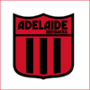
Adelaide Redbacks

I've named this team after the South Australian cricket team, I like the name and thought I could do something good with red and black that isn't the traditional Bomber's sash.

Home:

I went for the prison bars with this, as I thought it showed off the red and black colours. I took the idea of the number panel from the Port Adelaide Magpies jumper.

redbacks_home.png


Clash:

I kinda had this design from craegus in mind when designing this jumper. He used the extra colour (in this case, red) over the top of the chest. I liked the look the red and stuck it it. I added the white collar and cuffs for better contrast.

redbacks_clash.png


Heritage:

This was also partly based on a Port Adelaide Magpies jumper. Plus I wanted to incorporate a little of Port Melbourne's design into it, it became the inspiration for the back of the jumper.

redbacks_heritage.png


Logo:

Well, as you can see I have taken the tradition VFL logo, and even the font fort this logo. The original concept had a red and black redback with a white background in this same shield, but as I couldn't find it again in a bigger image, I went with a tradition VFL/VFA logo look.

redbacks_logo.png


Font:
Marbold

Sponsors:
Coopers
Santos
Wendys
 

Remove this Banner Ad

Back
Top