calculon559
Team Captain
- Jul 28, 2022
- 325
- 351
- AFL Club
- Geelong
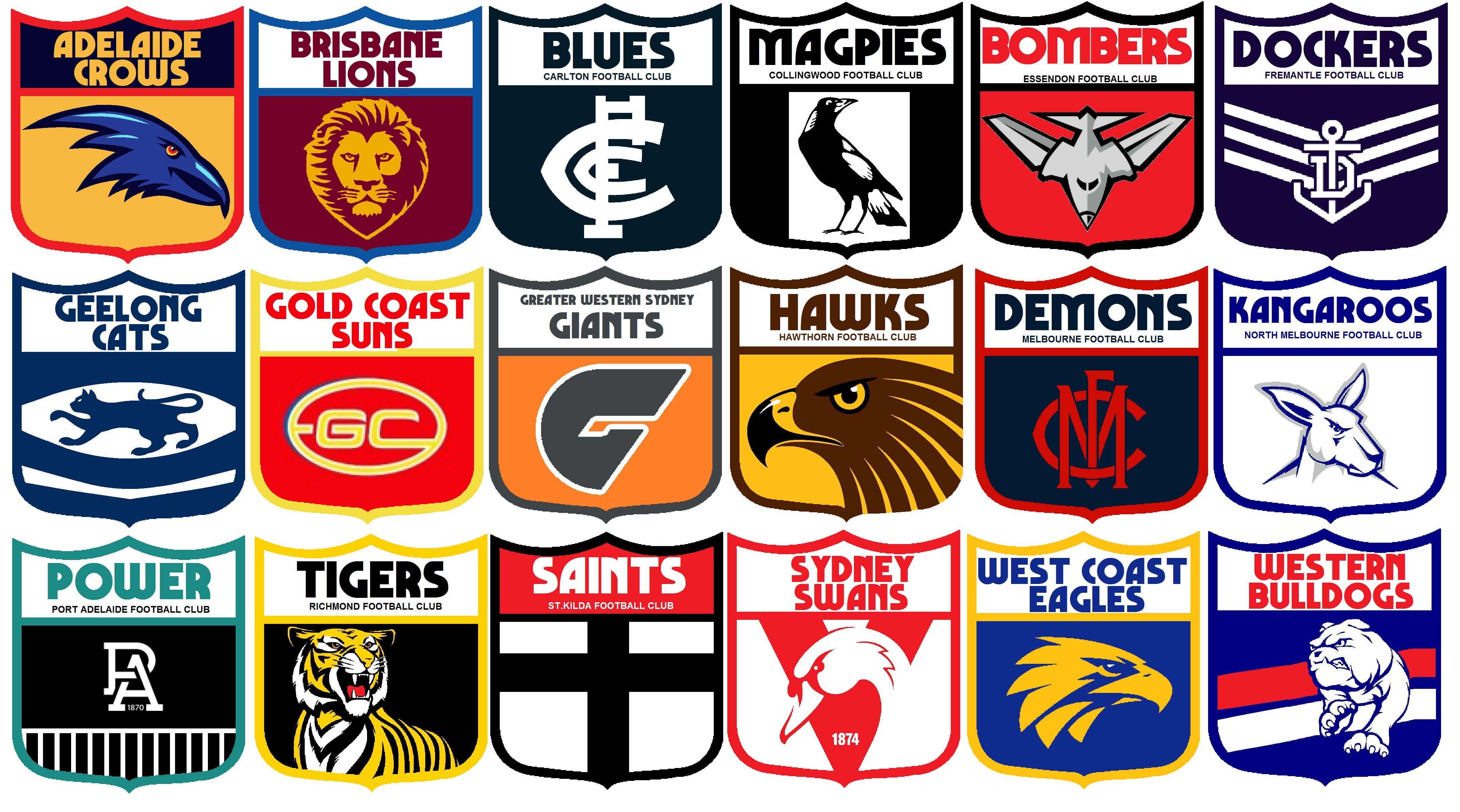
My take on the Shield logos. Inspiration was early AFL era, but with a common template similar to when the shields first appeared in '77, as opposed to the 'anything goes as long as it looks like a shield' attitude that crept in by the 90s.
Only Carlton, Essendon, Geelong, Hawthorn, and North Melbourne are the real 90s shields, the rest are either VFL shields with the now-old AFL logo, AFL shields made to conform to the template, or first logos turned into shields.
Let me know what you think")

Only Carlton, Essendon, Geelong, Hawthorn, and North Melbourne are the real 90s shields, the rest are either VFL shields with the now-old AFL logo, AFL shields made to conform to the template, or first logos turned into shields.
Let me know what you think