- Nov 15, 2010
- 2,409
- 2,157
- AFL Club
- Fremantle
- Other Teams
- WACA, Western Force, Arsenal, Glory
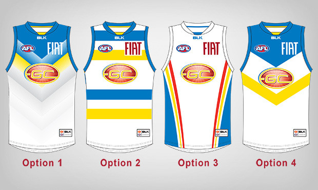
VOTING OPEN!
http://www.goldcoastfc.com.au/news/2015-10-15/vote-for-our-2016-clash-guernsey
Vote for our Mero (option #3)

________________________________________
I dunno if this has been posted yet
http://www.goldcoastfc.com.au/news/2015-09-23/design-our-2016-clash-guernsey
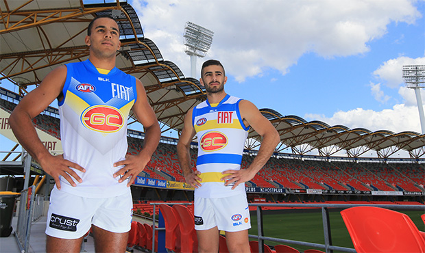
Calling all Gold Coast SUNS supporters! We need your help designing our 2016 clash guernsey.
We all know how important a guernsey is to the team, so we would like your input on how we go into battle next season.
The club has come up with two designs, but we need more. We are searching for two more designs from our supporters.
Then, the top four guernsey designs will be voted upon by our supporters to select our 2016 clash guernsey.
There will be prizes awarded to the two selected designs and the winning designers will be presented with the guernsey they create.
How to enter
1. Click here to download the BLK design template
2. Colour it in and work your magic!
3. Submit your finished entry (along with your name and contact details) before 12pm, Friday October 2 either via email to digital@goldcoastfc.com.au, in person at the GC SUNS Shop during business hours or post to:
2016 Clash Guernsey Design
PO Box 4952
Gold Coast MC QLD 9726
Terms and Conditions
- Design cannot clash with any other team's home guernsey, in particular the Adelaide Crows, Brisbane Lions, GWS Giants, Hawthorn, and Sydney Swans.
- The design must be predominantly a light colour ie white or grey.
- The GC logo will remain on the front of the guernsey.
- There must be a clear space for sponsors and playing numbers.
- All designs are subject to final approval by the AFL and the winning artwork will be assigned to the AFL to own and use.
- All entries become the property of the AFL.
http://www.goldcoastfc.com.au/news/2015-10-15/vote-for-our-2016-clash-guernsey
Vote for our Mero (option #3)
________________________________________
I dunno if this has been posted yet
http://www.goldcoastfc.com.au/news/2015-09-23/design-our-2016-clash-guernsey
Calling all Gold Coast SUNS supporters! We need your help designing our 2016 clash guernsey.
We all know how important a guernsey is to the team, so we would like your input on how we go into battle next season.
The club has come up with two designs, but we need more. We are searching for two more designs from our supporters.
Then, the top four guernsey designs will be voted upon by our supporters to select our 2016 clash guernsey.
There will be prizes awarded to the two selected designs and the winning designers will be presented with the guernsey they create.
How to enter
1. Click here to download the BLK design template
2. Colour it in and work your magic!
3. Submit your finished entry (along with your name and contact details) before 12pm, Friday October 2 either via email to digital@goldcoastfc.com.au, in person at the GC SUNS Shop during business hours or post to:
2016 Clash Guernsey Design
PO Box 4952
Gold Coast MC QLD 9726
Terms and Conditions
- Design cannot clash with any other team's home guernsey, in particular the Adelaide Crows, Brisbane Lions, GWS Giants, Hawthorn, and Sydney Swans.
- The design must be predominantly a light colour ie white or grey.
- The GC logo will remain on the front of the guernsey.
- There must be a clear space for sponsors and playing numbers.
- All designs are subject to final approval by the AFL and the winning artwork will be assigned to the AFL to own and use.
- All entries become the property of the AFL.
Last edited by a moderator: