Covertackle
Premiership Player
- Banned
- #1
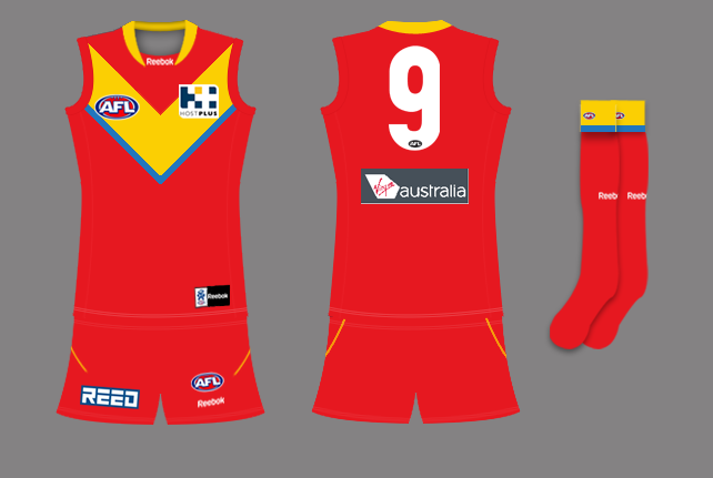
i cant say im in love with our current Guernsey design. next season is an opportunity to get it right. it would also be an opportunity to make us all buy a new Guernsey..
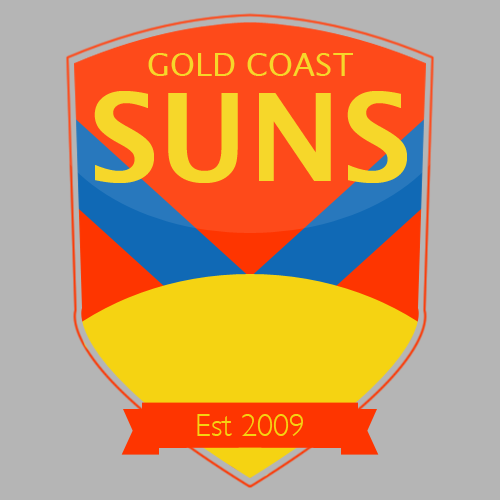
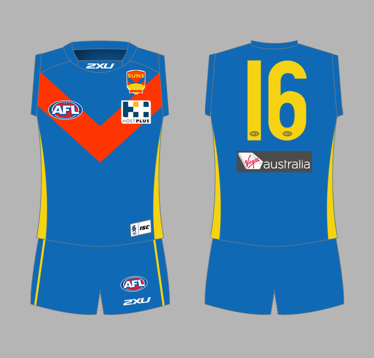
as our emblem is the sun, and in advertising (and emails) we spruik the 'suns rising', how about we have a rising sun dominating the front of our Guernsey? the current emblem on the front is a pretty sad looking sun.
as next year we will REALLY be rising as a team in the competition, how about our guernsey reflects it?
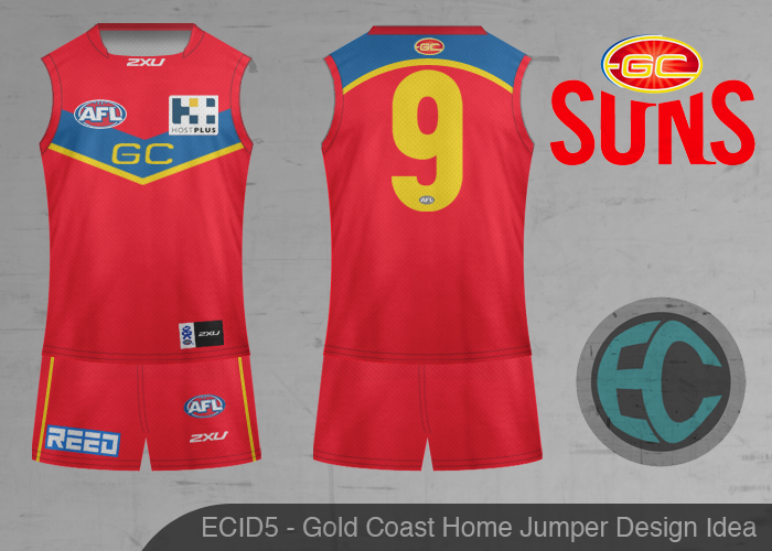
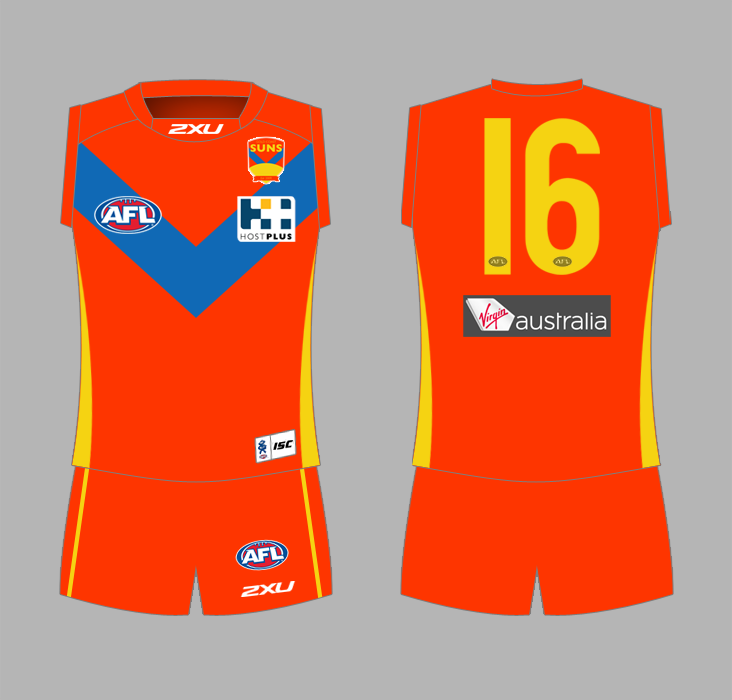
anyone have any design ideas? or are you all happy with the current strip?
as our emblem is the sun, and in advertising (and emails) we spruik the 'suns rising', how about we have a rising sun dominating the front of our Guernsey? the current emblem on the front is a pretty sad looking sun.
as next year we will REALLY be rising as a team in the competition, how about our guernsey reflects it?
anyone have any design ideas? or are you all happy with the current strip?