Workshop Improve a Current Guernsey

Remove this Banner Ad

Re: Improve a current Guernsey.

I think it's a generational thing. The older the fan, the less likely they'll want clip art on the jumper. I don't mind abstraction, but slapping an animal motif on a jumper for the sake of it smacks of unoriginality.

Unfortunately the board's populated with adolescents who, when voting in the design comps on here, go for the designs with cartoon characters, and anything which is merely geometric or simple is, ahem:


Leave the clip art for preseason jumpers, people... when it's down to real business in footy, in the regular season, use a no-nonsense jumper.
I'm 16, hate the dog on the guernsey which would look much better with just the stripes and hate that tacky, plastic monogram on GC's jumper.
 
Re: Improve a current Guernsey.

I've got to admit, the Gold Coast jumper has grown on me immensely. I like it.
 
Been trawling these forums for a couple of years, better late than never to make my first post I guess...
Awesome designs, awesome portfolio and awesome first name (I'm Dean as well).

Love the GC designed Melbourne jumpers with the Red and Yellow and Blue and Yellow.

It's a shame that GC didn't use the light blue and yellow more. That wave jersey is horrid. :eek:

The GWS three stripes :thumbsu:

The Freo 4 colour chevron :thumbsu: :thumbsu:
 

Log in to remove this ad.

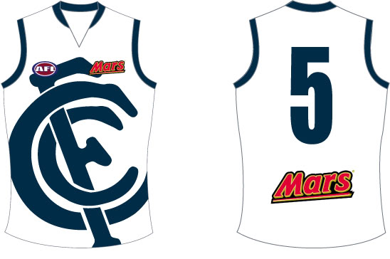
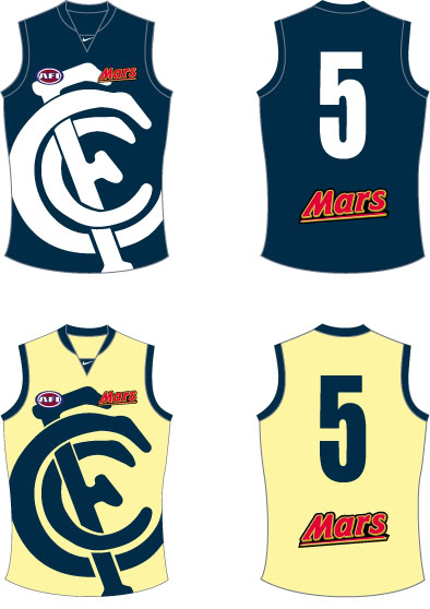
New-away-strip.jpg

Option-2.jpg

Possible pre season strip?

Yeah not bad at all Vinsain. I remember seeing these on the Carlton board late last year.
 
This is my idea for the Port Adelaide Clash, it keeps a little of the originality of the Power (their first jumper).

PortAdelaidebetter.png

These jumpers were pushed a bit when we were still using that design, but I think now with the new SA State guernsey style V thing we've got going on we should probably stick to it. Maybe a silver, black and white clash, but I'm pretty happy with our kits the way they are.
 
Been trawling these forums for a couple of years, better late than never to make my first post I guess...

On the whole I prefer simple, traditional style designs (eg. Melbourne, St Kilda home jerseys etc) over "more different" styles (eg. Hawthorn clash jersey).

I put most of these together several months ago when I was on leave and had some time to kill, there are around 70 or so designs - some are only very minor tweaks to current designs, others are influenced by past design and other are just things that looked "interesting" as I was playing around.

Below is a handful of some I liked more than others, the whole bunch can be found here.

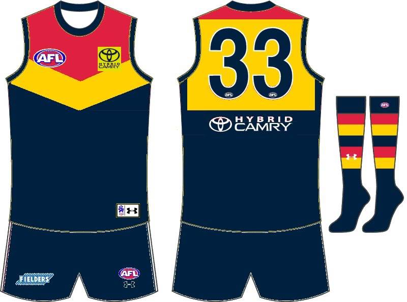
Adelaide Crows - Clash
Something a little different, but keeping their crow's head (which I still think looks really unbalanced when place on a jersey

adelaide-3-400x380.png


Fremantle Dockers - "Heritage" Clash
It is only really "heritage" in the sense that it reintroduces red and green.

fremantle-3-400x380.png


Geelong Cats - Clash
Lighter by virtue of there being less horizontal stripes, perhaps something more suited to a training jersey?

geelong-3-400x380.png


Gold Coast Suns - Home
Basically a traditional yoke design (eg. Melbourne Demons) but in the Suns' colours.

gold-coast-1-400x380.png


GWS Giants - Home
A new team, so something 'new' (I'm not really a huge fan of the off-centre G design they picked). A clash version could easily be made by simple swapping the charcoal for white.

gws-1-400x380.png


Melbourne Demons - Clash
I've seen several members on here suggest something similar to this, this is my take on the idea.

melbourne-2-400x380.png


West Coast Eagles - Home
The standard 'wings' design but in the current 'darker' colours. I've also done away with the wing tips on the back in favour of a solid panel... don't hurt me.

west-coast-1-400x380.png


Western Bulldogs - Home
Something more traditional (not sure what year I based this jersey on?) since so many seem to dislike" the bulldog on the front of the current jersey.

western-2-400x380.png


Lots more over here, and I've still got a few more sitting unfinished in a folder somewhere.

Apart from GWS, GC & WB I totally agree with all these, they look sensational. I hope these are pushed by their teams supporters. Especially the crows one, that smashes their clash outfit.

I think the only point I'd bring up is that Geelong's guernsey is naturally light in colour, therefore any clash really needs to be a dark alternative, however you could probably have that guernsey as a clash and also have a reverse of it as another clash.
 
I don't like the Adelaide one, simply coz it uses our god awful logo. I'd prefer a band of red, yellow and blue instead in its place.
 

(Log in to remove this ad.)

Here is my take on the St.Kilda alternate. (It was just a quick paint job so don't kill me over detail!!)

5zqtxw.png


I just think the current option they have of having red and black on each side looks a bit weird with the cross in the middle. I sorta got the idea from the Saint's late 90's 'hot cross buns' design
 
I would love for the magpies guernsey from 2004 to return in any shape or form possibly as a clash or pre-season like this
i agree 100% but instead of stripes and the top the jersey at the back, it should be solid black
 
Apologies if it's been done before, but I thought I would try a design for Carlton Away strip that mimics the Australian Navy dress uniform.... in an attempt to come up with something to maintain the "We are the navy Blues.." without wearing the Navy Blue strip.

Carlton Away (Australian Navy Inspired):

8s0mft


My main problem is that it's pretty similar to the Dockers Away, but in theory it could work as a good promotional tie-up for the Club and the Australian Navy... better than M&M's!
 
I wouldn't want to be a Carlton player wearing that, put it that way. You'd get plenty of "hello, thailor!" jibes. :)

I can't really comment on a Carlton players ability to absorb jibes, I can't see why it would be any less offensive than sky-blue or banana-peel yellow.
 
Apologies if it's been done before, but I thought I would try a design for Carlton Away strip that mimics the Australian Navy dress uniform....

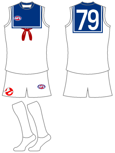
Reminds me of a fun one I did last year. No apology necessary as I don't recall posting it before :) (if I did, it was a long time ago now)

MarshmallowMan.png

A kit based on the "Stay Puft" Marshmallow Man from Ghostbusters.
 
would love to see the eagles permanently take up the yellow as an away, and royal blue as home, but the navy mockups earlier are amazing and making me think twice,

just quietly the richmond away jersey suggested by some (with the inverted colours black strip on yellow ) is a direct ripoff of the WA state jersey and would make me mad if this was chosen, big fan of the "bumblebee" with black stripes on yellow.
 

Remove this Banner Ad

Back
Top