Discussion Preseason, 2024 - Photos and Discussion

Remove this Banner Ad

Wasn't sure if there was likely to be a thread made for this in the end, so decided to put my own up.

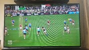
By no means a clash nor an egregious look at the Stk vs Ess practice match, just made a little bit complex with Saints opting for their training kit while Essendon stick with their home/white shorts.

20240223_144925.jpg

Saints the home side but probably better off in white shorts, although wish Essendon had a set of red shorts handy for a matchup like this
 
I can't be the only person who thought it was odd that saint Kilda wore blue today?
 

Log in to remove this ad.

So Essendon have gone with Dutton on the front and Airstage on the back.
1709283498469.png
What interests me is that the Bombers have alternated which of their major sponsor gets the front and back. For quite some time it was year, then Amart got to stay on the front in 2020 after they had it in 2019. Then Fujitsu got the front for two years (21 and 22), before Amart got back to the front in 2023. Dutton seem to have continued the two-year cycle, however I can't remember if Essendon wore alternating sponsors at home and away (today was an away game despite the black shorts).
 
So Essendon have gone with Dutton on the front and Airstage on the back.
View attachment 1917116
What interests me is that the Bombers have alternated which of their major sponsor gets the front and back. For quite some time it was year, then Amart got to stay on the front in 2020 after they had it in 2019. Then Fujitsu got the front for two years (21 and 22), before Amart got back to the front in 2023. Dutton seem to have continued the two-year cycle, however I can't remember if Essendon wore alternating sponsors at home and away (today was an away game despite the black shorts).
Yeah Essendon will frequently do an "away sponsor kit", so it's likely that Airstage will be on the kit for home games
 
So Essendon have gone with Dutton on the front and Airstage on the back.
View attachment 1917116
What interests me is that the Bombers have alternated which of their major sponsor gets the front and back. For quite some time it was year, then Amart got to stay on the front in 2020 after they had it in 2019. Then Fujitsu got the front for two years (21 and 22), before Amart got back to the front in 2023. Dutton seem to have continued the two-year cycle, however I can't remember if Essendon wore alternating sponsors at home and away (today was an away game despite the black shorts).
It was an away game so that's the away jumper.
 
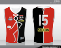
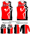
St Kilda have a mostly white-backed clash strip - this stickman one is just for one pre-season and some in-season games (Gather Round and Retro Round perhaps?); Saints Locker | NB Guernseys
I hope so nice kit would be good to see it get a run since it's in the store/will be, if it is used for GR I wish they kept it a secret and didn't use it until then but I don't mind now
 

(Log in to remove this ad.)

what I want to see for each GR match up

Crows - Normal GR kit - Dees - Flamming M red kit

Brissy - Bears kit - Roos - Retro Kit (hopefully 03-04)

WC - Ochare - Swans - 97-98 Pre season

Freo - Purple Haze anchor - Blues - White clash

Dogs - Diamond Dog - Cats Normal kit

Suns - Normal Kit - GWS - Never Surrender

Richmond - 98-03 claws pre season - Saints - Stickman

Pies - White modern Swoop - Hawks 2024 Legends kit brown base yellow V
 
can't find the template thread
Steve Harvey Reaction GIF by MOODMAN
 
This St Kilda red clash strip looks a lot like the Swans or Bullants (VFL) from behind/wide shots.
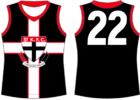
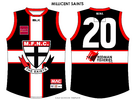
It’s an interesting one there with the Saints, I think a positive part of their branding and identity is the fact that they are a tricolour team which is relatively unique within the league. In terms of Victorian clubs it’s just them and the Bulldogs, but unlike the Dogs, there’s a team wearing each combination of two out of three St Kilda colours.
Even when you look at other tricolour teams in the league like Port and GWS, you take white out and they still have a colour scheme that is unique to them. The only other team who needs to have all 3 of their colours to look like themselves would be the Crows and they do a good job of that.
The Saints ordinarily do well in this regard, and the white cuffs help give them a unique look from the back, but with a rarely seen kit like this one it probably would’ve made sense with a black back to look more like St Kilda. I know that the red back was on the original, but ideally if the Saints had given the original a black back or something closer to what chibimatty had originally designed, it would’ve looked more suited to themselves.
IMG_2211.png IMG_2210.png
 
It’s an interesting one there with the Saints, I think a positive part of their branding and identity is the fact that they are a tricolour team which is relatively unique within the league. In terms of Victorian clubs it’s just them and the Bulldogs, but unlike the Dogs, there’s a team wearing each combination of two out of three St Kilda colours.
Even when you look at other tricolour teams in the league like Port and GWS, you take white out and they still have a colour scheme that is unique to them. The only other team who needs to have all 3 of their colours to look like themselves would be the Crows and they do a good job of that.
The Saints ordinarily do well in this regard, and the white cuffs help give them a unique look from the back, but with a rarely seen kit like this one it probably would’ve made sense with a black back to look more like St Kilda. I know that the red back was on the original, but ideally if the Saints had given the original a black back or something closer to what chibimatty had originally designed, it would’ve looked more suited to themselves.
View attachment 1919176View attachment 1919177
Goodness me mate, I hadn't seen that in a while. Have a new computer, so quite thankful to download copies of my old stuff off this post, after I'd lost some of it from the old one
 
Last edited:
It’s an interesting one there with the Saints, I think a positive part of their branding and identity is the fact that they are a tricolour team which is relatively unique within the league. In terms of Victorian clubs it’s just them and the Bulldogs, but unlike the Dogs, there’s a team wearing each combination of two out of three St Kilda colours.
Even when you look at other tricolour teams in the league like Port and GWS, you take white out and they still have a colour scheme that is unique to them. The only other team who needs to have all 3 of their colours to look like themselves would be the Crows and they do a good job of that.
The Saints ordinarily do well in this regard, and the white cuffs help give them a unique look from the back, but with a rarely seen kit like this one it probably would’ve made sense with a black back to look more like St Kilda. I know that the red back was on the original, but ideally if the Saints had given the original a black back or something closer to what chibimatty had originally designed, it would’ve looked more suited to themselves.
View attachment 1919176View attachment 1919177
I like the idea - but if you do that you're effectively creating another home jumper rather than a clash or alternative. I also think the number would get very lost between the red and black sections.

I do think the back needs more black though. Could the black front section wrap around and stop just to the left of the number on the back? So it's say a quarter black or the rest red? Also agree with a black outline for the numbers (one of the rare examples where it actually makes sense.

Another option would be a black number panel (probably a square rather than one like Port) with white numbers.
 

Remove this Banner Ad

Back
Top