Which club has the worst guernsey?

Which club's guernsey is the worst?


  • Total voters
    1,628

Remove this Banner Ad

I’m not of a fan of the generic gurnsey’s straight of out an afl ‘create a team’ mode.

Collingwood, north, hawthorn, port Adelaide, Essendon, Richmond etc all have very dull designs.

My favourites are Brisbane, Sydney, Carlton, Fremantle
 
I’m not of a fan of the generic gurnsey’s straight of out an afl ‘create a team’ mode.

Collingwood, north, hawthorn, port Adelaide, Essendon, Richmond etc all have very dull designs.

My favourites are Brisbane, Sydney, Carlton, Fremantle
Bring back Port's SBS logo!
 
the20color20brown20in20sports201.jpg
 

Log in to remove this ad.

Gold Coasts jumper was an absolute howler when it was released.

Increadible it's still being used 10 years down the track.

I suspect it will eventually be looked back like the early Brisbane Bears jumpers were.

The problem is the red color is way too bright. It's clearly the surf life saving colors, but it looks terrible in football branding.

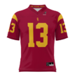
They should shift to a more burgundy red and mimic the colours of the USC Trojans.

Go to a classic yolk, stripe, sash, or band (like the bulldogs) would look unreal in the following colors:


1687842908429.png
 
I've got a feeling Tasmania's will be horrendous, especially if it has a graphic of the island on it. It depends on what they are called I guess - the Tasmania Devils, Tasmania Theythems, Tasmania Twoheads


The mistake the modern marketing people make is making the designs too 'busy'. It means they tend to look OK up close (e.g. when viewing in a baordroom0 but just look like a jumble from a distance and on TV.

It's why the older, simpler jumpers still look iconic and have aged well.
 
Haven't done this for a while, nothing has changed for me and I still think Hawthorn is the worst although the Suns and Giants give them a good run for their money. How two new clubs could get it so wrong is beyond me. As for the away strips, it's Essendon who takes the cake, a team with one of the best home strips has the worst away strip.
My top 5 are
Geelong
St.Kilda
Essendon
Richmond
Collingwood

My worst 5 are
Hawthorn
GWS
Gold Coast
*Essendon away strip
*Port Adelaide away strip
 
So, GC are the worst by a comfortable margin. I wonder when they'll fix it?

The best? Putting aside my Tigers bias, I like Melbourne and Carlton's the most.
 

(Log in to remove this ad.)

Gold Coasts jumper was an absolute howler when it was released.

Increadible it's still being used 10 years down the track.

I suspect it will eventually be looked back like the early Brisbane Bears jumpers were.

The problem is the red color is way too bright. It's clearly the surf life saving colors, but it looks terrible in football branding.

They should shift to a more burgundy red and mimic the colours of the USC Trojans.

Go to a classic yolk, stripe, sash, or band (like the bulldogs) would look unreal in the following colors:


View attachment 1723432
Great, and get them looking even more similar to their perceived biggest ‘rivals’.
 
Haven't done this for a while, nothing has changed for me and I still think Hawthorn is the worst although the Suns and Giants give them a good run for their money. How two new clubs could get it so wrong is beyond me. As for the away strips, it's Essendon who takes the cake, a team with one of the best home strips has the worst away strip.
My top 5 are
Geelong
St.Kilda
Essendon
Richmond
Collingwood

My worst 5 are
Hawthorn
GWS
Gold Coast
*Essendon away strip
*Port Adelaide away strip
Because simple is often best, simple designs with simple colour schemes, it's why those you mentioned have good designs, they're simple, classic, traditional.

Everything new these days in marketing is wanky and has to be "fresh" or "innovative", which is why the colour schemes and designs of GC and GWS leave a lot to be desired.

If the Tassie team branding can learn anything, it's that a simple and classic design and colour scheme probably will work best. None of this orange, white and grey crap, I assume they will include Green, possibly Gold/Yellow as a popular combo, the key is to not try and overcomplicate it as a piece of art... Just do a traditional sport guernsey and pattern, it's nothing ground breaking but it will easily look better than any overly complicated pattern or colour scheme.
Yep. Look at Port and Freo, tried something different, failed, and ended up with traditional style guernseys which look pretty good.
 
Yep. Look at Port and Freo, tried something different, failed, and ended up with traditional style guernseys which look pretty good.
Freo's original strip was pure 90's which is back now so looks great during Rivalry round. I'm still glad we changed though, it was a bit busy for an every day kit.
 
can't decide who has the worst guernsey, y'know, probably hawthorn, but i can say for sure that Freo have the worst team song by quite a stretch..
As much as part of freo's song is terrible. It has some really good parts too.

At least there's some good in there somewhere, unlike West Coast and Carlton's which are by far the worst two.
 
Freo's original strip was pure 90's which is back now so looks great during Rivalry round. I'm still glad we changed though, it was a bit busy for an every day kit.
I wish you changed to your purple haze kit. That's probably my favourite you've gone with.
 
Freo's original strip was pure 90's which is back now so looks great during Rivalry round. I'm still glad we changed though, it was a bit busy for an every day kit.

Part of me wishes Freo hadn't ditched the green and red, but moving to purple with the V lines was such a masterstroke imo

Brilliant rebranding, but I'm glad Freo's starting to bring it back
 
Back
Top