Discussion If you controlled the Finals...

Remove this Banner Ad

Jul 4, 2012
5,435
9,157
County Grant
AFL Club
Geelong
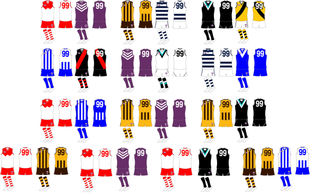
If you controlled what everyone worse for the finals series what would you do?

Use any logos or templates you want, can be completely out of the blue.
Try to explain why you are chosen to go on a particular direction if you can, just to get some discussion happening.

This is not a competition, but some some fun for the finals series.
 
Again, I like the old AFL logo so I've used it here, added a Finals Series logo underneath just for the theatre of it all...if Dreamtime at the G and Heritage Round get their own logos then so should the finals.

Firstly Friday night Hawthorn v Geelong.
Really this is a perfect match up already and the only thing I change is to have the umpires in blue so they contrast more.
upload_2014-8-31_11-7-57.png

Sydney v Freo
Again the jumpers themselves are perfect, I only changed Sydney's because I have a thing about the front of a jumper needing to be the same dominant colour as the back (hate GWS, West Coast and Hawthorn's old away jumper for that reason)
upload_2014-8-31_11-9-38.png
North v Essendon
North get to wear their full kit as the home side, Essendon I've opten for the thinner curved sash because I loved their Heritage jumper a few years back, and to avoid white shorts clashing with North's jumper I've put them in the stylish red shorts.
upload_2014-8-31_11-11-9.png
Port v Richmond
Port, one of the best jumpers in the league by far keep theirs. Richmond with the obvious clash jumper they seem determined to avoid, I'd like to see more yellow clash jumpers around. Also the only game of the week that sees the umpires in the traditional white.
upload_2014-8-31_11-12-57.png
 

Log in to remove this ad.

Again, I like the old AFL logo so I've used it here, added a Finals Series logo underneath just for the theatre of it all...if Dreamtime at the G and Heritage Round get their own logos then so should the finals.

Firstly Friday night Hawthorn v Geelong.
Really this is a perfect match up already and the only thing I change is to have the umpires in blue so they contrast more.
View attachment 76750

Sydney v Freo
Again the jumpers themselves are perfect, I only changed Sydney's because I have a thing about the front of a jumper needing to be the same dominant colour as the back (hate GWS, West Coast and Hawthorn's old away jumper for that reason)
View attachment 76751
North v Essendon
North get to wear their full kit as the home side, Essendon I've opten for the thinner curved sash because I loved their Heritage jumper a few years back, and to avoid white shorts clashing with North's jumper I've put them in the stylish red shorts.
View attachment 76752
Port v Richmond
Port, one of the best jumpers in the league by far keep theirs. Richmond with the obvious clash jumper they seem determined to avoid, I'd like to see more yellow clash jumpers around. Also the only game of the week that sees the umpires in the traditional white.
View attachment 76753
Hahaha 100% what I would've chosen!
 
The AFL logo needs updating, but nonetheless some great designs. What would it take to get someone at the AFL to sort out the clash issue?
 
Slightly off topic, but I have a question about the grand final- when the GF has a jumper clash, the higher ranked side gets to wear their home kit (correct me if I'm wrong)- ie Collingwood vs Saints.

Who is the higher ranked side if the competing teams are say 2nd vs 3rd (after H&A), but where the 3rd ranked team beats the 2nd ranked team in the qualifying final? Is it a ranking as at the end of H&A, or is it a 'finals' ranking, where 3rd should be ahead because they have already defeated 2nd during the finals?
I wouldn't have thought that the inept AFL would consider anything besides the most likely scenario :rolleyes:
 
Okay so I'm a bit late this week, but here would be my ideal week 2 scenario.

Last night's game was excellent clash wise and worked incredibly well. Personally I'm not a big fan of inverted stripes, I know they can work but I like a the clash colour (in this case royal blue) to be a touch more prominent. So for North I have gone with what I think is a very classy jumper they wore when they entered the VFL.
upload_2014-9-13_10-17-0.png

For tonight's match, again I'm sure the obvious jumpers will be worn tonight and will look great. However I'm campaigning for the return of white umpire uniforms and the eventual phase out of white clash jumpers for some clubs. I don't mind a bit of teal (although this is closer to an aqua colour) and it looks more like port than yet another white clash jumper.
upload_2014-9-13_10-24-24.png
 
wanbb7.jpg
 

(Log in to remove this ad.)

I like Port having theirs on their jumper. A little cluttered, sure, but it's a traditional link to the SANFL.
It looks great on Port, especially on the Prison bars. But on Sydney, like above, it doesn't fit. Even more so when you consider the fact that there is a small Opera house in the logo, and a bigger one on the jumper
 
It looks great on Port, especially on the Prison bars. But on Sydney, like above, it doesn't fit. Even more so when you consider the fact that there is a small Opera house in the logo, and a bigger one on the jumper
That reminds me of the GC Sekem jumpers. It looks so stupid because it has the main logo on the guernsey, and then on the breast it has the main logo with SUNS written underneath. Just bugs me. Like this:
A419090.jpg
 
That reminds me of the GC Sekem jumpers. It looks so stupid because it has the main logo on the guernsey, and then on the breast it has the main logo with SUNS written underneath. Just bugs me. Like this:
A419090.jpg
Same goes for the Sekem Carlton jumper. Actually...any of the Sekem jumpers to be honest :p
 
Same goes for the Sekem Carlton jumper. Actually...any of the Sekem jumpers to be honest :p
Yeah, GWS/Carlton look stupid, but GC is even stupider because it's a different logo
 
I love the idea of having premiership history incorporated on the guernseys. Would like to see it incorporated somewhere on the guernsey in the regular season too. Subtle enough to be noticed but not big enough to dominate it. Maybe something like what the the Aussies used in the rugby. image.jpg
 
I love the idea of having premiership history incorporated on the guernseys. Would like to see it incorporated somewhere on the guernsey in the regular season too. Subtle enough to be noticed but not big enough to dominate it. Maybe something like what the the Aussies used in the rugby.View attachment 82737
Don't know if anyone here is familiar with the NRL, but Souths have 20 premierships (possibly 21 next Sunday!) and would need to wear long sleeves if this was the case haha. I think maybe stars or even a small premiership cup with a number in it (like the Champions League) would be cool...
682px-UEFA_Badge_of_Honour.svg.png
 

Remove this Banner Ad

Back
Top