Portfolio Alternate History AFL (by craegus) 5 year anniversary

Vote for the location that should be the 20th team to enter the AFL (one vote only, cannot change)


  • Total voters
    28
  • Poll closed .

Remove this Banner Ad

Aug 8, 2008
7,947
8,641
Campbelltown
AFL Club
Sydney
Other Teams
Arsenal, Macarthur FC
5 years ago I decided to try a portfolio for the first time. This portfolio looked at an alternate universe where Aussie Rules went through a period like Rugby League did during the Super League era and the designs produced were the outcome of the merger between the break away league and the VFL and how teams looked in the present.

The original thread can be viewed here.

-------------------------------------------------

Now 5 years later, I have decided to revisit the alternate AFL and see what has happened since we last visited it.

So what has happened in those 5 years?

Well something major. During that time the way guernseys were designed has changed massively and started to become a problem. The AFL finally got sick of the craziness of the templates after a particular manufacturer came out with what became known as the "Panel", a guernsey where every single colour section was made up of a different sewn panel and several different materials which according to the manufacturer allowed for superior movement and comfort for the players.

In reality, during games guernseys were constantly being changed due to different panels constantly being torn and in several cases players being completely stripped of their tops multiple times during a game.

The AFL decided that to curb this and to make the designs more about the look rather than technological advances that all manufacturers would be required to use a single template. This restriction meant that manufacturers could spend less money on coming up with new advances in guernsey technology and were able to spend more on getting clubs to be part of their brand. This had a slight negative effect for the fans as some clubs gave up tradition for the addition of much needed funds.

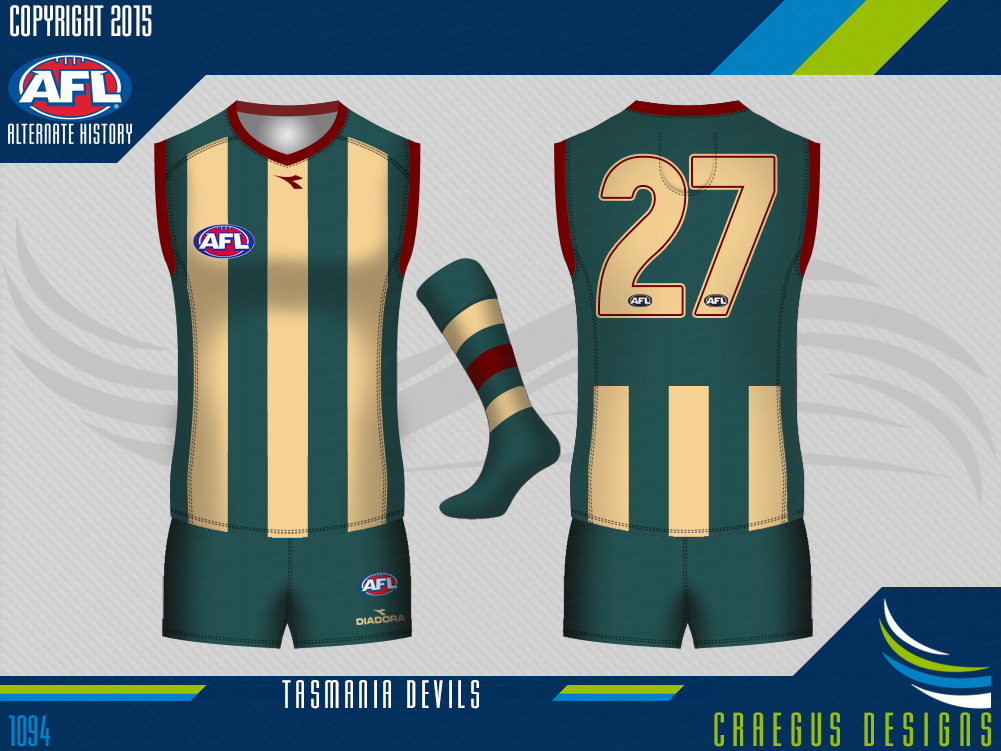
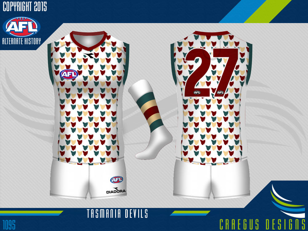
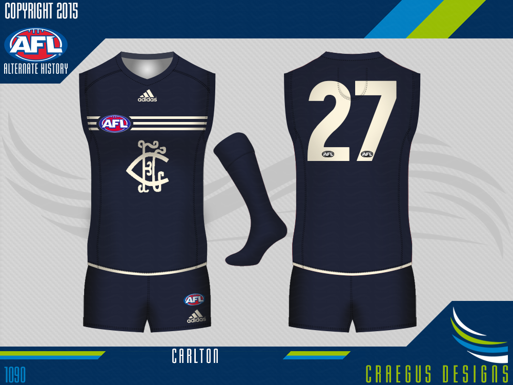
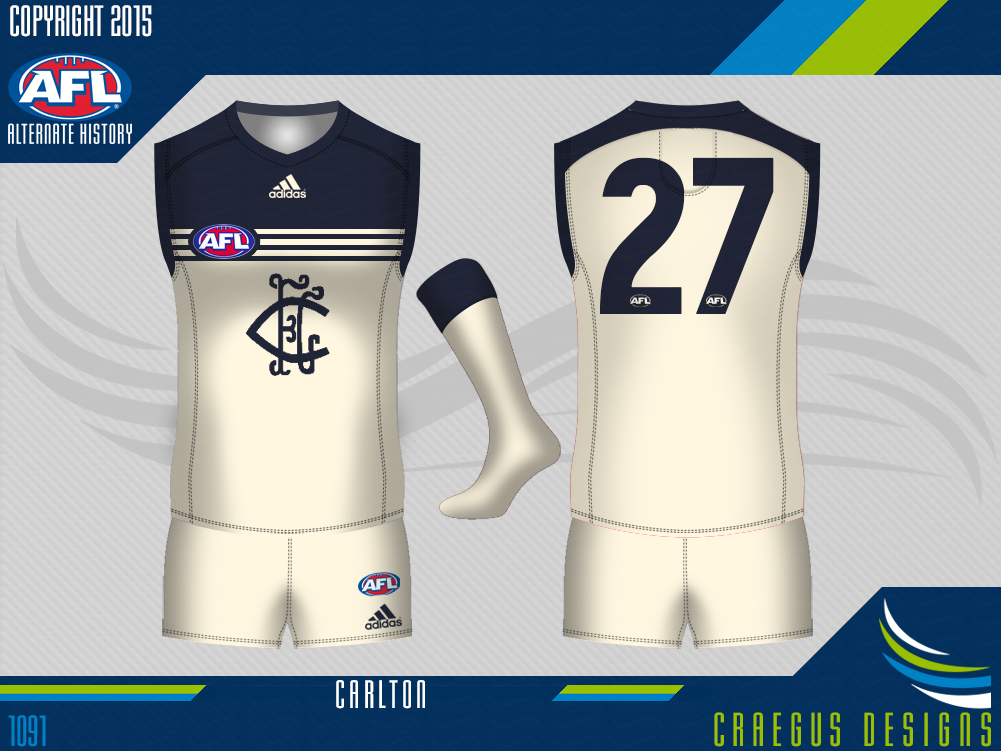
So what do the clubs look like now? Are all the clubs that featured 5 years ago still around or have things changed and are there new faces or even some old ones? Lets find out...
 
Blue is blue.

The new rules on designs gave Carlton the opportunity and excuse to listen to the fans and revert back to an older logo on the chest. They also chose to replace white with cream to represent the old chamois designs of the past.

However fans were left extremely unhappy when the club went too far back with the logo and also allowed their new manufacturer Adidas to place the three stripes across the chest of their uniform.

Carlton%20Home%20Alternate%20History%202015_zpsk0libzva.png
Carlton%20Clash%20Alternate%20History%202015_zpsp1ocewet.png
 

Log in to remove this ad.

Blue is blue.

The new rules on designs gave Carlton the opportunity and excuse to listen to the fans and revert back to an older logo on the chest. They also chose to replace white with cream to represent the old chamois designs of the past.

However fans were left extremely unhappy when the club went too far back with the logo and also allowed their new manufacturer Adidas to place the three stripes across the chest of their uniform.

Carlton%20Home%20Alternate%20History%202015_zpsk0libzva.png
Carlton%20Clash%20Alternate%20History%202015_zpsp1ocewet.png

That clash is an F_ing great clash... why can't they us something like that...
 

(Log in to remove this ad.)

I guess the question could be asked is the preview for Port or for someone else?
Hmm, now, why would Port give up their prison bars? Unless Collingwood completely messed them up, I don't see the reason for change ;)

I shall be waiting eagerly to see the answers.
 
Very excited about this! I loved the original! Hope St. Kilda survives in this timeline (given our position at the moment in OTL). I wonder if Collingwood would treat their currawong to antagonise Port.

Will West Perth survive? If they do, I would have preferred the sash as their home, but the red with white falcon as their away. It will be cool how the teams will look like. Will the Tasmanian team survive as well? Or could there be a 20-team competition? Either way, this will be cool! Enjoy, Craegus!
 
Will the Tasmanian team survive as well?

Well your question is answered.

A Southerly Change, Part 1:


The Tasmania Devils made changes to their colour scheme, they darkened the green and red and made the yellow a more wheat yellow colour. The club claimed this was because the old colours were too bright and jarring when viewed on television and the new colours would look much better and felt more organic. Diadora came on-board as uniform supplier and kept the traditional look for the team with the only real change to the clubs home uniform being the red being removed from the stripes and moved to the collar and cuffs and part of the number outline.

Tasmania%20Devils%20Home%20Alternate%20History%202015_zpsxlil6ngf.png


The club then told fans that the clash uniform would be a "Tasmania Pride" design, unfortunately.........

to be continued...

I appreciate you wanted to change something but to be quite honest I preferred the old design with the more vivid green. This is nice though.
 
Previously on Alternate History AFL (by craegus) 5 year anniversary;

The club then told fans that the clash uniform would be a "Tasmania Pride" design, unfortunately.........

And now the conclusion...

A Southerly Change, Part 2 ("Oh what on earth is that?"):


...what was produced was what is currently called the ugliest guernsey ever seen on a football field. The design features the map of Tasmania but unlike the jumper of the state team which is just a single map in the centre of the guernsey, the map is tiled across the front and back in the clubs three colours.

This guernsey has been slated as going into the hall of shame, but people are also saying that it will one day be seen as a classic of design that is wanted by collectors from across the country.

Tasmania%20Devils%20Clash%20Alternate%20History%202015_zpsaaaq4l1h.png
That's worse than the diamonds by far
 
Previously on Alternate History AFL (by craegus) 5 year anniversary;

The club then told fans that the clash uniform would be a "Tasmania Pride" design, unfortunately.........

And now the conclusion...

A Southerly Change, Part 2 ("Oh what on earth is that?"):


...what was produced was what is currently called the ugliest guernsey ever seen on a football field. The design features the map of Tasmania but unlike the jumper of the state team which is just a single map in the centre of the guernsey, the map is tiled across the front and back in the clubs three colours.

This guernsey has been slated as going into the hall of shame, but people are also saying that it will one day be seen as a classic of design that is wanted by collectors from across the country.

Tasmania%20Devils%20Clash%20Alternate%20History%202015_zpsaaaq4l1h.png
murder of Tassie?
 
Previously on Alternate History AFL (by craegus) 5 year anniversary;

The club then told fans that the clash uniform would be a "Tasmania Pride" design, unfortunately.........

And now the conclusion...

A Southerly Change, Part 2 ("Oh what on earth is that?"):


...what was produced was what is currently called the ugliest guernsey ever seen on a football field. The design features the map of Tasmania but unlike the jumper of the state team which is just a single map in the centre of the guernsey, the map is tiled across the front and back in the clubs three colours.

This guernsey has been slated as going into the hall of shame, but people are also saying that it will one day be seen as a classic of design that is wanted by collectors from across the country.

Tasmania%20Devils%20Clash%20Alternate%20History%202015_zpsaaaq4l1h.png
104-223-blue.jpg

putin-sunglasses-7.jpg
 
Previously on Alternate History AFL (by craegus) 5 year anniversary;

The club then told fans that the clash uniform would be a "Tasmania Pride" design, unfortunately.........

And now the conclusion...

A Southerly Change, Part 2 ("Oh what on earth is that?"):


...what was produced was what is currently called the ugliest guernsey ever seen on a football field. The design features the map of Tasmania but unlike the jumper of the state team which is just a single map in the centre of the guernsey, the map is tiled across the front and back in the clubs three colours.

This guernsey has been slated as going into the hall of shame, but people are also saying that it will one day be seen as a classic of design that is wanted by collectors from across the country.

Tasmania%20Devils%20Clash%20Alternate%20History%202015_zpsaaaq4l1h.png
I could golf in that
 
Previously on Alternate History AFL (by craegus) 5 year anniversary;

The club then told fans that the clash uniform would be a "Tasmania Pride" design, unfortunately.........

And now the conclusion...

A Southerly Change, Part 2 ("Oh what on earth is that?"):


...what was produced was what is currently called the ugliest guernsey ever seen on a football field. The design features the map of Tasmania but unlike the jumper of the state team which is just a single map in the centre of the guernsey, the map is tiled across the front and back in the clubs three colours.

This guernsey has been slated as going into the hall of shame, but people are also saying that it will one day be seen as a classic of design that is wanted by collectors from across the country.

Tasmania%20Devils%20Clash%20Alternate%20History%202015_zpsaaaq4l1h.png
Love this. Different, unique, really sends a bold message to the opposition. 10/10 would wear.
 
Back
Top