


Hope it wasn't the Chris Grant game you were watching.
Your first loss of the year, rd 21?
Follow along with the video below to see how to install our site as a web app on your home screen.
Note: This feature may not be available in some browsers.
Hope it wasn't the Chris Grant game you were watching.
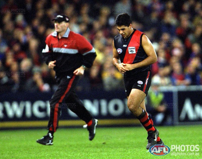
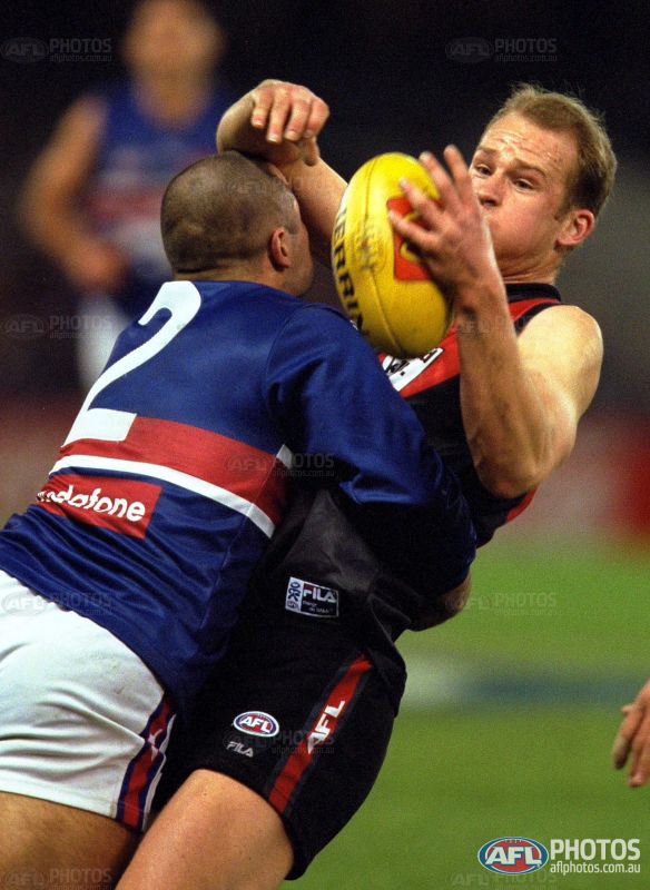
Watching a 2000 replay of ESS v WB.
Mero, does Essendon's 00-03 jumper have a slightly different shade of red on purpose, or does it need to be made consistent with the others?
I also think the numbers aren't quite right (I know that's a super helpful comment...)

I always loved the look of the vodafone logo on that doggies jumper.
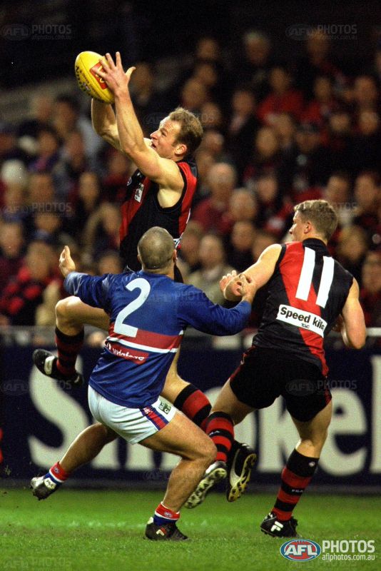
You can sort of see where the bottom of the 2 is in this pic in relation to the sash:
The numbers on the Bulldogs jumper are also only slightly above the white hoop:
This image also has different shades of red, front v back. Based on the pics previously posted, I'd say the back is the correct one.
I was trying to show the change in material had changed the look of the jumpers.Watching a 2000 replay of ESS v WB.
Mero, does Essendon's 00-03 jumper have a slightly different shade of red on purpose, or does it need to be made consistent with the others?
I also think the numbers aren't quite right (I know that's a super helpful comment...)
Ugh why add more clutter?Mero
All the Indigenous Jumpers that have the Recognize logo. Easier reference for you on where to place them. Sorry for the big pictures.
From a design perspective, that's subjective. There's so much 'clutter' on these already that one extra logo makes a very marginal difference. Not worth complaining about.Ugh why add more clutter?
I meant in terms of placement. It's ok on Richmond's, above the manufacturer's tag, but for some clubs, having 3 logos on the right side of the jumper doesn't look great. Either above or below the AFL logo would be fine too i reckon.From a design perspective, that's subjective. There's so much 'clutter' on these already that one extra logo makes a very marginal difference. Not worth complaining about.
From any other perspective, exposure for the Recognise campaign (to raise awareness of the need to end the exclusion of Aboriginal and Torres Strait Islander peoples from the Australian Constitution and deal with racial discrimination in it) can only be a good thing and I don't see how "ugh" is an appropriate response at all.
Dunno, maybe when it adds too much clutter to a jumper?I was never complaining about the Recognise campaign in the first place, just the placement of the logo. How could the Recognise campaign be not a good thing?
That's putting words in Gattsby' mouth. He was clearly talking about logo placement. Atleast that's what I took from his post. Being on a board that's more about design then anything else, I thought that was a given.From any other perspective, exposure for the Recognise campaign (to raise awareness of the need to end the exclusion of Aboriginal and Torres Strait Islander peoples from the Australian Constitution and deal with racial discrimination in it) I don't see how "ugh" is an appropriate response at all.
I read it as disgust (ugh) at the placement of another logo myself, and that's without any emotional investment. Either way it's been cleared up now.That's putting words in Gattsby' mouth. He was clearly talking about logo placement. Atleast that's what I took from his post. Being on a board that's more about design then anything else, I thought that was a given.
MagzDear Mr. Mero,
I just wrote a piece for some crazy American site that focuses on Uni(form) Watch(ing) regarding the Indigenous Round for this season. I don't know if they'll use it, but if they do, I wrote "That about wraps it up for 2015 AFL Indigenous Round, with a huge shoutout to <your name> at footyjumpers.com!"
I have no control over what they use out of what I write to them, so if they don't include that shoutout I'll send them a strongly worded email (ha!) and make certain they plug you afterwards. They're usually pretty good about that stuff, though.
I linked to your site for Essendon, Richmond, Adelaide and Freo's previous seasons (so I didn't have to use links for every past jumper since those are the clubs who have been at it for more than just last season and this; I'm sure you didn't need me to tell you that, but I just did anyway).
Cheers and keep that damn cold air up there next winter, eh?
Sincerely,
Mr. Maggotz.
Mero if you want a much better and accurate picture of the Carlton design for this round, go to carltonfc.com.au and zoom out quite a lot. The background has the snake and the turtles for you
Is anyone else having trouble getting on to the site? I've cleared browsing data and the cache, but it still just comes up as a blank screen
Some jumpers come up for me as a blank.Is anyone else having trouble getting on to the site? I've cleared browsing data and the cache, but it still just comes up as a blank screen
It's the entire site for meSome jumpers come up for me as a blank.

 .
.


