Portfolio 1997 AFL Lightning Premiership

Remove this Banner Ad

lightningcuplogo.png

Lightning Strikes Twice!

In 1997, the AFL in partnership with sponsor Coca-Cola, launched the second annual Lightning Premiership competition - a knockout competition held at a single venue (this year, it was the WACA Ground in Perth) primarily under lights across one weekend in February, prior to the start of the Ansett Preseason Cup. This competition featured the sixteen AFL clubs, including the newly launched Port Adelaide Power, as well as the new merger of Brisbane and Fitzroy.

Each of the sixteen teams wore a bespoke design with Coca-Cola as the naming rights sponsor across all guernseys, made of the classic sportswool material with cut-and-sew panelling as opposed to the new technology of sublimated polyester, which this portfolio will showcase.

Let the games begin.​
 
Last edited:
  • Thread starter
  • Moderator
  • #2
lightning_adelaide.png

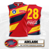
Adelaide's design features a red base with navy and gold diagonal panels, inspired by the flight trail of the crow in the club's logo.
 
Last edited:
  • Thread starter
  • Moderator
  • #3
lightning_brisbane.png

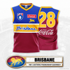
Brisbane's design features an amalgamation of Brisbane's and Fitzroy's 1996 home guernseys, reimagined into a horizontal panel across the front, with the wordmark and lion pressed on as transfers.
 
Last edited:

Log in to remove this ad.

  • Thread starter
  • Moderator
  • #7
That Channel 7 aesthetic goes hard!


7AFL about to hit me with that cease and desist. 😉

Pretty proud of the scorebug though, made it from scratch and it turned out better than I had even expected.
 
  • Thread starter
  • Moderator
  • #8
lightning_carlton.png

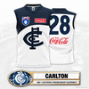
Carlton's design features a primarily white base for the first time in club history, with a navy top panel inspired by the club's inaugural guernseys, with a curved shape based on the club's monogram, which is featured across the front in traditional fashion, albeit oversized.
 
Last edited:
  • Thread starter
  • Moderator
  • #9
lightning_collingwood.png

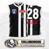
Collingwood's design features an experimental black based design, with two off-centre stripes as opposed to the traditional three stripes, with the club's magpie emblem pressed on below the sponsor.
 
Last edited:

(Log in to remove this ad.)

View attachment 1541835

Brisbane's design features an amalgamation of Brisbane's and Fitzroy's 1996 home guernseys, reimagined into a horizontal panel across the front, with the wordmark and lion pressed on as transfers.
I love it, but this logo wasn't used until the 2002 season :sadv1:
 
  • Thread starter
  • Moderator
  • #15
Last edited:
  • Thread starter
  • Moderator
  • #16
lightning_essendon.png

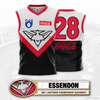
Essendon's design features a remarkable change from their historic red-on-black sash, with the club's brand new logo adorned across the front on a chevron panel in their new tertiary grey colour, and the traditional colours below.
 
  • Thread starter
  • Moderator
  • #17
lightning_fremantle.png

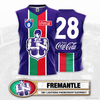
Fremantle's design features a take on the club's shield logo, with a unique duotone centre panel in green and red with white surronds on a primarily purple base, and the Docker emblem applied atop.
 
Last edited:
  • Thread starter
  • Moderator
  • #21
Just going to leave this here to add to the nostalgia, I had this on PC as a kid, and that rockin' intro was amazing - as what the impressive 3D AFL logo (and the team logos too)!


Elite stuff!

Whilst for me growing up, AFL Premiership 2007 was the 🐐 (thanks to Mero and his input with all the classic guernseys), EA’s AFL 99 holds a special place in my heart, mostly because of the 3D mascots, which as a kid I thought was the coolest s**t ever.
 
View attachment 1541931

Fremantle's design features a take on the club's shield logo, with a unique duotone centre panel in green and red with white surronds on a primarily purple base, and the Docker emblem applied atop.


As Bruce McAvaney succinctly said about Cyril, "DELICIOUS!"
 
  • Thread starter
  • Moderator
  • #24
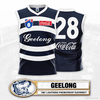
lightning_geelong.png

Geelong's design features oval hoops and a classic script wordmark on the front, inspired by the logo of long term club sponsor Ford, due to the competition-wide sponsorship from Coca-Cola.
 
  • Thread starter
  • Moderator
  • #25
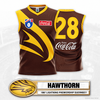
lightning_hawthorn.png

Hawthorn's design features the hawk's head from the club's brand new logo in gold on a brown based guernsey.
 

Remove this Banner Ad

Back
Top