


That is sick.View attachment 1541836
Carlton's design features a primarily white base for the first time in club history, with a navy top panel inspired by the club's inaugural guernseys, with a curved shape based on the club's monogram, which is featured across the front in traditional fashion, albeit oversized.
Navigation
Install the app
How to install the app on iOS
Follow along with the video below to see how to install our site as a web app on your home screen.
Note: This feature may not be available in some browsers.
More options
You are using an out of date browser. It may not display this or other websites correctly.
You should upgrade or use an alternative browser.
You should upgrade or use an alternative browser.
Portfolio 1997 AFL Lightning Premiership
- Thread starter Freight Train
- Start date
- Tagged users None
Looks good! I take it there is no ‘What if’ for GC and GWS?
Freight Train
Once hit the sign at the Mercantile Mutual Cup
- Thread starter
- Moderator
- #28
Looks good! I take it there is no ‘What if’ for GC and GWS?
man was just waiting for the letter G.
- Mar 30, 2014
- 2,606
- 4,274
- AFL Club
- Brisbane Lions
- Other Teams
- Dolphins, Seattle Kraken
Come on you Gold Coastman was just waiting for the letter G.
Freight Train
Once hit the sign at the Mercantile Mutual Cup
- Thread starter
- Moderator
- #30
Come on you Gold CoastSharksehChargersmmm no,Gladiators, wait noSeagulls,dammit, Gold Coast, just pick a team!
Yeah - I did consider doing Southport (for the Suns) and Canberra (for the Giants) but honestly, no one questions someone for doing an 80s folio without the Dockers, so I wasn’t really going to fret too much.
Freight Train
Once hit the sign at the Mercantile Mutual Cup
- Thread starter
- Moderator
- #31

Melbourne's design features the flaming "M" motif from the club emblem as a red wraparound panel on a primarily navy guernsey.
Freight Train
Once hit the sign at the Mercantile Mutual Cup
- Thread starter
- Moderator
- #32

North Melbourne's design features a prominent white chevron on a royal base, inspired by the club's inaugural VFL jumper, with the Kangaroo logo from the 1996/1997 away guernsey pressed onto the front, as well as the number panel from that same guernsey put onto the back.
Zoops
Club Legend
- Apr 20, 2017
- 1,406
- 5,414
- AFL Club
- Melbourne
- Other Teams
- Vancouver Canucks, Southampton FC
View attachment 1542464
Melbourne's design features the flaming "M" motif from the club emblem as a red wraparound panel on a primarily navy guernsey.
Freight Train
Once hit the sign at the Mercantile Mutual Cup
- Thread starter
- Moderator
- #34

Port Adelaide's design features a white and teal lightning bolt sash and a matching duotone rear number panel, taking inspiration from both the club's away and preseason guernseys from their inaugural 1997 season.
Freight Train
Once hit the sign at the Mercantile Mutual Cup
- Thread starter
- Moderator
- #35

Richmond's design features a primarily yellow design for the first time in the club's history, however with a straightened, thicker sash with a smaller yellow sash running through it, creating both the effect of stylised claw marks and paying homage to the club's iconic home jumper.
Freight Train
Once hit the sign at the Mercantile Mutual Cup
- Thread starter
- Moderator
- #36

St Kilda's design features black & red diagonally alternating cross on a white base guernsey, with the vertical lines overlapping onto the back.
Freight Train
Once hit the sign at the Mercantile Mutual Cup
- Thread starter
- Moderator
- #37

Sydney's design features a elements from the 2000 Sydney Olympics logo to promote the upcoming Games, with the Opera House pressed atop a white arch element, representing the Harbour Bridge, with the Sydney 2000 wordmark below the sponsor.
Freight Train
Once hit the sign at the Mercantile Mutual Cup
- Thread starter
- Moderator
- #38

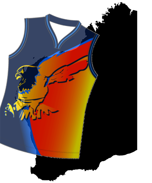
West Coast's design features their traditional royal and gold colour way, with a stylised outline of the WA coast as a golden panel across the front, with the club logo pressed below the sponsor.
What, you didn't think I'd find a way to work the Ochre into this somehow?
Freight Train
Once hit the sign at the Mercantile Mutual Cup
- Thread starter
- Moderator
- #39

The Western Bulldogs' design features a literal 90° spin on their new 1997 home guernsey, with their bands design encompassed within an oversized front vee-yoke, and below the number on the back, with the club logo pressed atop the red and white front bands.
Freight Train
Once hit the sign at the Mercantile Mutual Cup
- Thread starter
- Moderator
- #40
Like the real Lightning Premiership competition, it's over just about as soon as it's begun...
I hope you all enjoyed the portfolio, funnily enough it really sprang to life sitting in a kebab shop the other day with DAT8, or at least that's the first time the idea had really been more than just an idea in my head. Was a whole lot of fun putting this together, first portfolio in around two years and really happy with how it all turned out. Let me know your thoughts guys, I'll try not to take two years for the next portfolio.
On that note, feel free to check out any of my other portfolios, was a nice trip down memory lane for me anyway!
FEDLEAGUE - The Future of Australian Football
Cricket Australia - A 2020 Vision
NSL '99
WAFL 2019 - Welcome to the West
NBL x Adidas
AFL '99
AFL Retro Round
Thanks again to everyone for following along - good timing for post #7000.")
I hope you all enjoyed the portfolio, funnily enough it really sprang to life sitting in a kebab shop the other day with DAT8, or at least that's the first time the idea had really been more than just an idea in my head. Was a whole lot of fun putting this together, first portfolio in around two years and really happy with how it all turned out. Let me know your thoughts guys, I'll try not to take two years for the next portfolio.
On that note, feel free to check out any of my other portfolios, was a nice trip down memory lane for me anyway!
FEDLEAGUE - The Future of Australian Football
Cricket Australia - A 2020 Vision
NSL '99
WAFL 2019 - Welcome to the West
NBL x Adidas
AFL '99
AFL Retro Round
Thanks again to everyone for following along - good timing for post #7000.
- Mar 30, 2014
- 2,606
- 4,274
- AFL Club
- Brisbane Lions
- Other Teams
- Dolphins, Seattle Kraken
Freight. Mate. Where is the ochre? You havin' a laff?View attachment 1543339
West Coast's design features their traditional royal and gold colour way, with a stylised outline of the WA coast as a golden panel across the front, with the club logo pressed below the sponsor.
What, you didn't think I'd find a way to work the Ochre into this somehow?
Now before you get all uppity because it didn't exist until 2000 -
- First of all, time travel exists (I've seen Dr Who, don't get all timey-whimey), who's to say Guy McKenna didn't travel back in time and hand himself the beast that is the Ochre.
- Second of all, it was in development for at least 10 years, you can't rush perfection, but you can use a prototype in the 1997 Lightning Premiership
- Thirdly, you're making baby Gil cry
Don't make me downvote every post you've ever made. I'll do it, I'm that petty.
Freight Train
Once hit the sign at the Mercantile Mutual Cup
- Thread starter
- Moderator
- #42
Freight. Mate. Where is the ochre? You havin' a laff?
Now before you get all uppity because it didn't exist until 2000 -
- First of all, time travel exists (I've seen Dr Who, don't get all timey-whimey), who's to say Guy McKenna didn't travel back in time and hand himself the beast that is the Ochre.
- Second of all, it was in development for at least 10 years, you can't rush perfection, but you can use a prototype in the 1997 Lightning Premiership
- Thirdly, you're making baby Gil cry
Don't make me downvote every post you've ever made. I'll do it, I'm that petty.
It was always there, my guy.
- Mar 30, 2014
- 2,606
- 4,274
- AFL Club
- Brisbane Lions
- Other Teams
- Dolphins, Seattle Kraken
So you're saying we didn't get power from the Ochre? The Ochre was inside us all along?
It was always there, my guy.
Freight Train
Once hit the sign at the Mercantile Mutual Cup
- Thread starter
- Moderator
- #44
So you're saying we didn't get power from the Ochre? The Ochre was inside us all along?
The real Ochre is the friends we made along the way.
- Mar 30, 2014
- 2,606
- 4,274
- AFL Club
- Brisbane Lions
- Other Teams
- Dolphins, Seattle Kraken
The real Ochre is the friends we made along the way.

not pictured: friends
It's like the Dog's Breakfast had a baby with one of our early training jumpers.View attachment 1543339
West Coast's design features their traditional royal and gold colour way, with a stylised outline of the WA coast as a golden panel across the front, with the club logo pressed below the sponsor.
What, you didn't think I'd find a way to work the Ochre into this somehow?
Ewww.
Freight Train
Once hit the sign at the Mercantile Mutual Cup
- Thread starter
- Moderator
- #47
It's like the Dog's Breakfast had a baby with one of our early training jumpers.
Ewww.
That was the goal!

BigBadBergman
Rookie
- Sep 1, 2022
- 39
- 86
- AFL Club
- Port Adelaide
Incredible stuff mate, love the creativity. I would happily see these rolled out as fun preseason or clash guernseys
I especially love the Richmond guernsey, such a clever twist on a classic
I especially love the Richmond guernsey, such a clever twist on a classic
- Nov 15, 2010
- 2,409
- 2,157
- AFL Club
- Fremantle
- Other Teams
- WACA, Western Force, Arsenal, Glory
Brisbane and Collingwood are so much like those old summer season designs, Adelaide and Melbourne are like a retro fauxback to the time, great to see the Sydney 2000 logo back. Another awesome portfolio again mate.
Heardy_101
LET'S GO BRANDON
Wipes away tearsThe real Ochre is the friends we made along the way.
That was beautiful.
Similar threads
- Replies
- 37
- Views
- 2K
