


Australia always look best when they are in a proper shade of gold, not yellow. It's a simple as that to make a good national kit for us.
Navigation
Install the app
How to install the app on iOS
Follow along with the video below to see how to install our site as a web app on your home screen.
Note: This feature may not be available in some browsers.
More options
You are using an out of date browser. It may not display this or other websites correctly.
You should upgrade or use an alternative browser.
You should upgrade or use an alternative browser.
News 2014 Australia International Rules guernsey options
- Thread starter SJ
- Start date
- Tagged users None
Australia always look best when they are in a proper shade of gold, not yellow. It's a simple as that to make a good national kit for us.

i preferred the home one, but this is pretty much perfect.
not sure why they changed it though...
- Nov 15, 2010
- 2,409
- 2,157
- AFL Club
- Fremantle
- Other Teams
- WACA, Western Force, Arsenal, Glory
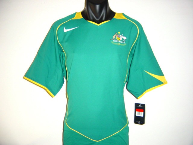
Also the shade of green is very important, I remember the Socceroos changing from a horrible blue-green in 2004 to a more Aussie green in 2005
From this:
To this:
The pictures may not show it, but in real life the second one was considerably better and looked more "Australian"
It had the yellow tweaked to be more gold also.
From this:
To this:
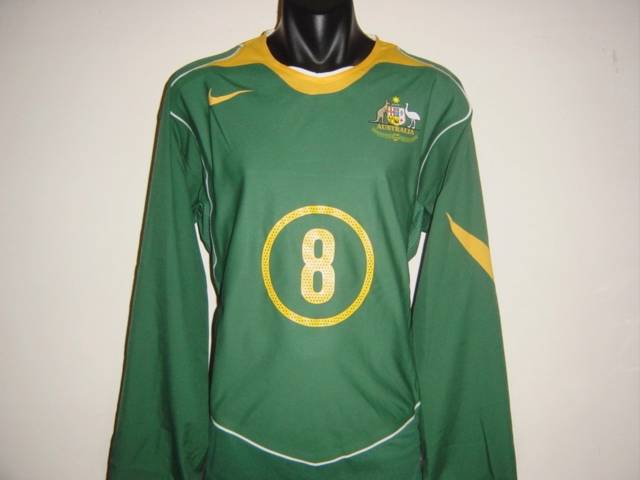
The pictures may not show it, but in real life the second one was considerably better and looked more "Australian"
It had the yellow tweaked to be more gold also.
- Nov 15, 2010
- 2,409
- 2,157
- AFL Club
- Fremantle
- Other Teams
- WACA, Western Force, Arsenal, Glory
Unfortunately it looked a bit bluer on matchday, almost like a dark turquoise.
Willo_
Trust the Process
- Apr 27, 2010
- 35,237
- 62,327
- AFL Club
- Geelong
- Other Teams
- 76ers, Melbourne Roys
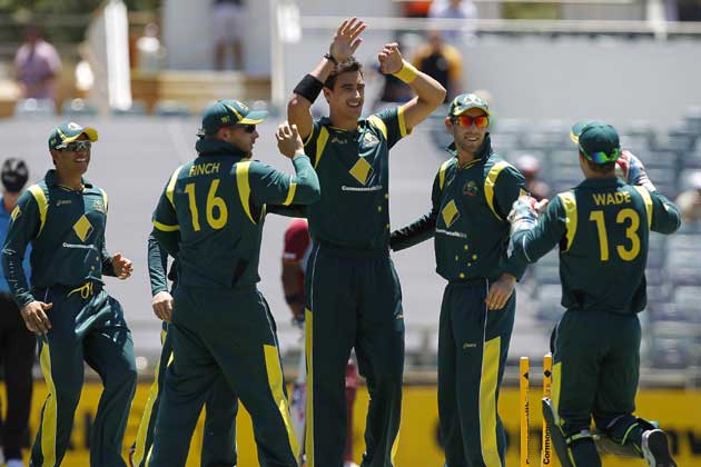
Preferred the home one as in that all green pile of crap? I hate our home ODI uniform, the yellow/gold ones we wear overseas always look so much better.
i preferred the home one, but this is pretty much perfect.
not sure why they changed it though...
For me the best looking national team uniform us consistently the Wallabies, the shades of gold and green they have always generally look great
This sort of stuff happens all the time when a set of (usually) two jumpers is released to the public... the one which looks more, interesting, I guess is the one that receives much higher levels of support... and sure, it might be a more visually appealing design (in this case I honestly don't think it is... even a gold V isn't enough to stop the dark green and navy from clashing) but as for terms of how it actually looks on a player, out on the field... it's usually the more simplistic design which would be the wiser decision.
Take for example GWS' kit... it's widely known that when it was first revealed along with its moniker etc. - another, more simplistic design (basically Gold Coast's kit, orange base, charcoal G and side panels) was also tossed up. At the time the current outfit was widely regarded as MUCH better than its counterpart, but I truly believe the unchosen design would've looked a lot better on the field. No strange front to back charcoal to orange melding, no charcoal shorts that are a different shade of grey than on the guernsey, no non-brand specific use of white, a nice duel colour outfit, orange top with charcoal shorts, which is really just a less cluttered design. GWS don't have a bad jumper, but I don't think it'll evolve, they'll probably just scrap it and move to a different design entirely.
Another example of this is when Gold Coast launched their maiden jumpers. There was a bunch of public support for the ill-fated wave jumpers, with a lot of fairweathers saying they wished they'd be the permanent strip... but on the field they looked plain dumb, the sides didn't match up, it felt like a contrived and forced gettup. They were to be scrapped at the end of their second season.
Preferred the home one as in that all green pile of crap? I hate our home ODI uniform, the yellow/gold ones we wear overseas always look so much better.
For me the best looking national team uniform us consistently the Wallabies, the shades of gold and green they have always generally look great
i loved this one, much better than our home one now any way, and i really like the separate home and away strips we've been using.
the current home doesn't look good at all, i hate it and the font for the numbers and names is crap IMO.
Willo_
Trust the Process
- Apr 27, 2010
- 35,237
- 62,327
- AFL Club
- Geelong
- Other Teams
- 76ers, Melbourne Roys
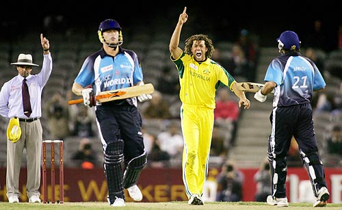
When I was a kid we wore yellow all the time, I love watching us play overseas because we just look better.
i loved this one, much better than our home one now any way, and i really like the separate home and away strips we've been using.
the current home doesn't look good at all, i hate it and the font for the numbers and names is crap IMO.
The sooner they kill off the all green at home the better for me
then you'll be taking away what the current generation has grown up with, maybe if we wear green away it'd look ok.When I was a kid we wore yellow all the time, I love watching us play overseas because we just look better.
The sooner they kill off the all green at home the better for me
but i'd prefer us in green at home and yellow away.
just like football, dark shorts home, light shorts away
Willo_
Trust the Process
- Apr 27, 2010
- 35,237
- 62,327
- AFL Club
- Geelong
- Other Teams
- 76ers, Melbourne Roys
Stuff the current generation.... they are wrong hahathen you'll be taking away what the current generation has grown up with, maybe if we wear green away it'd look ok.
but i'd prefer us in green at home and yellow away.
just like football, dark shorts home, light shorts away
Stuff the current generation.... they are wrong haha
Grew up with green uniforms, but I prefer yellow by a mile.then you'll be taking away what the current generation has grown up with, maybe if we wear green away it'd look ok.
but i'd prefer us in green at home and yellow away.
just like football, dark shorts home, light shorts away
with the current i agree, but the last one we had was great and looks much better than the yellowGrew up with green uniforms, but I prefer yellow by a mile.
Willo_
Trust the Process
- Apr 27, 2010
- 35,237
- 62,327
- AFL Club
- Geelong
- Other Teams
- 76ers, Melbourne Roys
Clearly Dylan... you are a good eggGrew up with green uniforms, but I prefer yellow by a mile.
Willo_
Trust the Process
- Apr 27, 2010
- 35,237
- 62,327
- AFL Club
- Geelong
- Other Teams
- 76ers, Melbourne Roys
Of course I am only being a s**t stirrer, kids today do grow up with the green home shirts and that's what they know and like.
I just have my preference
I personally prefer the yellow home (born 1994 if that counts for anything) but the green doesn't look bad as a predominant colour IMO. These jerseys are horrible however, and should be burnt and left behind with the rest of the 2013 cricket uniforms. Jeez this past 2 years have been horrible for cricket merch.
lmach
Naitanui2Yeo
Australia wore yellow at home until 2006. So you probably grew up watching them in yellow unless you were born after '96.
98Australia wore yellow at home until 2006. So you probably grew up watching them in yellow unless you were born after '96.
- Moderator
- #72
Australia wore yellow at home until 2006. So you probably grew up watching them in yellow unless you were born after '96.
Yeah I'd still say I grew up watching them in yellow I reckon
Yeah born in 94. The first Aussie shirt I got was the canary yellow in 2005.
I remember at the time I was really upset because the store had all these new shirts in when all I wanted was one of these.
I remember at the time I was really upset because the store had all these new shirts in when all I wanted was one of these.
I guess it was in between for me - I still have a yellow one day top somewhere from when I was like 9.Australia wore yellow at home until 2006. So you probably grew up watching them in yellow unless you were born after '96.

Similar threads
- Replies
- 0
- Views
- 505
- Replies
- 4
- Views
- 745
- Replies
- 0
- Views
- 477
- Replies
- 10
- Views
- 536
