


_Wang_
73,74,80,17,19,20
Lions have gone back to the future and gone back to their old logo.
Should we?
I'm a yes, I like the old one better
Should we?
I'm a yes, I like the old one better
Follow along with the video below to see how to install our site as a web app on your home screen.
Note: This feature may not be available in some browsers.
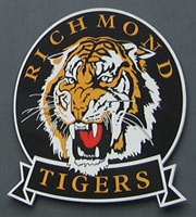
I don't, it was symbolic of a failed era , since transitioning our win loss is 60% and we haven't missed finals , I kinda like that , it's something to build onLions have gone back to the future and gone back to their old logo.
Should we?
I'm a yes, I like the old one better

So you're saying we'd start losing again if we reinstated it ?I don't, it was symbolic of a failed era , since transitioning our win loss is 60% and we haven't missed finals , I kinda like that , it's something to build on
Lions have gone back to the future and gone back to their old logo.
Should we?
I'm a yes, I like the old one better
Wang has turned into a whinging old campaigner since he changed his name.New one looks good, no need for change
Still love you deep down.****in wow
Would be pointless to change it, this one is symbolic of Tiger GlorySo you're saying we'd start losing again if we reinstated it ?
At least we won a final under the last oneWould be pointless to change it, this one is symbolic of Tiger Glory
yesSo you're saying we'd start losing again if we reinstated it ?
Also looks like we poached an actual tiger and taxidermied it. Tiger thus is dead.
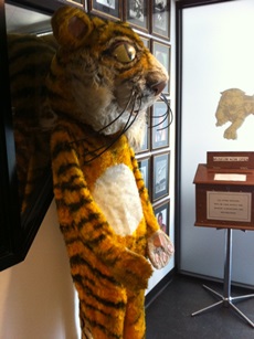
It really does look like something the cat dragged in.That used to be the mascot. They still have it in the museum at Punt Rd. Pity we can't get it on a jumper, really.
