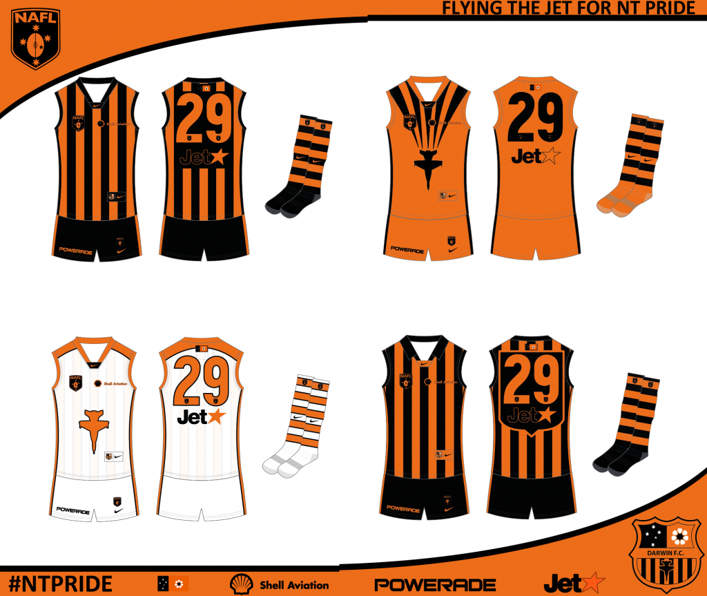
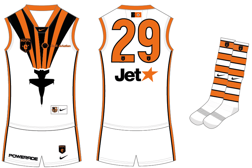
Discussion NAFL 2014-15 franchise bidding and discussion

Remove this Banner Ad

Status
Not open for further replies.
I wouldn't mind seeing it with a marone and white colour scheme, I feel like if you just change the marone to blue it simply becomes the West Coast jumper.


I'm going to change my design from the wings and the design I changed it to looks pretty nice with the darker maroon but I think the white doesn't look that good with it.

Black looks like the best option at the moment.
 
Last edited:
Also, I love this idea!!

Any feedback will be appreciated. :)

finalENTRY_zps797a2f65.png
To add to what others have said, I think you've used two much orange on the home and heritage (not just the logos and numbers). I reckon thicker stripes or a bigger gap between each stripe would've looked better. It's a very bright shade of orange so using too much of it against a dark colour can be a bit in-your-face. I really like the away, but I think you could've done a bit more with the clash.

One thing that I noticed from the comp is that a lot of people had a strong home jumper but they seem to have slacked off on the away/clash (myself included). I learnt that your away/clash jumper needs to be just as strong as your home - I'm pretty sure all of my losses were when I was the away team.

Also, I feel you COULD have been much more creative with the logo? As opposed to just using Barcelona's shield.
I think this applies to a lot of the entries. Many people just re-coloured or edited designs they found off the net. If there's going to be a logo round, all logos should be original, just as each jumper should be. I'm hoping people enter original logos in the IFA too, because it's not really fair otherwise.
 
To add to what others have said, I think you've used two much orange on the home and heritage (not just the logos and numbers). I reckon thicker stripes or a bigger gap between each stripe would've looked better. It's a very bright shade of orange so using too much of it against a dark colour can be a bit in-your-face. I really like the away, but I think you could've done a bit more with the clash.

One thing that I noticed from the comp is that a lot of people had a strong home jumper but they seem to have slacked off on the away/clash (myself included). I learnt that your away/clash jumper needs to be just as strong as your home - I'm pretty sure all of my losses were when I was the away team.


I think this applies to a lot of the entries. Many people just re-coloured or edited designs they found off the net. If there's going to be a logo round, all logos should be original, just as each jumper should be. I'm hoping people enter original logos in the IFA too, because it's not really fair otherwise.
Couldn't agree more.
 

Log in to remove this ad.

Well, I found that the logos and numbers on your home, away and heritage kits just got lost in the jumper. Needed some white. I quite like the away design though, despite the logos.
Yeah I 100% agree with this. If I had my time again I would have made the numbers and logos either white or black. They are barely visible as it is.

Thanks mate :)

I liked the away and clash but I thought the home/heritage looked a bit busy, I don't think anything was wrong with the colour scheme.
Yep. I was tempted to make my away kit my home kit and go from there. But for some odd reason I wanted something traditional, so I based my club off FC Barcelona, besides the away kit. Yeah thicker stripes and better use of colour with the numbers and logos would have helped too.

Thanks :)

As others have pointed out, the home and the heritage needed some white in it.
Also, I feel you COULD have been much more creative with the logo? As opposed to just using Barcelona's shield.

I did like it though, great designs nonetheless.
Yes, the home and heritage kits were in dire need of some white. And on the logo, I made everything for my NAFL club at 1:30am when my brother had people over. I wanted to finish by the time they left. I finished at 4:00am, and gave up and went to bed. But yeah, here's the logos that I made and I chose the one that I felt represented the Darwin Jets the best. The other logos bar the first one, I felt were too plain, and let's be honest, my creative juices weren't exactly flowing at the time haha

Logos_zps7206469d.png


Thanks Ando :)

To add to what others have said, I think you've used two much orange on the home and heritage (not just the logos and numbers). I reckon thicker stripes or a bigger gap between each stripe would've looked better. It's a very bright shade of orange so using too much of it against a dark colour can be a bit in-your-face. I really like the away, but I think you could've done a bit more with the clash.

One thing that I noticed from the comp is that a lot of people had a strong home jumper but they seem to have slacked off on the away/clash (myself included). I learnt that your away/clash jumper needs to be just as strong as your home - I'm pretty sure all of my losses were when I was the away team.

Yeah, upon further reflection there was too much going on. As you said, a couple of minor tweaks could have helped such as number and logo colouring, thicker stripes etc. I had all of this in my mind before I started, which it looked better in my head than the final result. Here's some other attempts at the clash, but I didn't want to re-use the away jumper if you get what I mean?

Clash2_zps84607670.png


Clash_zpsbce16b9b.png


I think this applies to a lot of the entries. Many people just re-coloured or edited designs they found off the net. If there's going to be a logo round, all logos should be original, just as each jumper should be. I'm hoping people enter original logos in the IFA too, because it's not really fair otherwise.
No doubt about it, I learned a lot more than I thought I would from the NAFL. What I have learned I am trying to apply in my AFL Invasion portfolio. Ultimately, without constructive criticism and feedback I cannot improve and grow as a designer.

What I've learned:
  • Don't stick to only the colours of the club, don't get caught up in the colour scheme
  • What looks good in your head mightn't look good on paper
  • Keep the design options open, and only finish when you are satisfied with the work
  • Keep experimenting, don't settle for using other logos and identities as a base mark for a club
  • Feedback is the greatest thing

Thanks heaps for the feedback everyone, I really mean it!!

:)
 
Very nice, I thought the logo was excellent. Is it original?


The phoenix was found on google and I just told lmach what I wanted and he worked his magic, with a few added touches of his own.


Edit: I also edited the shape of the head a bit.
 
1st
Victoria*
Location: Ballarat*
Nickname: Diggers
Colours: Blue*, gold, white
*Happy to change these for the spread of the competition

2nd
Victoria
Location: Surf Coast
Nickname: Sharks
Colours: Navy blue, light blue, white

3rd
South Australia
Location: Mount Gambier
Nickname: Lakers
Colours: White, green, yellow
 
Last time, I only got involved at the last minute to fill a space. If there's a space to be filled again once teams have been allocated, I'd be happy with absolutely any of these:

Victoria
Melbourne Dragons (red, white)
Melbourne Royals (blue, gold)

Queensland
Brisbane Bobcats (yellow & blue)
Gold Coast Koalas (maroon & white)

NSW
Sydney Rangers (sky blue, charcoal)
Newcastle Canaries (black, white, yellow)
Newcastle Kookaburras (red, blue)

ACT
Canberra Owls (navy, silver)
Canberra Griffins (blue-green, gold)

Tasmania
Hobart Devils (green, black)
Launceston Lions (red, yellow)

SA
Adelaide Pipers (black, white)
Limestone Sharks (lime, white, blue)

WA
West Coast Kangaroos (red, black, yellow)
Mandurah Dolphins (purple, teal, white)

NT
Darwin Beagles (navy, orange)
Central Eagles (brown, white)
 

(Log in to remove this ad.)

Primary option:
Victoria
Location: Port Melbourne
Nickname: Anchors
Colours: navy/white/yellow/orange


Secondary option:
Victoria
Location: Geelong
Nickname: Guards
Colours: Red/Blue


Tertiary option:
ACT
Location: Canberra
Nickname: Pirates
Colours: purple/white/black
 
WA/NZ/ACT teams are already decided but until I hear from others the other spots aren't confirmed.


2 WA teams (2/2)
2 SA teams (1/2)
2 NT teams (0/2)
2 VIC teams (1/2)
2 NSW teams (1/2)
2 QLD teams (1/2)
2 ACT teams (2/2)
2 NZ teams (2/2)
 
Last edited:
WA/NZ/ACT teams are already decided but until I hear from others the other spots aren't confirmed.


2 WA teams (2/2)
2 SA teams (1/2)
2 NT teams (0/2)
2 VIC teams (1/2)
2 NSW teams (1/2)
2 QLD teams (1/2)
2 ACT teams (2/2)
2 NZ teams (2/2)
Who got the Victoria team because I really want my Port Melbourne team to go ahead
 
Who got the Victoria team because I really want my Port Melbourne team to go ahead
St Mark (Ballarat Diggers) I'd say, since he won the reserves comp. Workhorse will probably get the second, seeing as first preference goes to returning players.
 
Who got the Victoria team because I really want my Port Melbourne team to go ahead


People who were in last season (and reserves winner) are the only people being picked at the moment.


Everyone has the chance to sign up for the reserves comp, though.
 
St Mark (Ballarat Diggers) I'd say, since he won the reserves comp. Workhorse will probably get the second, seeing as first preference goes to returning players.


Yep, although he may have to change location when I hear from others as he's the newbie.
 
Status
Not open for further replies.

Remove this Banner Ad

Back
Top