stupidlikeafox
All Australian
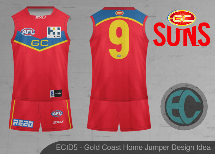
Can someone do a better version of this I knocked up


Personally I like option 2 the most but which do you Suns fans like the most?
I will make the clash and away based on the most popular option.
Follow along with the video below to see how to install our site as a web app on your home screen.
Note: This feature may not be available in some browsers.
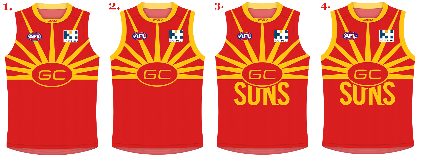
Can someone do a better version of this I knocked up
Personally I like option 2 the most but which do you Suns fans like the most?
I will make the clash and away based on the most popular option.
Personally I like option 2 the most but which do you Suns fans like the most?
I will make the clash and away based on the most popular option.
Awesome job stupidlikeafox I like both 1 and 2 agree that 3 and 4 are probably too busy. It would be a unique look in an AFL that can be sometimes too bland
EDIT: Hope you don't mind, I forwarded them to the club
I will make the full kit (shorts, socks), away and clash for you tonight.
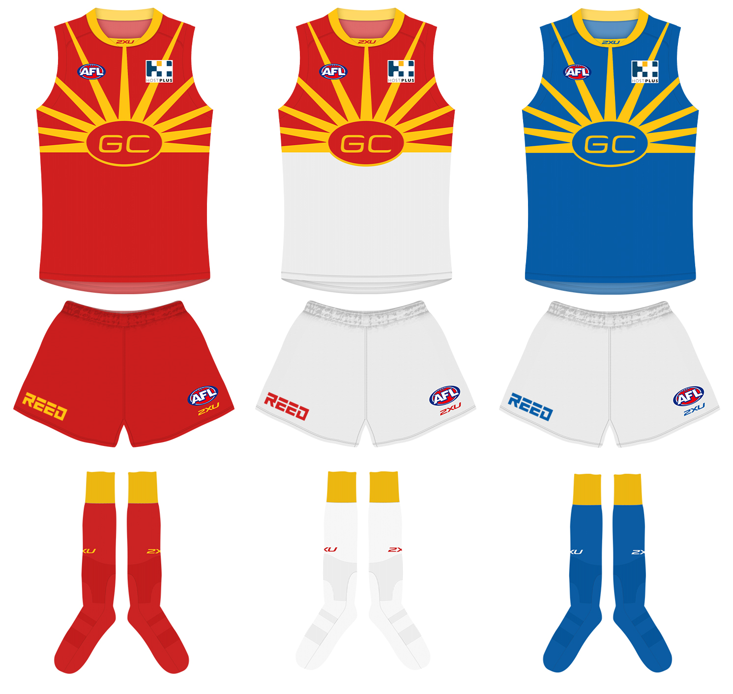
HOME AWAY CLASH
HOME AWAY CLASH
HOME AWAY CLASH
Try squinting, now hold the ipad a little further away, bingois it me or is it the wrong yellow?
should it be a brighter shade of yellow?
is it me or is it the wrong yellow?
should it be a brighter shade of yellow?
HOME AWAY CLASH
Nice job fox, but am I the only one who really doesn't like this design? Looks like a sunflower, I think the current top is actually pretty good.
I really like this. Just being a bit similar to the Dees is the only problem? Could gold shoulders help?
Its also similar to the Lions Guernsey (Fitzroy). I don't see that as a problem. I think the Lions are crazy not to go back to it. Its definitely something we should work with. Even if they make some of these concept designs for sale to fans. Id buy one or 3 for the kids! Does need more gold near the chest or shoulders though.I think being inverted colours to the Dee's would be enough to get away with it. Maybe a lighter blue and a bit more gold on the front