- Nov 15, 2010
- 2,410
- 2,157
- AFL Club
- Fremantle
- Other Teams
- WACA, Western Force, Arsenal, Glory
The Serbia kit would make an excellent England rugby league away kit.
Follow along with the video below to see how to install our site as a web app on your home screen.
Note: This feature may not be available in some browsers.
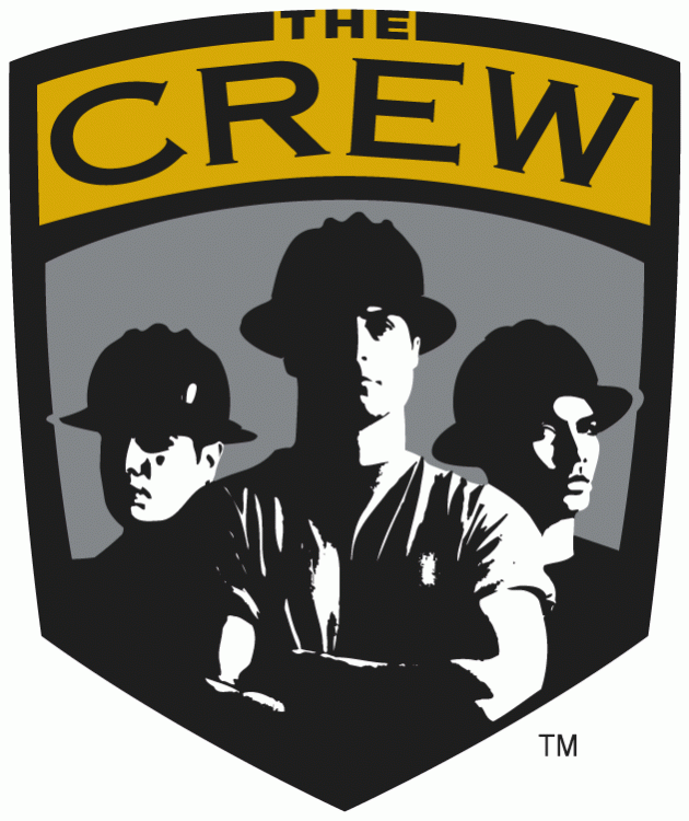
Yeah, I always liked their old logo - it suited the city's 'underdog' tag.I reckon the Crew should have just refined the old logo. Make the figures more stylised and less real.
I know you wanted it, but come on, 'd@ Kr3w' on a crest is simply unprofessional!Shattered that "the Crew" logo has been changed. Pretty garish shade of yellow on the new logo too, although no worse than the much-too-dark shade on the old one
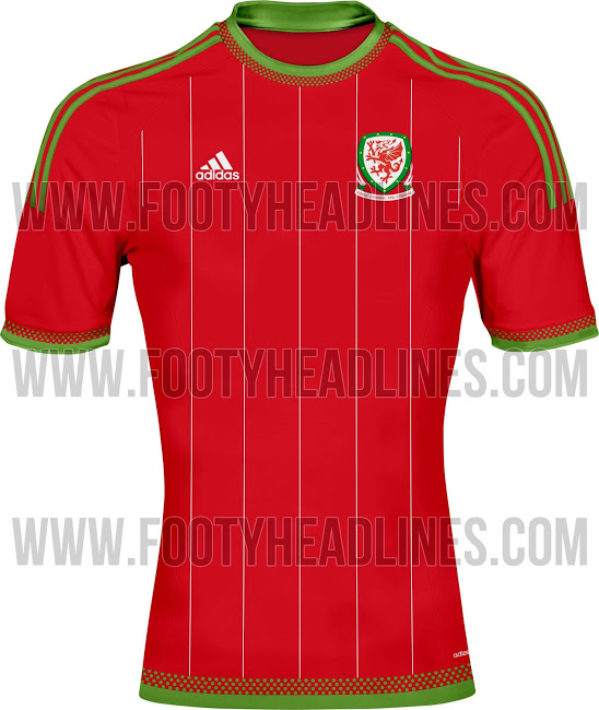
This is the new Adidas Wales 2015 Home Shirt.

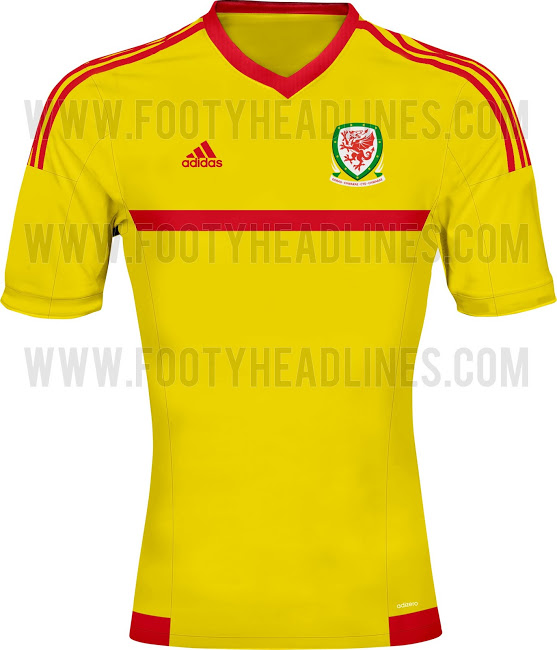
This is the new Wales Adidas Away Jersey.
Green mixed with most colours is absolutely horrid. Original, sure. Can countries pull it off? No.Red and green...
Primary colours mixing is dangerousGreen mixed with most colours is absolutely horrid. Original, sure. Can countries pull it off? No.
Agreed.Primary colours mixing is dangerous
Adelaide.There are plenty of examples of primary colours working just fine.
One primary colourAdelaide.
??? At least two...red and yellowOne primary colour